ERNIE-Image review work gets useful fast when the model is pushed past sample galleries and into real layout pressure. This model clearly aims at posters, structured scenes, and text-heavy compositions, so the important question is not whether it can make a pretty image. The better question is whether it can keep hierarchy, mood, and readability once the prompt starts asking for all three at once.
ERNIE-Image on Wiro looks promising for that job. The official release leans hard on structured generation, prompt enhancement, and stronger text rendering than most open image models. That matches what showed up in fresh test runs for this draft. The model is best when the scene has a clear focal subject and the layout only needs a few strong text anchors, not a wall of tiny copy.
Table of contents
- What this ERNIE-Image review tested
- Test 1: luxury product poster
- Test 2: editorial travel cover
- Test 3: cinematic sci fi poster
- Where ERNIE-Image still slips
- Bottom line
What this ERNIE-Image review tested
This rewrite focused on three things ERNIE-Image claims to handle well: cinematic detail, clean layouts, and readable display text. The prompts pushed toward posters and editorial covers because that is where weak models usually fall apart. They can make a mood, but they lose hierarchy. Or they place text, but the image stops feeling cinematic. ERNIE-Image does a better job of balancing both.
The reference points were simple. The official model materials highlight a single-stream DiT design, a prompt enhancer for short prompts, and strong performance on structured image tasks. A quick pass through the technical report and model card backed that up. A third-party launch writeup also pointed to the same strength: poster-like work with better than average text rendering. That does not make every layout perfect. It does mean the model deserves a real review built around layout stress, not generic style prompts.
| Test | What was asked | What held up | What slipped |
|---|---|---|---|
| Luxury poster | Centered product shot with headline stack | Strong hierarchy, reflections, controlled lighting | Small support copy still needs cleanup |
| Travel cover | Editorial scene with serif title and clean margins | Depth, atmosphere, readable top line | Magazine-style metadata stays light |
| Sci fi poster | Cinematic street scene with bold title | Mood, contrast, layout drama, legible title | Lower detail text is softer than the hero line |
Test 1: luxury product poster
The first run asked for a fragrance campaign image with a centered bottle, smoke, reflection, and a clean headline stack. This is the kind of prompt that exposes whether a model can manage design intent instead of just texture. ERNIE-Image handled it well. The bottle stayed anchored in the middle, the mood lighting felt deliberate, and the main title landed where it should. The image reads like an ad, not just a still life with text pasted on top.
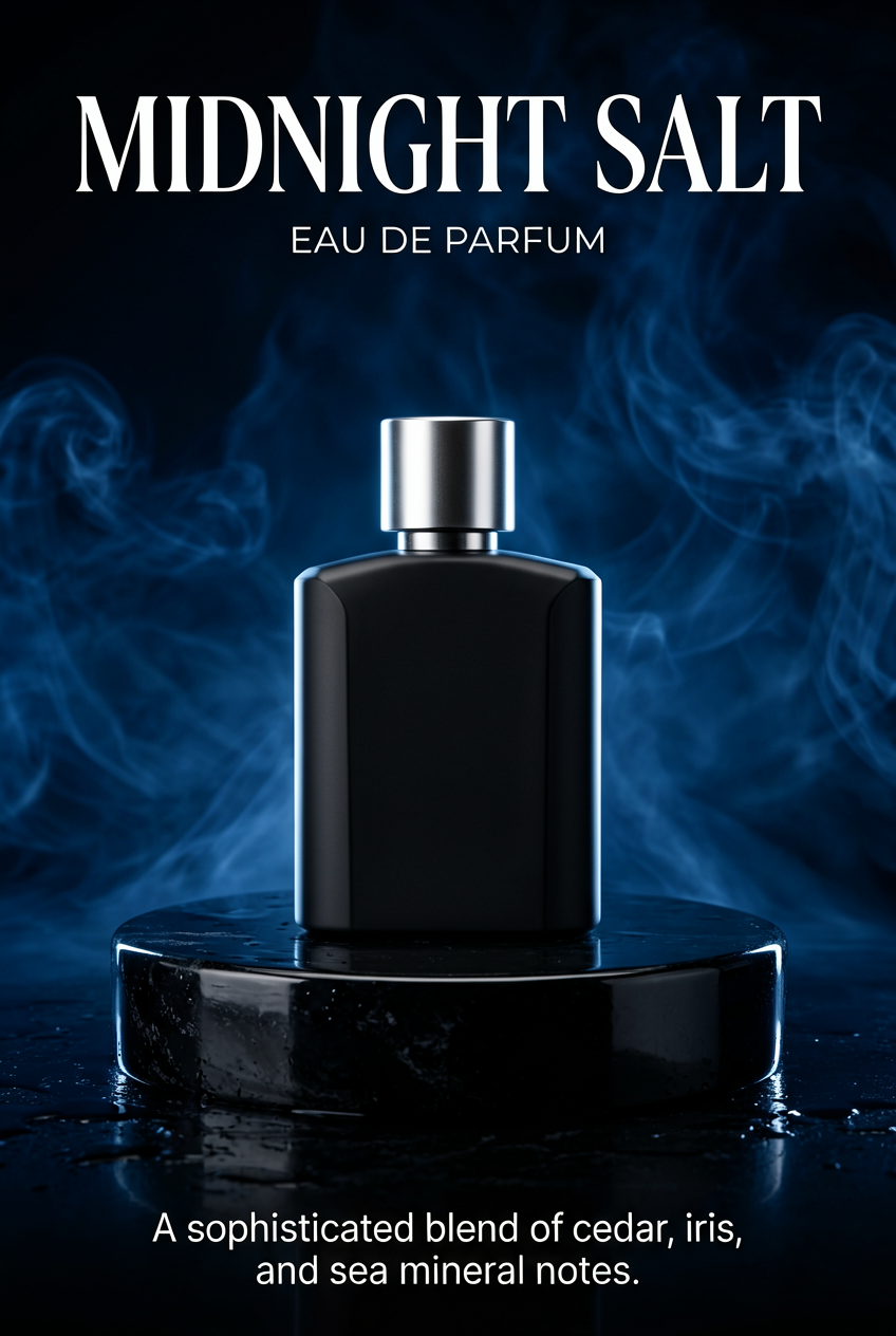
This is also where the model shows one of its limits. The big text is believable. The smaller supporting copy is less dependable. That is still a good trade if the job is concepting, campaign mockups, or early design exploration. It is not the same thing as production-safe typography. For high-stakes ad copy, the image should still move through a design pass after generation.
Test 2: editorial travel cover
The second run moved toward a travel magazine look. That meant layered perspective, warm haze, signage, a tram moving through the frame, and a restrained serif title at the top. ERNIE-Image did well here because the scene stayed readable even with a lot of small environmental detail. The tram, wet pavement, and mist held the eye, while the title stayed separate enough to feel intentional.
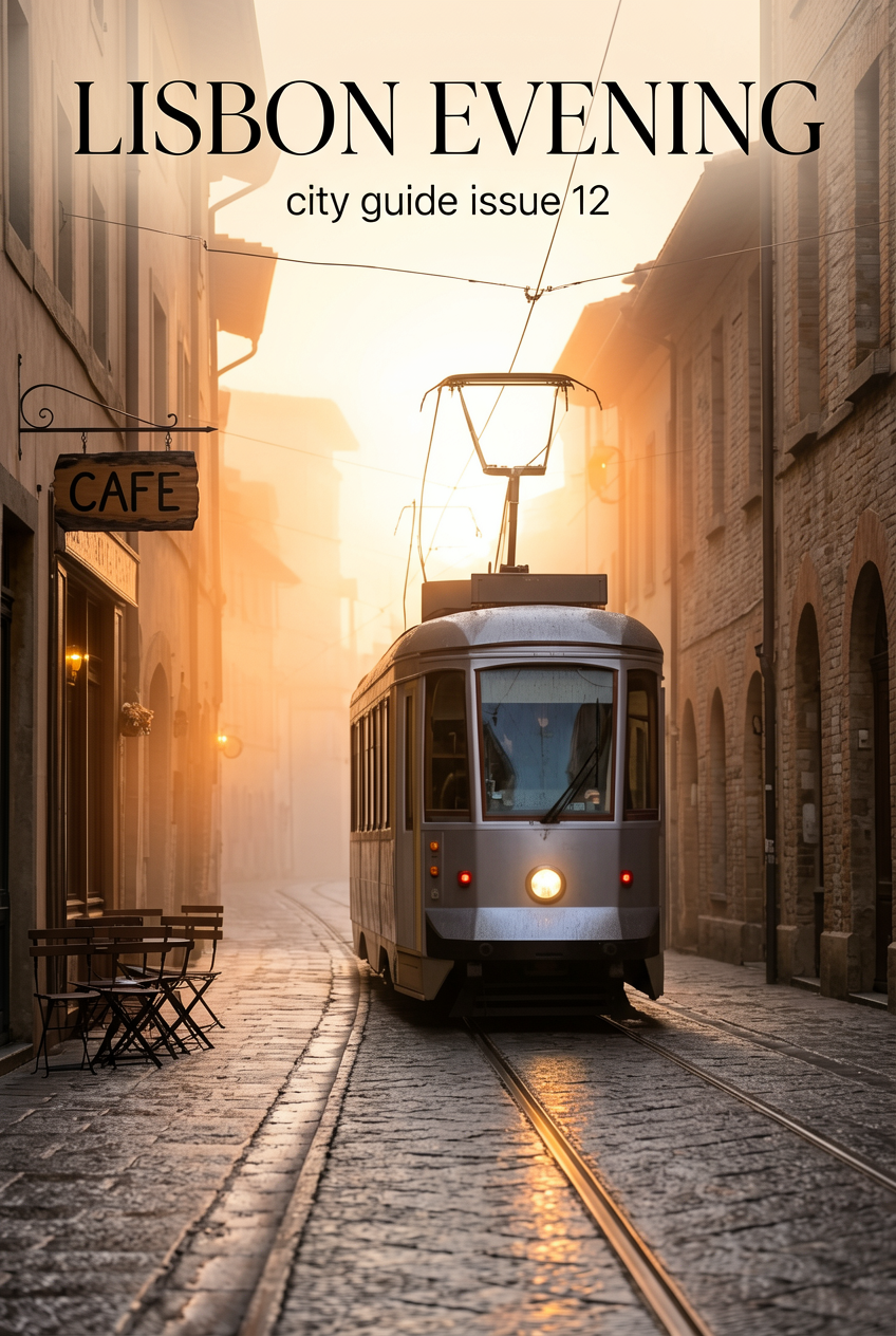
This result says a lot about the model’s practical range. ERNIE-Image is not only good at glossy product art. It can also keep a soft editorial tone without turning the frame muddy. That matters for covers, blog headers, event posters, and brand moodboards. The scene keeps its cinematic feel because the light has direction and the perspective stays stable.
Test 3: cinematic sci fi poster
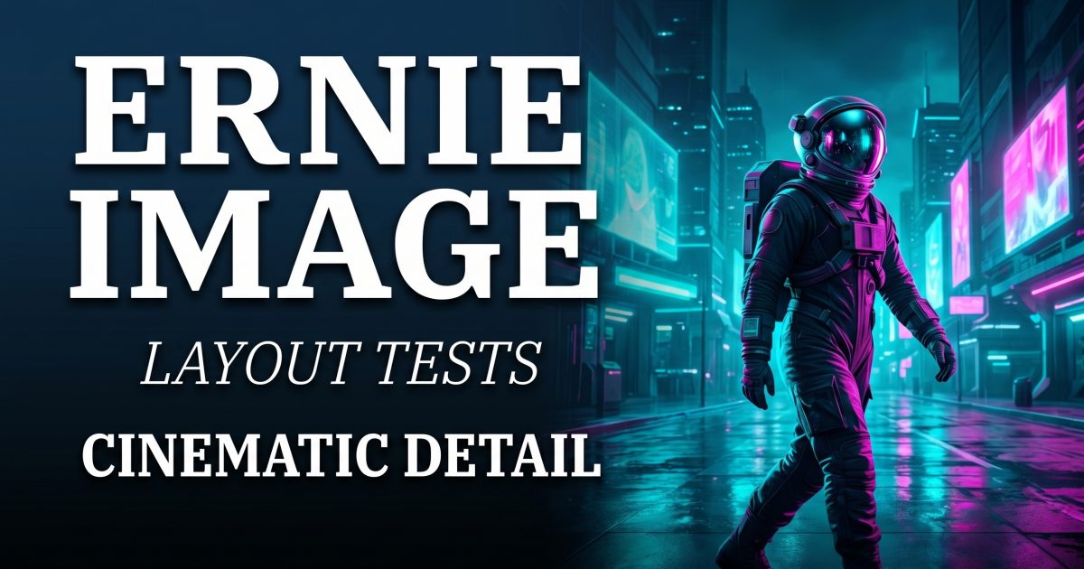
The third run was the hardest and the best. It asked for a neon sci fi street, an astronaut subject, reflective pavement, and a bold film-poster title with support text below. This is where ERNIE-Image looked most comfortable. The frame has motion, scale, and a clear visual rhythm. The hero title is readable enough to sell the idea, and the subject placement gives the layout real tension instead of dead center symmetry.
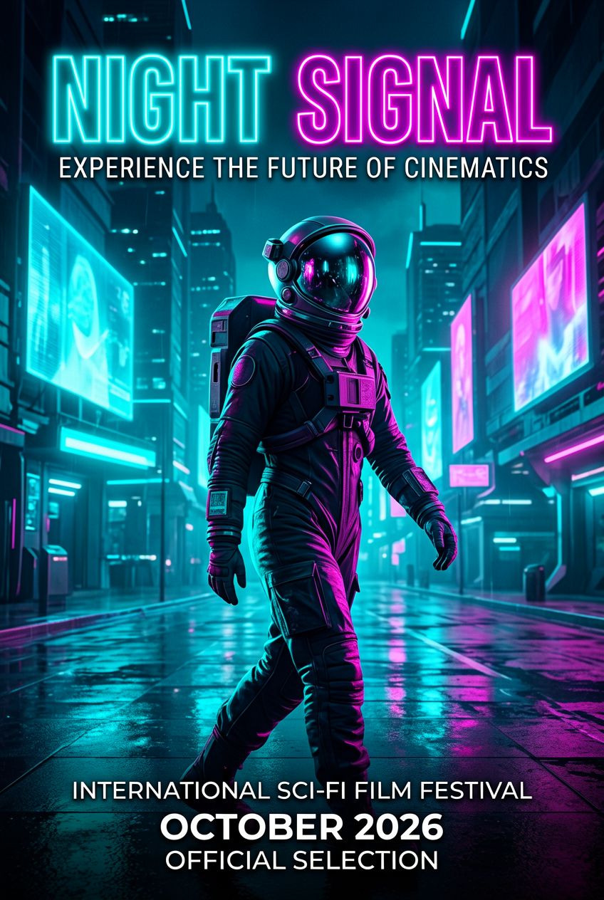
This test is also why the post now uses a new cover built from the same scene. The source image already had the right structure for a blog header: strong negative space, a clear subject on one side, and a visual mood that supports big type. That made it a better cover base than the earlier draft image set.
Where ERNIE-Image still slips
ERNIE-Image is good at headline-level text, scene control, and structured poster ideas. It is less reliable when the prompt asks for dense tiny copy, exact spelling across many lines, or packed infographic layouts. That is not unusual. Most image models still lose precision once the text block becomes dense. The difference here is that ERNIE-Image stays composed longer than average before the breakdown starts.
That makes it a good fit for concept posters, covers, campaign mockups, scene boards, and comic-style layouts. It is a weaker fit for finished assets that depend on perfect microtype. For the official model details, the Hugging Face model card and the technical report are worth checking. For a related layout-focused benchmark on this site, see GPT Image 2 Custom Guide: 4 Surprising Layout Tests.
Bottom line
ERNIE-Image review results are strongest when the prompt asks for a cinematic frame with a simple but deliberate layout. It handles posters better than many open models because it can preserve hierarchy while still making the image feel like a photograph or designed scene. It is not a replacement for final design cleanup, but it is a very usable model for covers, campaigns, and structured concept work.
Try the model on Wiro if the goal is poster-style image generation with sharper layout control.