Quick take
SenseNova U1 8B Interleave is built for mixed text and image output. The model page on Wiro is the easiest place to test it. It handled simple guides well, kept labels mostly clean, and stayed strongest when the brief asked for one page with a clear layout. The official model card on Hugging Face points to the same direction: native multimodal work, interleaved reasoning, and infographic-friendly generation. That matches the best results here. For a stricter layout test, compare this post with the GPT Image 2 Custom Guide and the ERNIE-Image Review.
The main pattern was simple. Short prompts worked. Busy prompts slipped. The model looked happiest when the page had one clear goal, a few labels, and a single focal diagram.
Quick jump:
- Prompt test table
- Solar panel explainer
- Sesame noodle recipe card
- Pour-over coffee guide
- Bicycle tune-up checklist
- Bilingual ramen poster
- Verdict
Prompt test table
| Prompt | Format | What it tested | Result |
| Solar panel explainer | 16:9 | Structure and simple labels | Best overall flow |
| Sesame noodle recipe card | 1:1 | Compact layout and icon balance | Clean and readable |
| Pour-over coffee guide | 3:2 | Step order and side diagram | Most balanced page |
| Bicycle tune-up checklist | 2:3 | Technical labels and portrait spacing | Strongest technical page |
| Bilingual ramen poster | 9:16 | Dense text and poster control | Good, but the hardest ask |
1. Solar panel explainer
This was the cleanest test of page structure. The model kept the flow logical and did not fight the layout. The output text read like a captioned walkthrough, then the image finished the idea with a tidy visual hierarchy. It felt dependable.
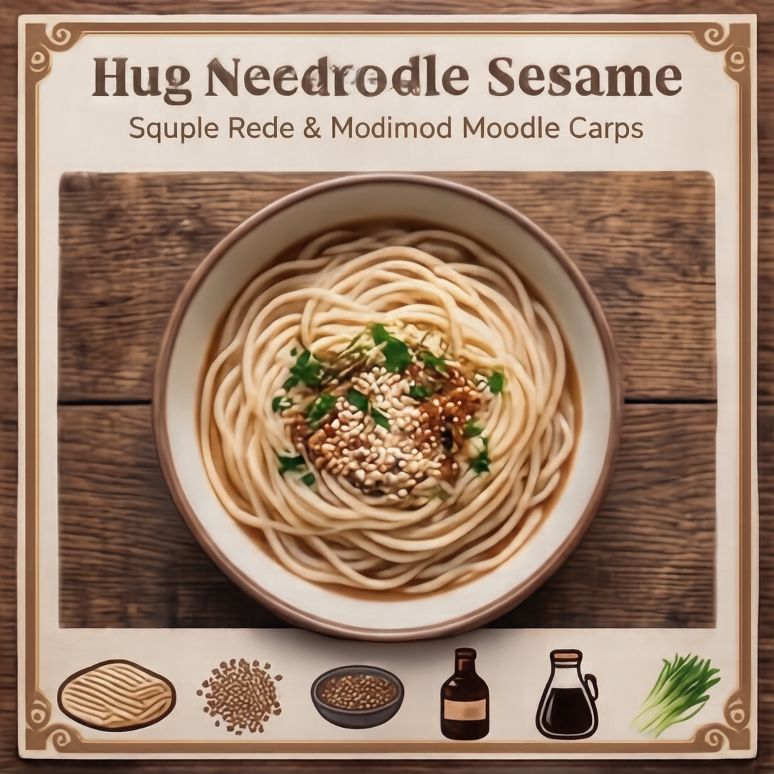
2. Sesame noodle recipe card
The square format helped here. The model handled the smaller frame without turning it into clutter. The ingredient idea and the numbered steps stayed readable, and the card had enough breathing room to work as a social post or a blog image.
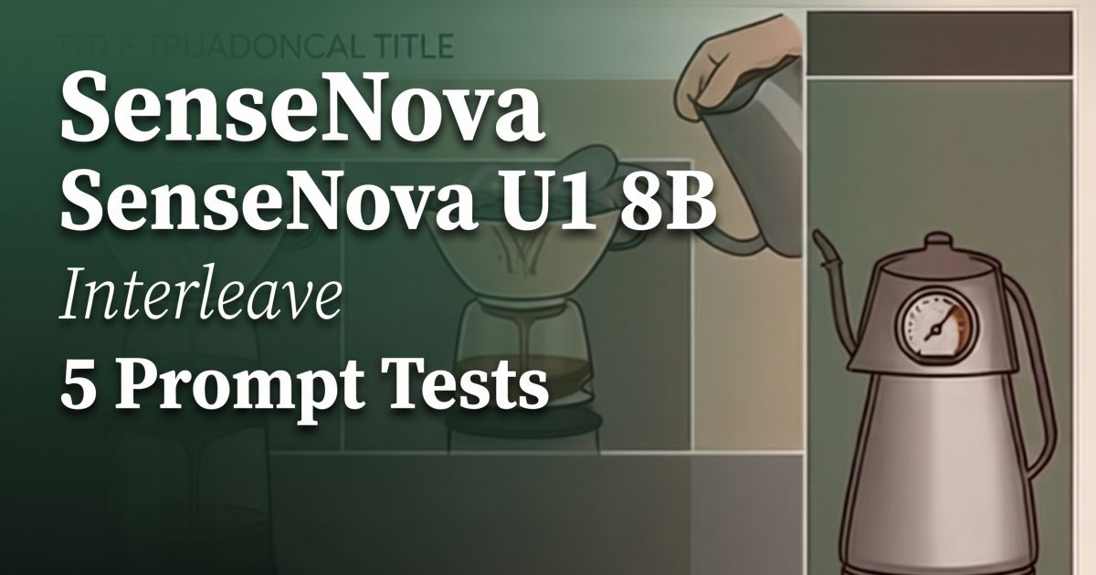
3. Pour-over coffee guide
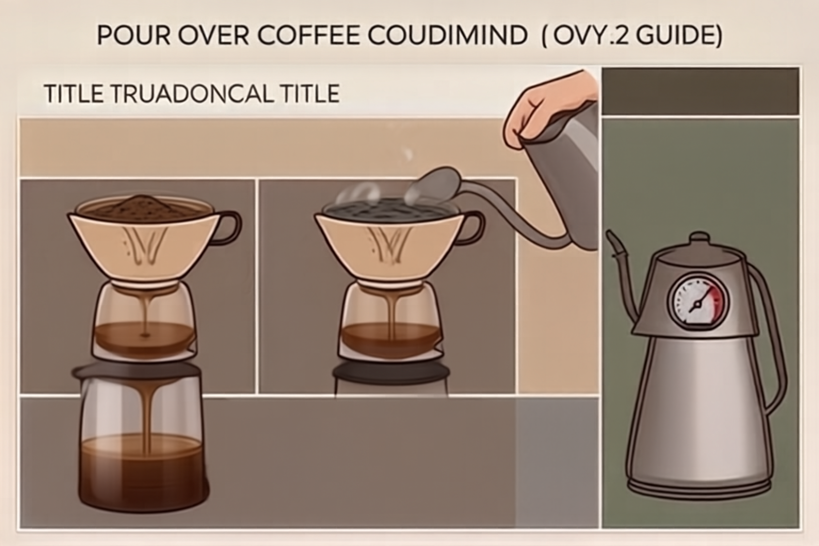
This was the most balanced result in the set. The layout had a clear header, a simple step flow, and one side diagram that did not crowd the page. It looked like something a cafe could actually use without much cleanup.
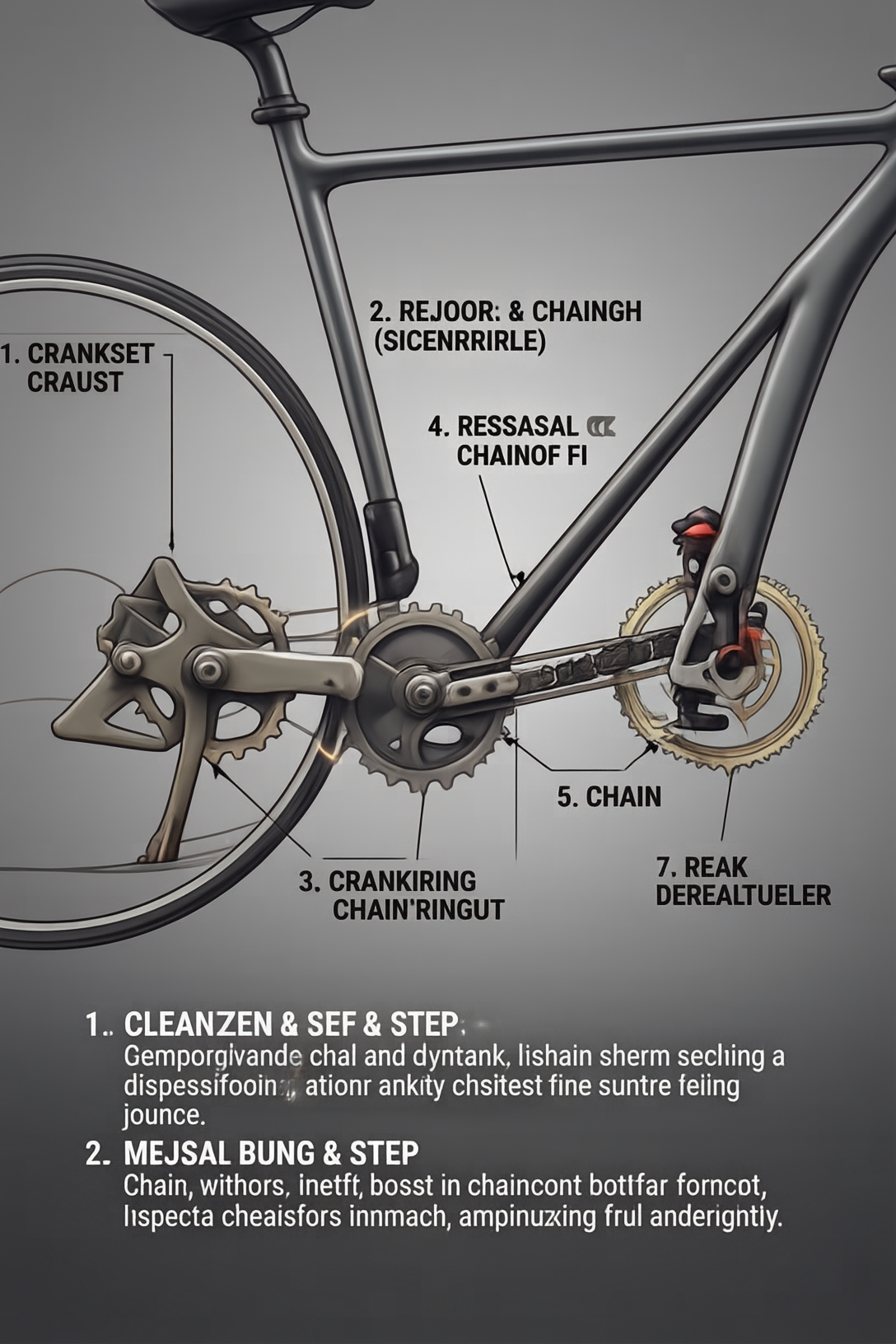
4. Bicycle tune-up checklist
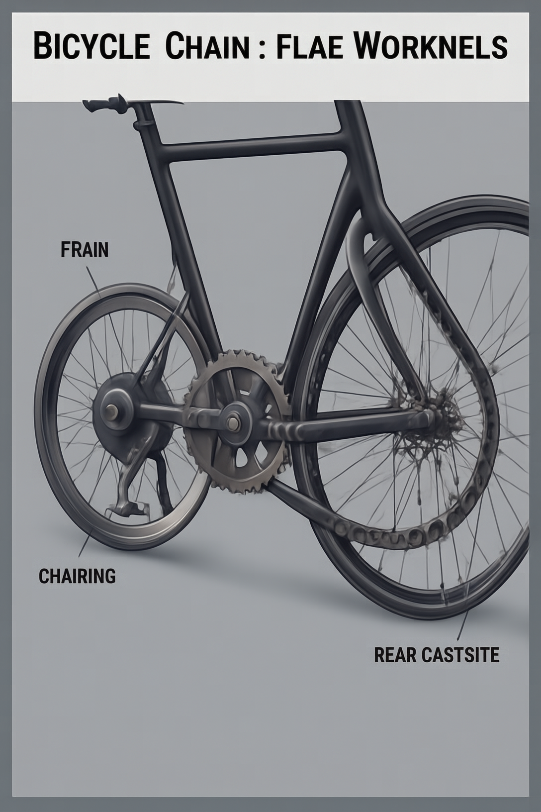
This was the strongest technical page. The portrait frame fit the checklist style well, and the drivetrain layout stayed crisp. Short labels worked better than long ones. The model did not need much room to make the page useful.
5. Bilingual ramen poster
This was the hardest brief. The model still kept the poster mood intact, but the tiny map and stacked text asked for more control than the earlier tests. It is the right kind of stress test for this model. It shows where the line is between a clean poster and a busy one.
Verdict
SenseNova U1 8B Interleave is a solid pick for tutorials, checklists, and infographic-style pages. It likes direct prompts. It likes one clear visual target. It can also handle a little density when the layout stays simple. The weaker spot is the busy poster brief. That is where the page starts to lose polish.
Two earlier attempts with a travel diary and a more ambitious poster stalled, which says a lot. This model is better at clean instruction than at loose art direction. That is not a flaw. It is a useful boundary.
If the goal is a single-page explainer with readable structure, this model is worth a test. Try SenseNova U1 8B Interleave on Wiro and push it with one hard layout next.