SenseNova U1-8B gets more interesting when layout tests force readable text, spacing control, and clean poster structure.
SenseNova U1-8B: what stands out
What SenseNova U1-8B does
SenseNova U1-8B is a text-to-image model built for dense compositions. The docs focus on posters, infographics, concept art, and scenes where text placement matters. Model page: https://wiro.ai/models/sensenova/u1-8b-text-to-image
Test setup
All five prompts used the same model and square output. Resolution was 1080P. Guidance scale was 3.0. Most runs finished in about one minute, with one longer run at just over two minutes.
| Test | What it checks | Elapsed seconds | Takeaway |
|---|---|---|---|
| Poster | Large headline and size row | 127 | Best overall composition |
| Infographic | Labels and directional flow | 59 | Strong diagram structure |
| Menu | Item names and prices | 59 | Readable with some spacing drift |
| UI | Small interface text | 56 | Good hierarchy, mixed small text quality |
| Product card | Headline, spec box, price tag | 59 | Clean ecommerce layout |
5 layout tests
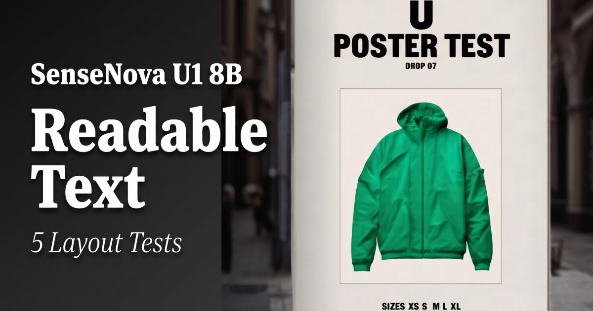
1) Streetwear poster
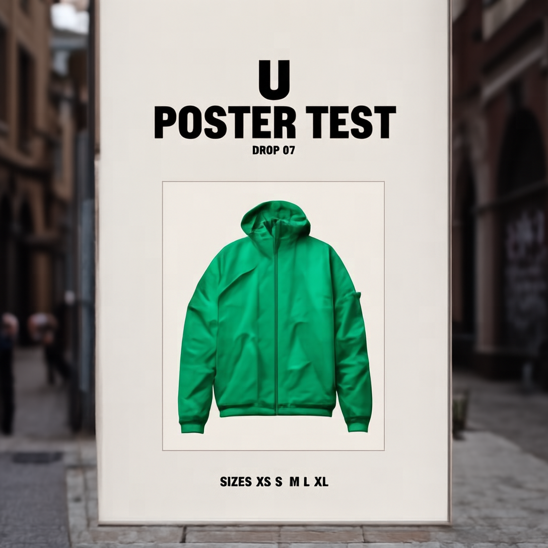
This is the strongest result in the set. The layout feels deliberate. The main headline reads cleanly. The size row stays visible. Letter spacing still drifts a little, but the frame looks like a real campaign mockup instead of a random image with text pasted on top.
2) Heat pump infographic
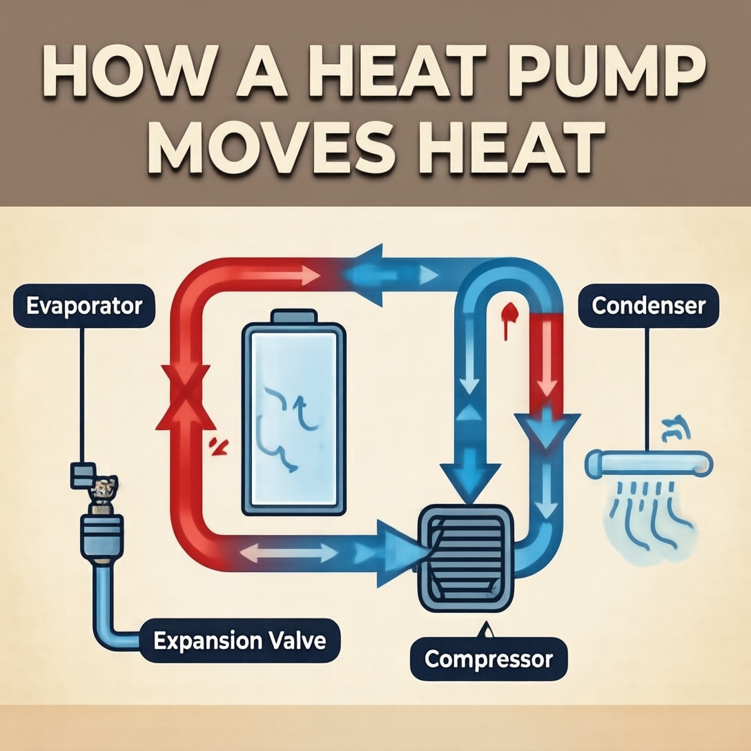
Infographics usually break image models fast. U1-8B holds up well here. The arrows and block structure stay organized. Labels are more readable than expected. Some words soften at small sizes, but the diagram still works as a single-page explainer.
3) Cafe menu board
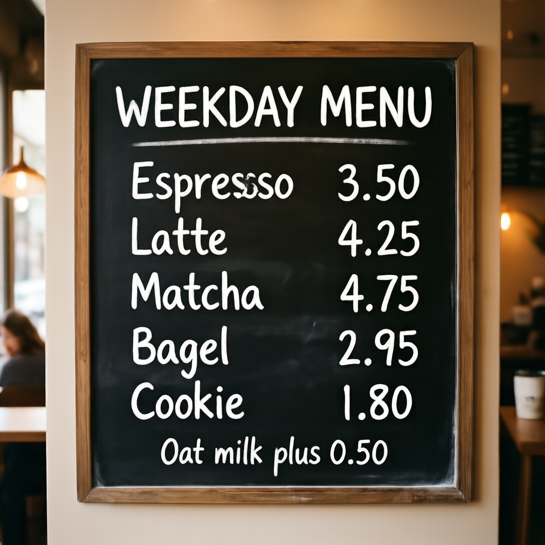
Menus expose spacing problems fast. U1-8B gets the broad structure right and keeps most lines legible. The header lands well. Prices read better than the small note. This looks useful for draft menu concepts, but final production text would still need cleanup.
4) Dark mode app settings UI
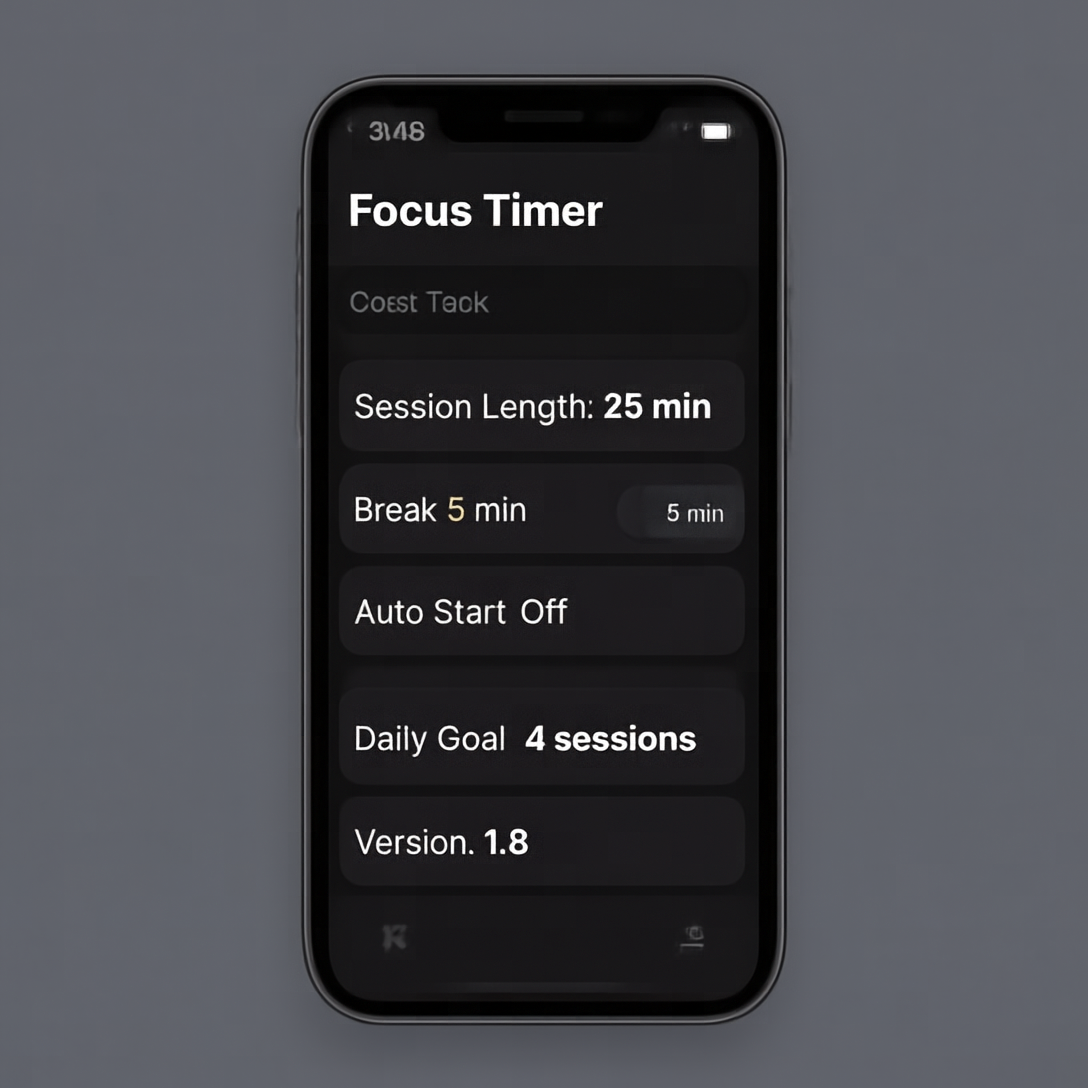
Small interface text stays harder than poster text. Even so, the hierarchy is solid. The header reads clearly. Rows feel like a real mobile settings page. Fine text is the weak point. For rough UI ideation, this is strong. For pixel-perfect screens, it still needs handoff to design tools.
5) Product card
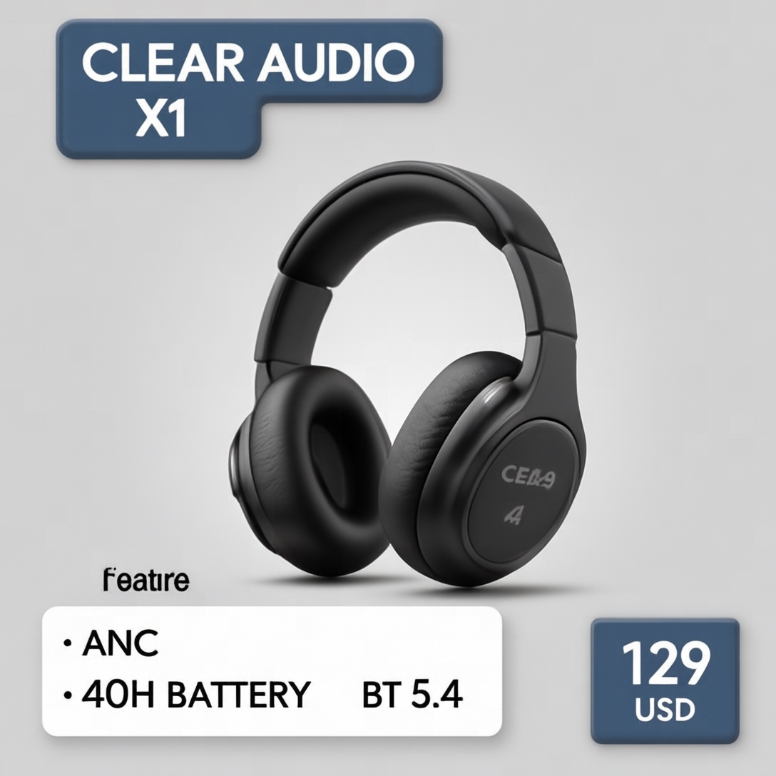
The ecommerce card shows where U1-8B feels practical. Product framing is clean. The spec box reads better than expected. The price tag is visible. This kind of layout is a good fit for quick concept cards, retail promos, and hero modules.
Where U1-8B works best
- Marketing posters with one strong headline
- Infographics with a clear diagram and short labels
- Product cards with a few large specs
- UI mockups where hierarchy matters more than exact microcopy
Verdict
SenseNova U1-8B does not solve text rendering completely. No model in this class does. Still, it handles structured layouts better than a standard scenic image model. Posters and product cards look the most convincing. Infographics are usable. Tiny UI text still slips. That makes U1-8B a solid option when the job needs both composition and readable words in the same frame.