GPT Image 1.5 clean layouts are easiest to judge when prompts push readable text blocks, packaging structure, and poster balance.
GPT Image 1.5 clean layouts: what stands out
Why GPT Image 1.5 stands out
GPT Image 1.5 is strong when the image needs structure. It keeps text blocks, objects, and spacing under control better than many image models.
This prompt guide tests one thing: clean layouts. Posters, ads, postcards, covers, and infographics all push the same weakness from different angles.
5 prompt tests
1. Night Circuit poster
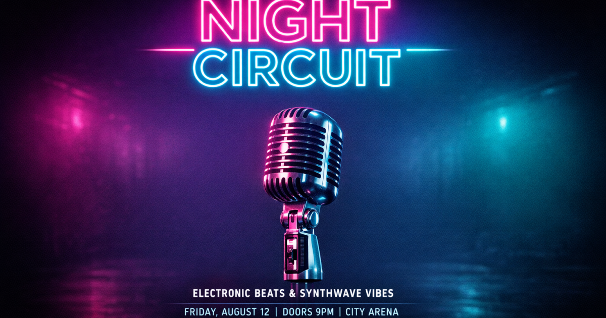
This is the best image in the set. The headline reads clearly. The composition also feels balanced and modern.
2. Espresso machine ad
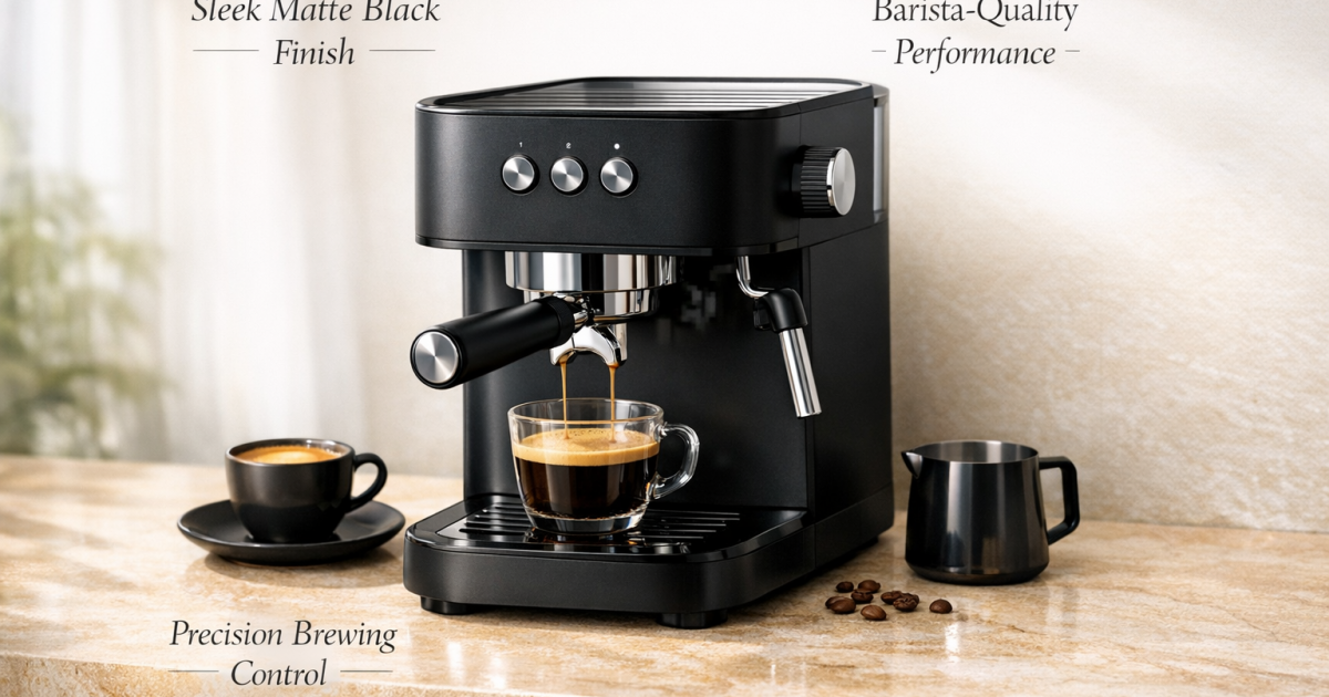
The product shot looks expensive and clean. The small labels are present, but the thin type needs space to breathe.
3. Lisbon travel postcard
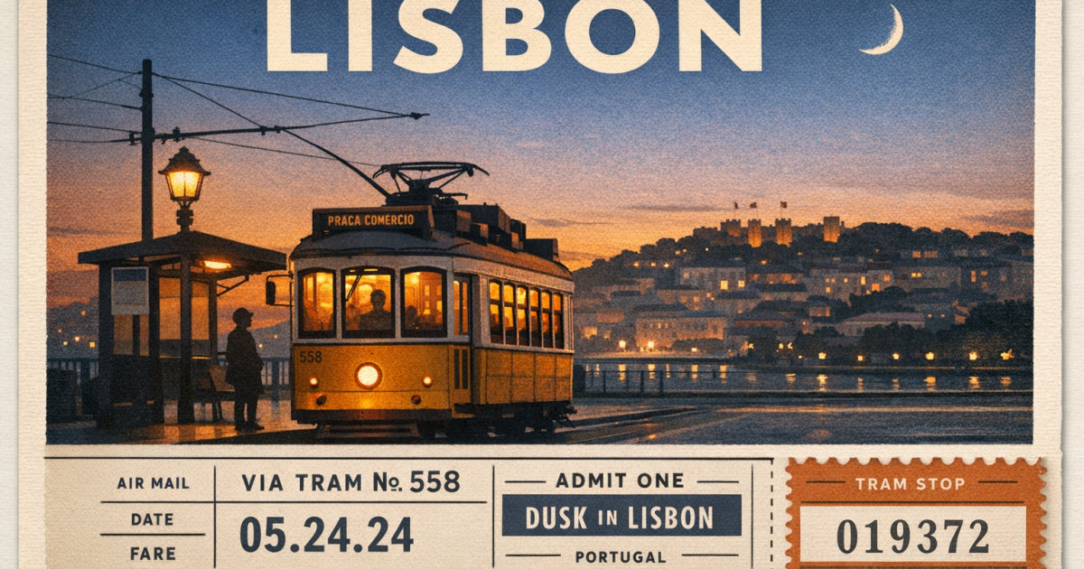
The grid is tidy and the scene feels editorial. Some smaller details soften, but the overall layout stays disciplined.
4. Spicy noodle cookbook cover
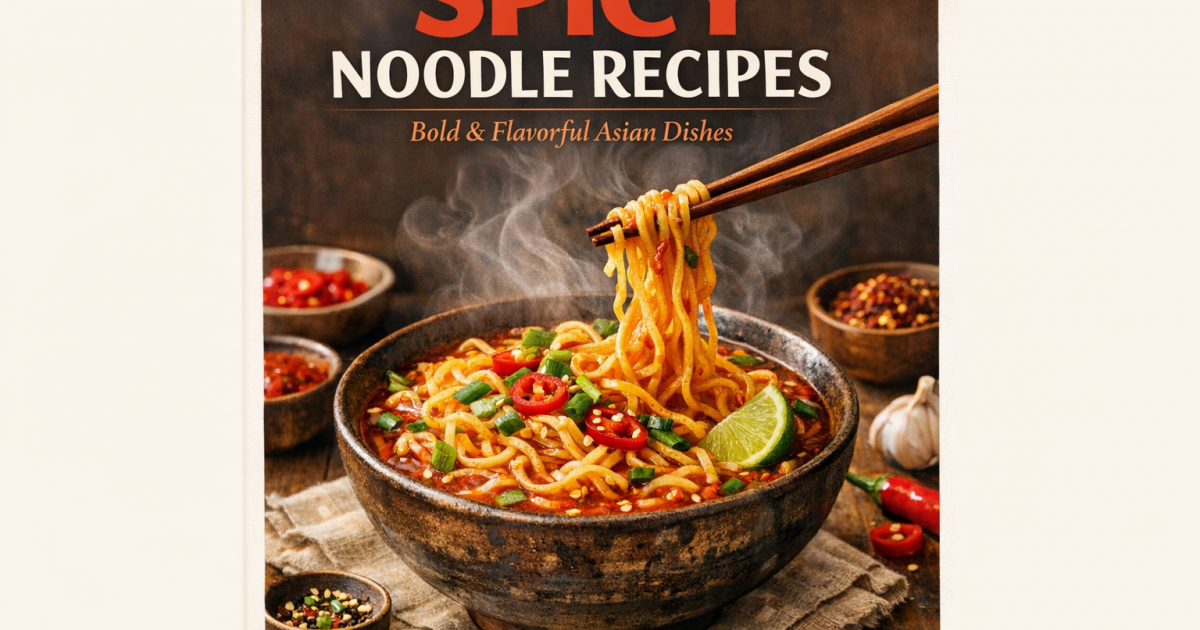
This one works well because the layout stays simple. The food styling carries the frame without crowding the title area.
5. Marathon training infographic
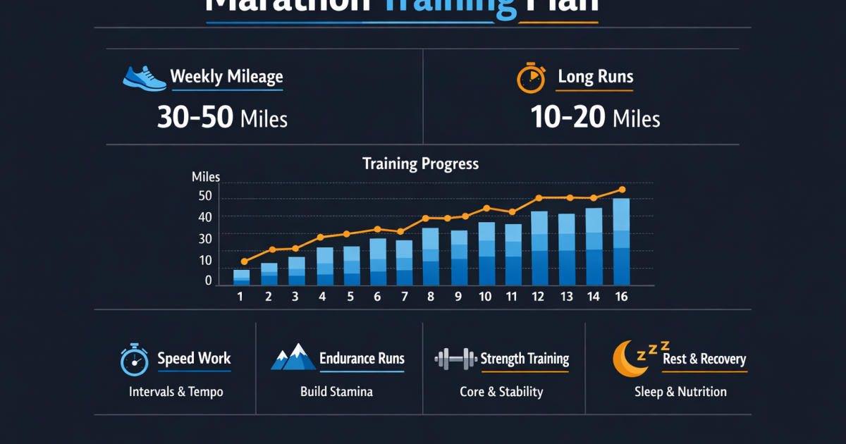
This is the cleanest information layout. It also handles the hardest text block structure in the batch.
Quick take
| Prompt | What worked | What slipped |
|---|---|---|
| Night Circuit poster | Best overall hierarchy and strongest title legibility | Very little |
| Espresso ad | Premium product framing and clean lighting | Thin callout text |
| Lisbon postcard | Strong grid and calm editorial feel | Small details soften |
| Cookbook cover | Simple, readable, and well balanced | Less visual drama than the poster |
| Marathon infographic | Best structure for dense information | Less cinematic than the poster |
Bottom line
GPT Image 1.5 handles clean layouts best when the prompt asks for one clear focal point and a strict grid. It is a strong fit for posters, ads, covers, and structured infographics.
Try GPT Image 1.5 for posters, product ads, and layout-first image work.