Grok Imagine Image text posters were tested with eight prompts designed to expose the difference between a convincing poster and a usable one. The useful cases need a clear headline, intentional whitespace, a subject that supports the copy, and small text that does not collapse into decoration. The set moves from a simple product poster to a dense airport board so the failure modes stay visible.
What the Grok Imagine Image poster test checked
Each prompt asks for text as part of a designed image, not as an afterthought. The first seven cases test hierarchy: one large title, a visible product or setting, then a small amount of supporting copy. The airport board is deliberately different. It asks for many aligned rows, repeated labels, and values that need to remain readable at once.
The original test used one text-to-image output for each prompt at a 3:4 portrait ratio and 1K resolution. Those choices suit posters and keep the test consistent. The current Grok Imagine Image model page lists text-to-image and image editing, 1K or 2K output, 1 to 10 samples, and a choice of aspect ratios. No source image was used here, so these are generation results rather than edits.
The point was not to certify exact spelling. It was to see how well the model places a short message in an image with a clear visual order. That distinction matters: a poster may look finished at feed size while still requiring manual typesetting before print or production use.
What each output actually shows
1. Streetwear poster: the clean baseline
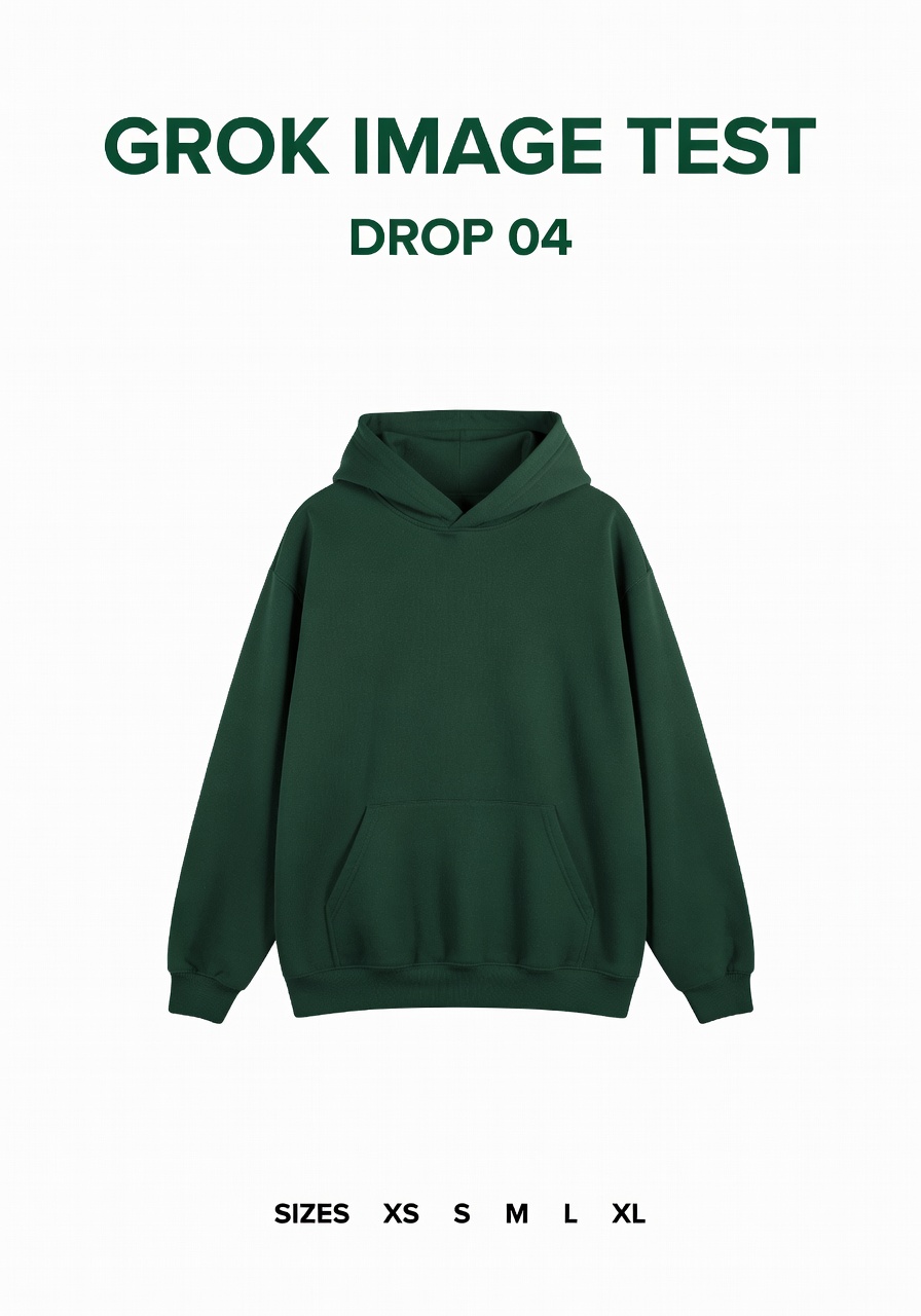
The hoodie owns the center and the requested headline has enough space around it to read as a title. The output demonstrates the easiest version of the task: one product, a short name, and a short secondary line. The size run is a useful stressor because it is small, but it should still be checked before it goes into a real layout.
2. Cafe menu board: readable mood before exact data
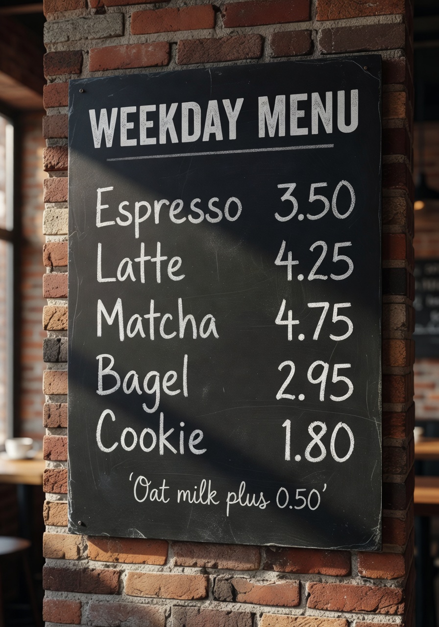
This result reads immediately as a cafe board. The headline, dark surface, chalk treatment, and warm lighting all support the idea. It also shows why menus are a limited use case: viewers may accept an approximate price list in a concept image, but a business cannot treat generated menu copy as verified pricing.
3. Heat pump infographic: labels work when the diagram stays sparse
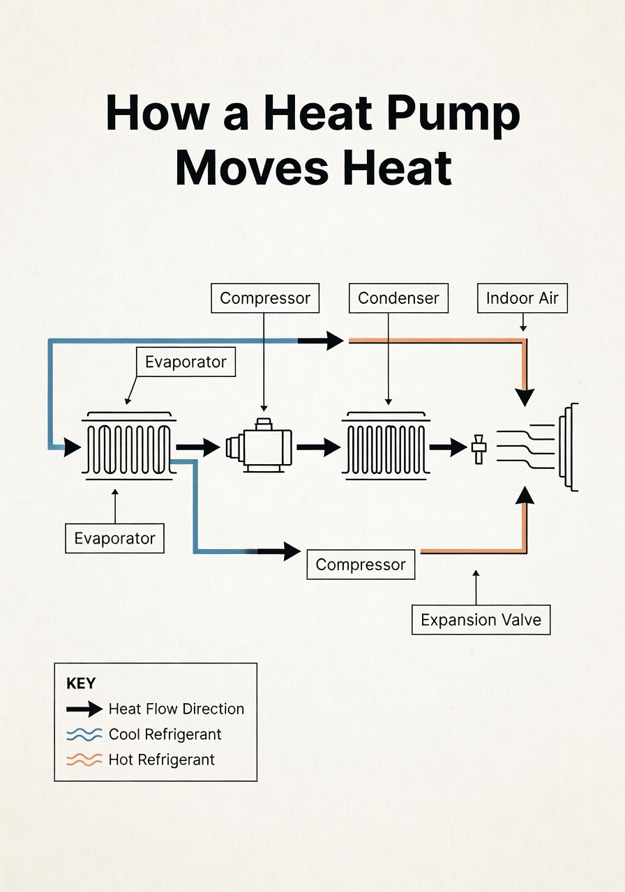
The image successfully signals an explainer graphic: arrows, a limited component set, and a restrained paper-like background. Five labels are a reasonable ceiling for this approach. It is a strong starting point for an article illustration, not a replacement for a technical diagram that must be factually exact.
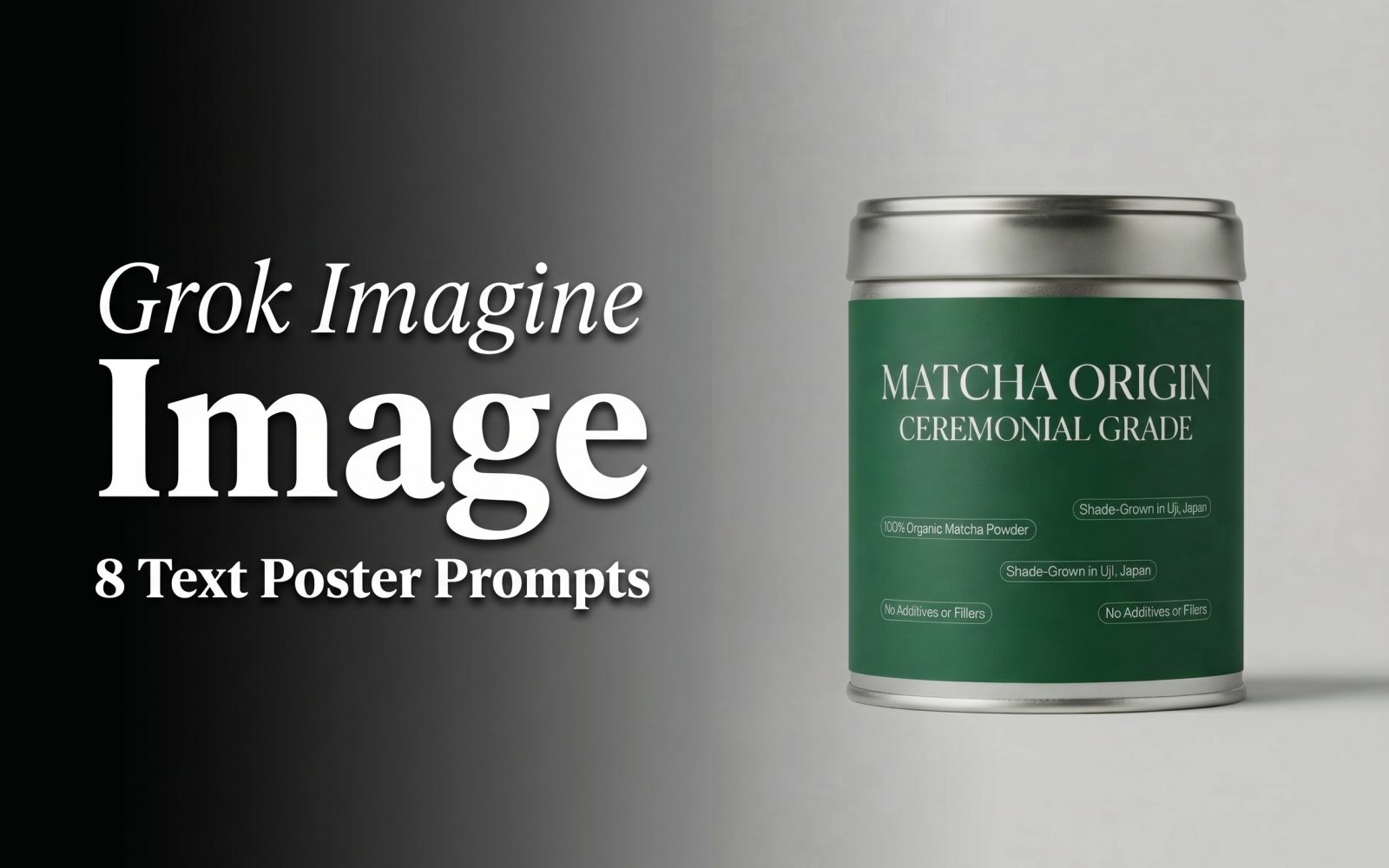
4. Matcha tin packaging: the best fit in the set
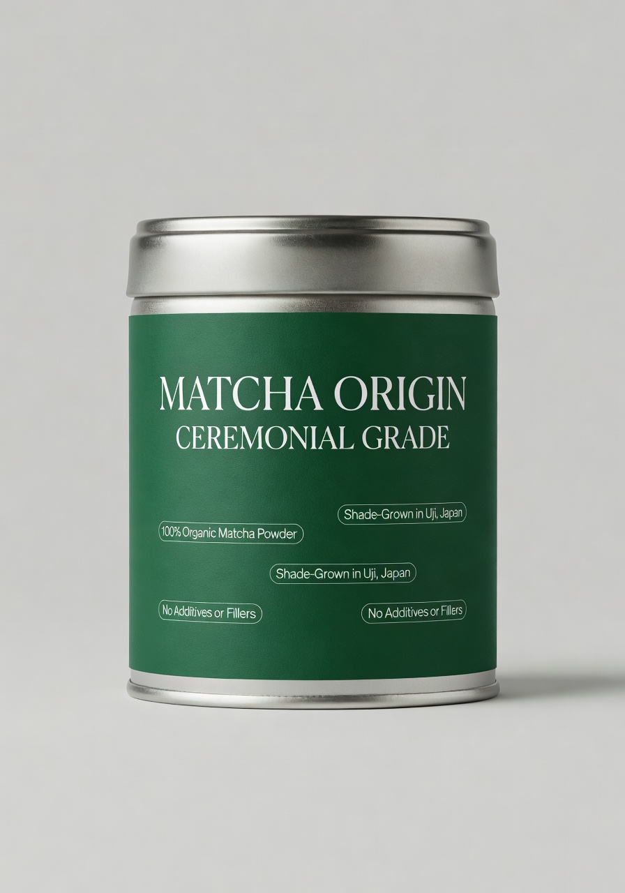
The product format gives the model a clear focal object and a natural place for copy. The emerald label, studio setup, and serif direction make the result feel like a packaging concept rather than a generic tea image. Use this mode for mood boards, retail concepts, and pitch visuals. Rebuild the final label in a design tool if it carries legal, ingredient, or brand information.
5. Synthwave flyer: strong hierarchy beats dense event details
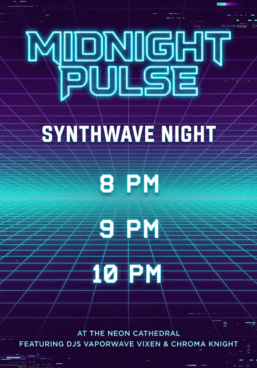
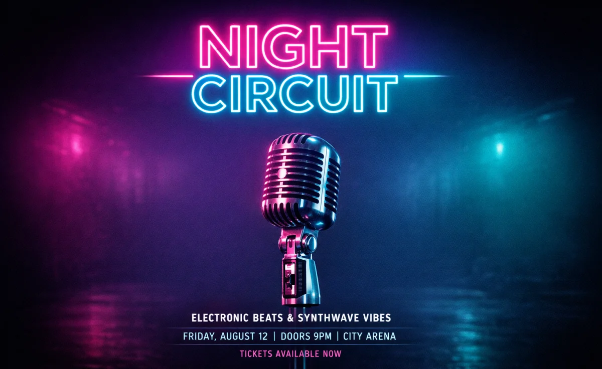
The title and neon grid carry this output. High contrast and a single event name give the model room to establish a clear first read. The three times add pressure without turning the image into a timetable. It is a good choice for social promotion concepts where the final logistics can be overlaid afterward.
6. Focus Timer screen: believable interface, risky microcopy
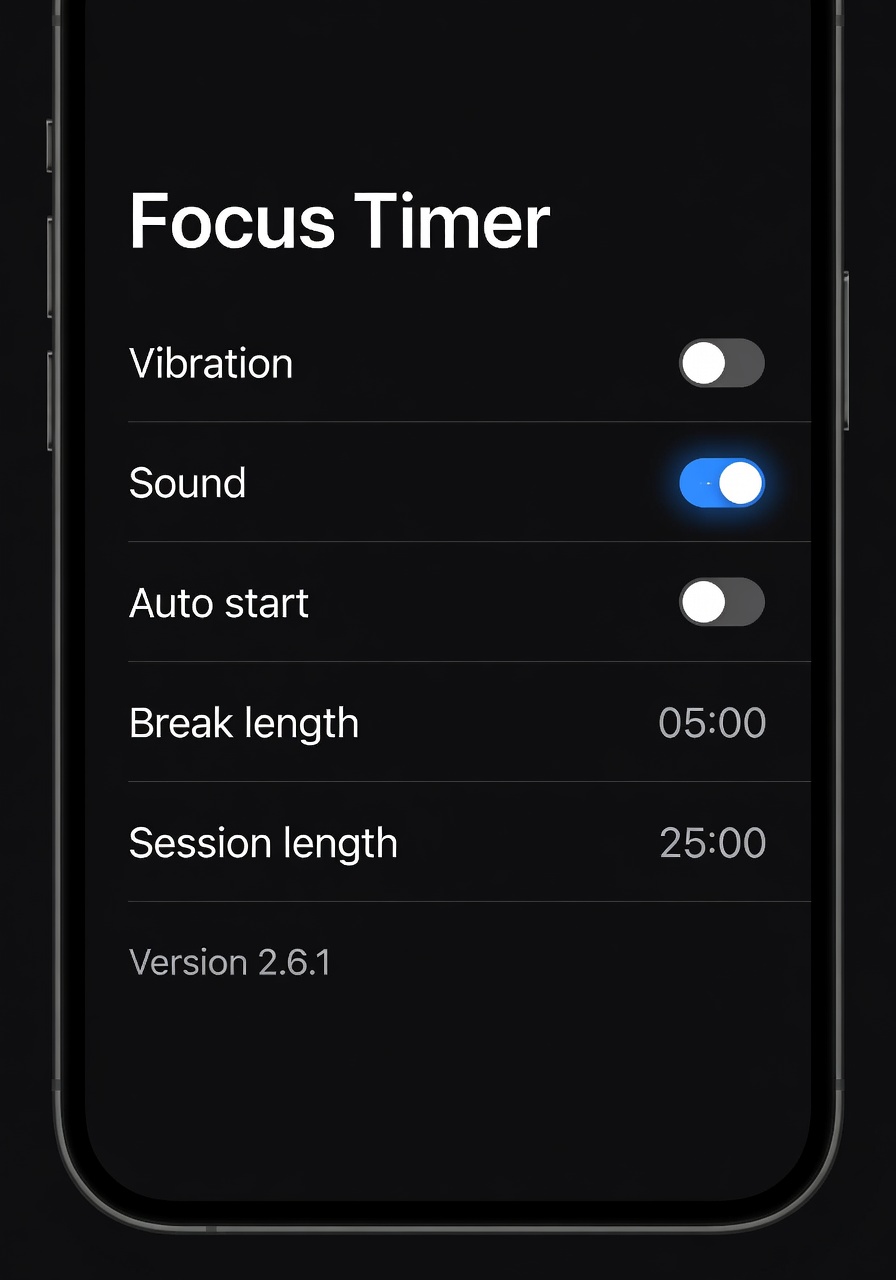
The screen has the visual grammar of a mobile settings view: rows, toggles, contrast, and grouped controls. That does not make it production UI. Small labels, values, and version strings are the part most likely to drift. Pick this approach for a product mood image or an early storyboard, then move the approved structure into Figma or code.
7. Bakery magazine ad: a friendly editorial use case
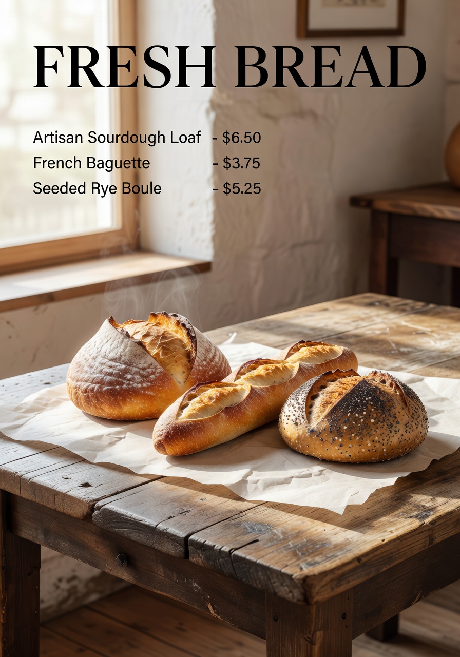
This output benefits from a simple editorial brief. Bread, warm light, paper texture, and one headline point in the same direction. The short price list is more manageable than a full menu, but it still needs human verification. It is best used as an art-direction reference or a quick campaign concept.
8. Airport departures board: the deliberate breaking point
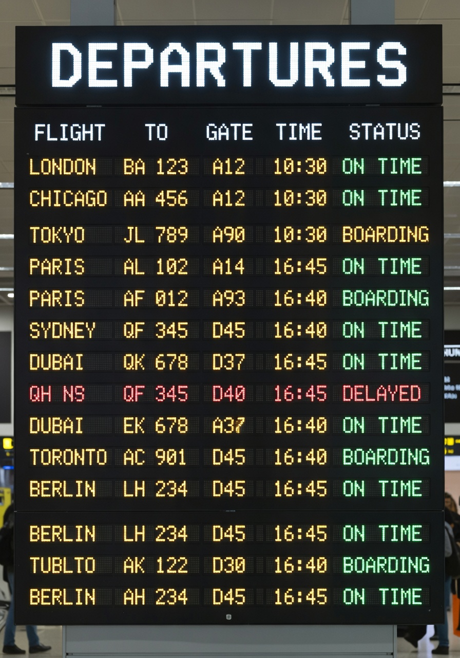
This is the hard case because it combines many rows, columns, repeated values, and alignment rules. The result communicates an airport board at a glance, but that is not the same as producing dependable tabular information. It makes the boundary plain: use the model for atmosphere and a believable scene, not for schedules, dashboards, or data that someone must read accurately.
Parameters, time, and cost
The recorded parameters for all eight original outputs are 3:4, 1K, and one sample. The original publication did not retain individual Wiro task records, so an exact elapsed time and charge cannot be assigned honestly to any of these eight images. The Wiro documentation confirms that the model supports 1K and 2K output plus 1 to 10 samples, but it does not publish a fixed run time or fixed cost for this specific test configuration.
For a useful directional comparison, a separate Grok Imagine Image vs GPT Image 1.5 test recorded about 10 seconds per Grok image across five runs. That figure is not a promise for these outputs: queue state, resolution, sample count, and the service configuration can change the result. The best way to budget a live job is to run one representative prompt with the intended resolution and sample count, then use that task record rather than extrapolating from a poster test.
xAI’s Imagine documentation describes image generation and editing and notes fixed per-image billing for image generation. It does not supply a Wiro price for these archived outputs, so none is claimed here.
When to pick Grok Imagine Image
Pick Grok Imagine Image when the image needs a strong visual premise plus a short headline: product concepts, event flyers, magazine-style ads, packaging explorations, and social poster directions all match this test. Choose 3:4 when the design will live as a portrait post or print-like composition. Move to 2K when the extra detail is worth the added wait and cost shown by a real task record.
Choose a conventional layout tool when the work depends on exact spelling, price lists, dense tables, accessible UI labels, or regulated package copy. For a direct comparison with a more literal layout-oriented option, see the GPT Image 1.5 clean layouts test. For image editing rather than a blank-canvas poster, see the Grok Imagine Image text and edit tests.
Open Grok Imagine Image on Wiro and start with one large text element, one clear subject, and no more supporting copy than the composition needs.