OpenAI GPT Image 2 was tested here with six practical image tasks: product photography, a rainy night street, two text-rendering scenes, macro detail, and one image edit. The aim was not to find the prettiest output. It was to see whether the model could hold onto the important constraints that make an image useful: material cues, readable words, camera language, small natural details, and a source image’s structure during an edit.
GPT Image 2 test setup
All six outputs used openai/gpt-image-2 on Wiro. The five generation prompts and the edit were run as one sample each at 2K, portrait 2:3, Medium quality, PNG output, opaque background, and Low moderation. At that setting, a portrait output targets 1600 x 2400 pixels according to the model documentation. The edit used one supplied tower photograph as its input; no mask was supplied. That matters: the model had to infer which parts of the scene should remain fixed from the text instruction alone.
| Model | OpenAI GPT Image 2 |
|---|---|
| Generation settings | 2K, 2:3 portrait, Medium quality, PNG, 1 sample |
| Edit settings | Same output settings; one source image; no mask |
| Test emphasis | Photorealism, constrained text, micro-detail, and structure-preserving edits |
| Cover model | Google Nano Banana Pro |
The model accepts image inputs for edits, optional masks for more tightly bounded changes, and output tiers up to 4K. This test deliberately stayed at 2K because it makes the results large enough to inspect while keeping every prompt on the same footing. For background on the underlying image-generation approach and its known limitations, see OpenAI’s official image generation announcement.
What the six GPT Image 2 outputs actually show
1. Product photo realism
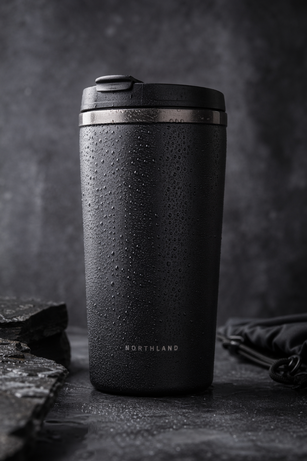
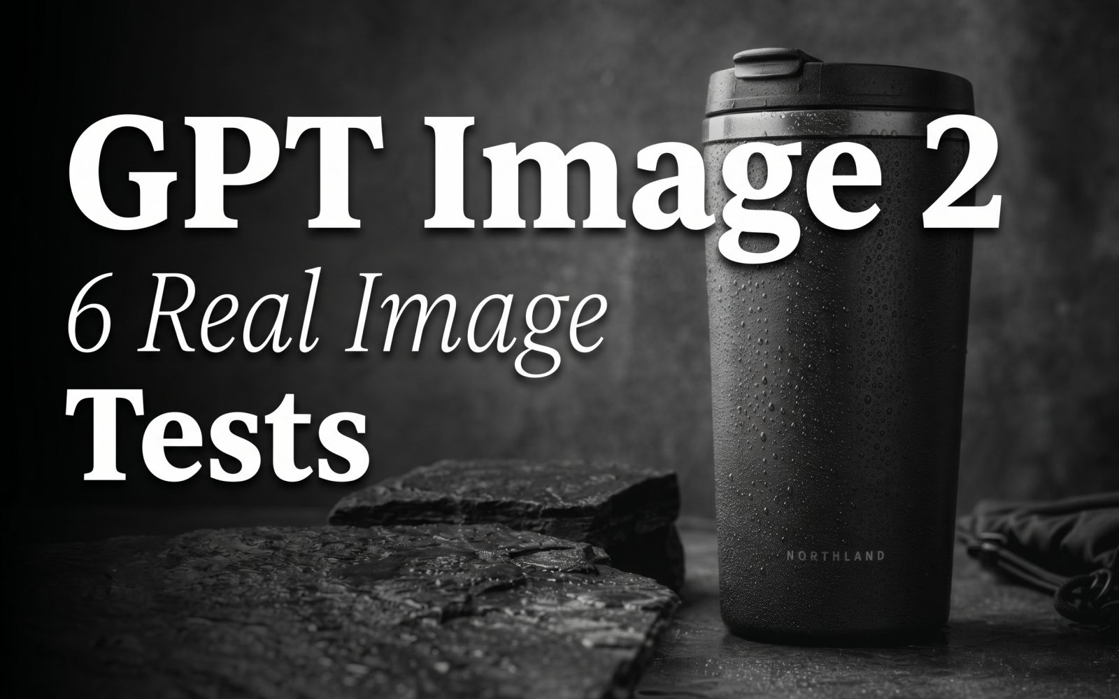
This output is a useful stress test for ordinary commercial imagery. The mug reads as dark coated metal rather than flat black plastic, while the left key light and rim light separate it from the slate. Condensation creates a believable surface cue without taking over the composition. The shallow focus also looks intentional. It is a good fit for a concept image or a product-shot starting point. It is not a replacement for a verified packshot when exact branding, dimensions, or a real product finish must be preserved.
2. Rain, neon, and a short word
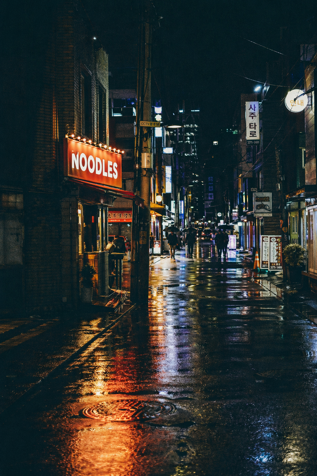
The output handles several competing requests at once: wet pavement, neon spill, distant umbrellas, film grain, and a sign with a specified word. The reflected light gives the image its night-street feeling, while the short all-caps word remains legible. That is the key result. It does not prove that long copy or tiny legal text will work. It shows that a short, high-contrast word placed prominently in the scene is a reasonable use case.
3. Two-line street-sign typography
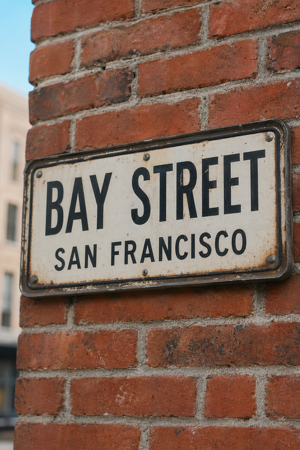
This prompt asks for layout as well as words. The sign needs two distinct lines, convincing embossed metal, a brick setting, and a shallow-focus photo treatment. The result keeps the sign as the visual subject and gives the lettering enough contrast to inspect. For mock signage, editorial illustrations, or a location concept, that balance is useful. For production artwork, the text should still be checked character by character before it goes to print.
4. Macro detail under close inspection
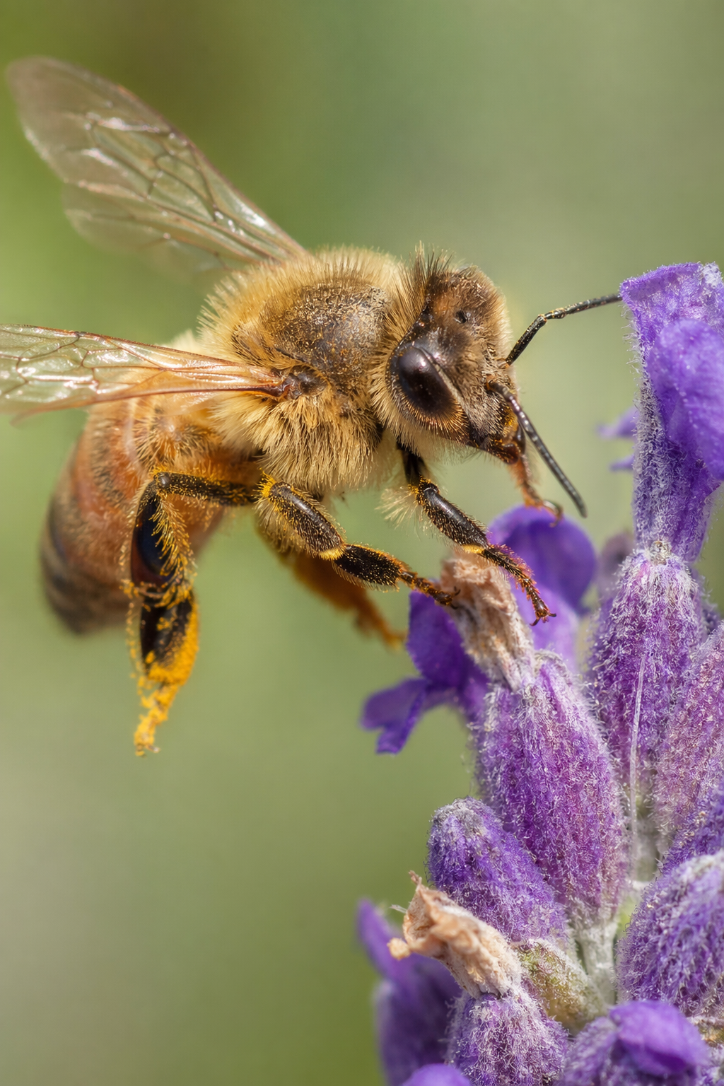
The macro image is the sharpest test of texture. The bee’s fuzzy legs, pollen, wing veins, and eye focus all need to work together, while the background needs to fall away smoothly. The output succeeds most clearly in its subject separation and layered depth of field. It is convincing at normal viewing size. As with any generated wildlife image, it should not be used as scientific reference material: visual plausibility is not evidence of anatomical accuracy.
5. Hand-drawn menu with prices
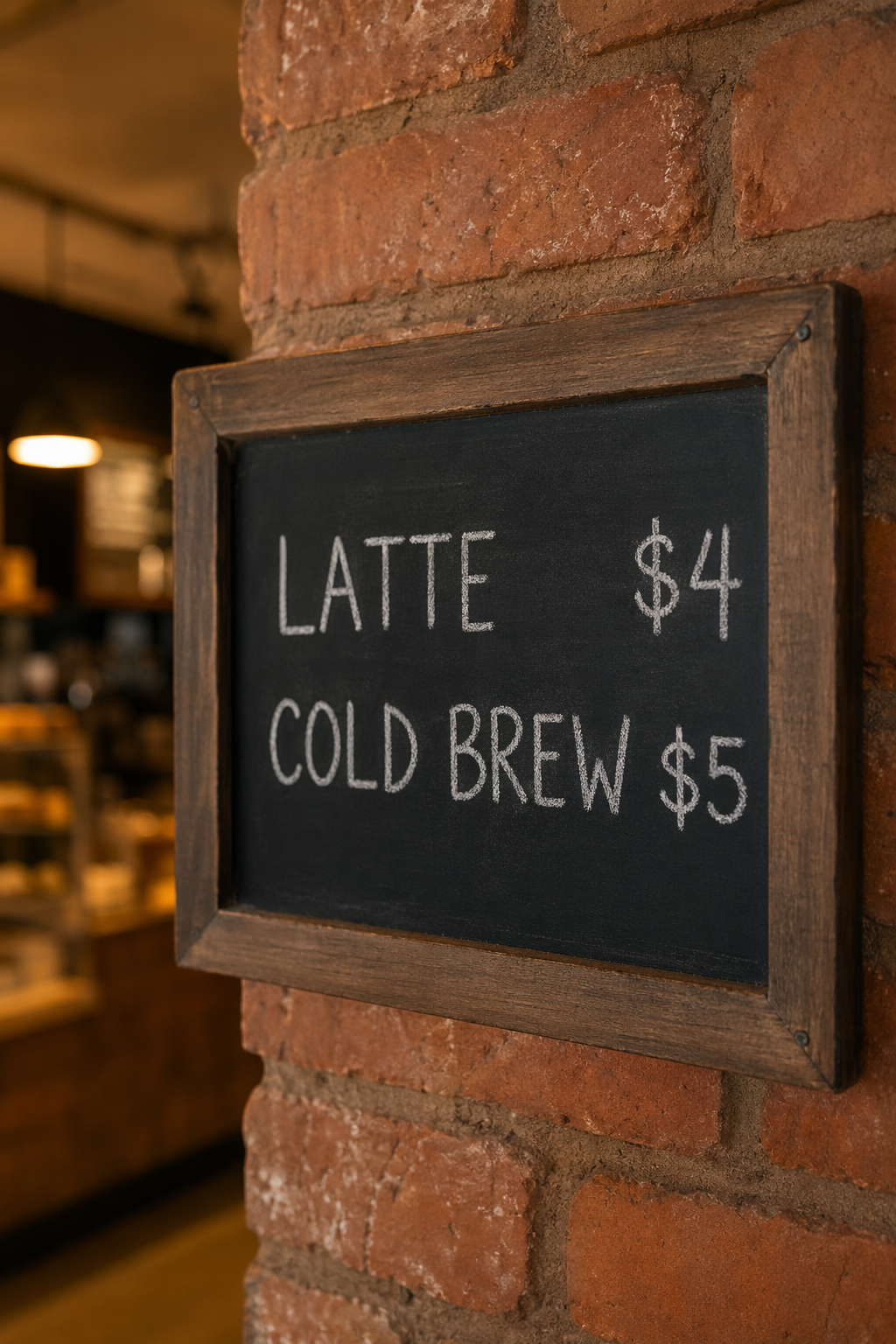
Chalk lettering is a harder typography setting than a clean neon sign because the prompt asks the model to combine irregular strokes with two prices. The output keeps the menu readable and the scene warm without turning the board into a sterile graphic. This is a sensible route for social concepts or menu mood boards. It is not a safe place to generate final pricing, policy language, or other text where one wrong character has a business cost.
6. Weather edit without a mask
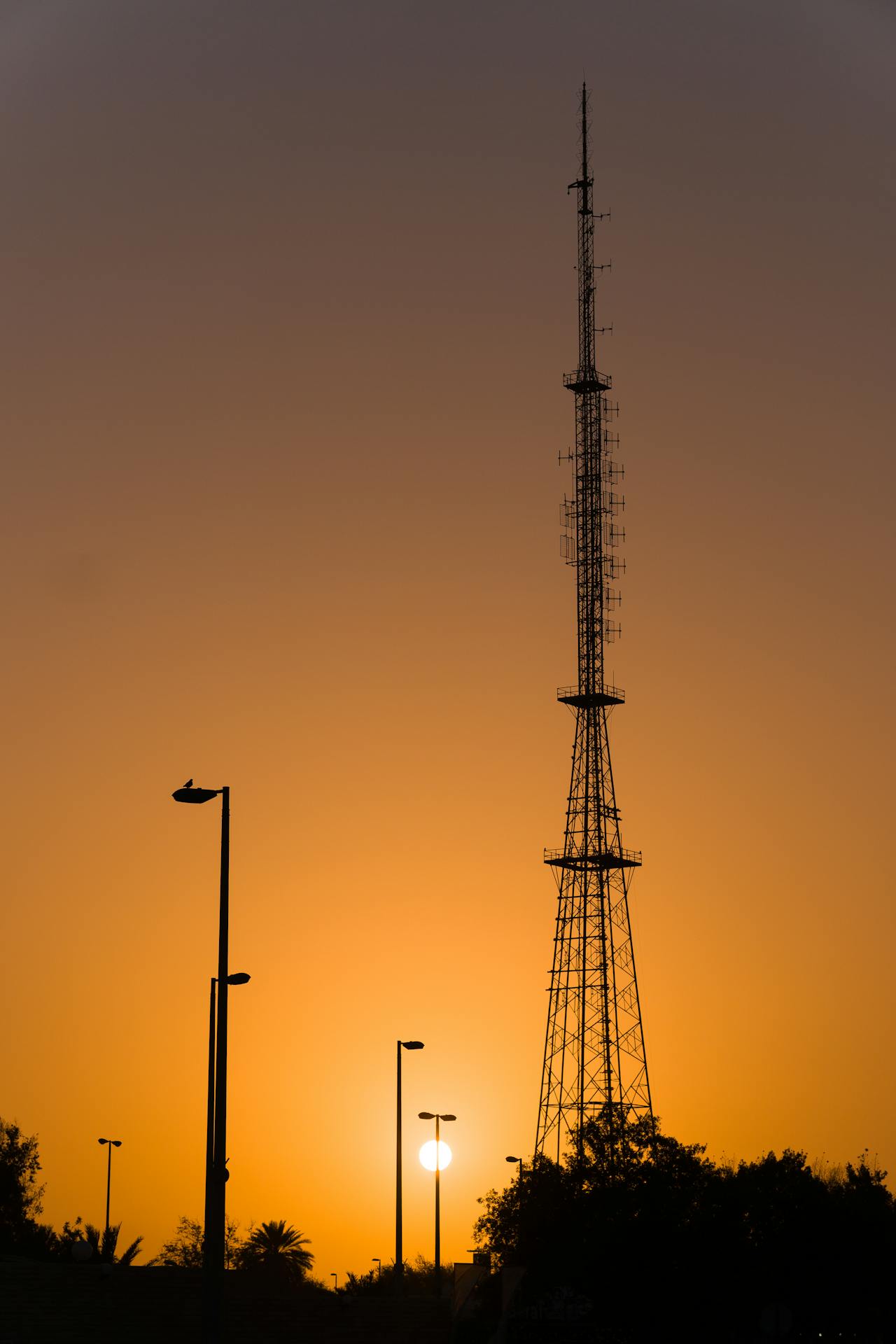
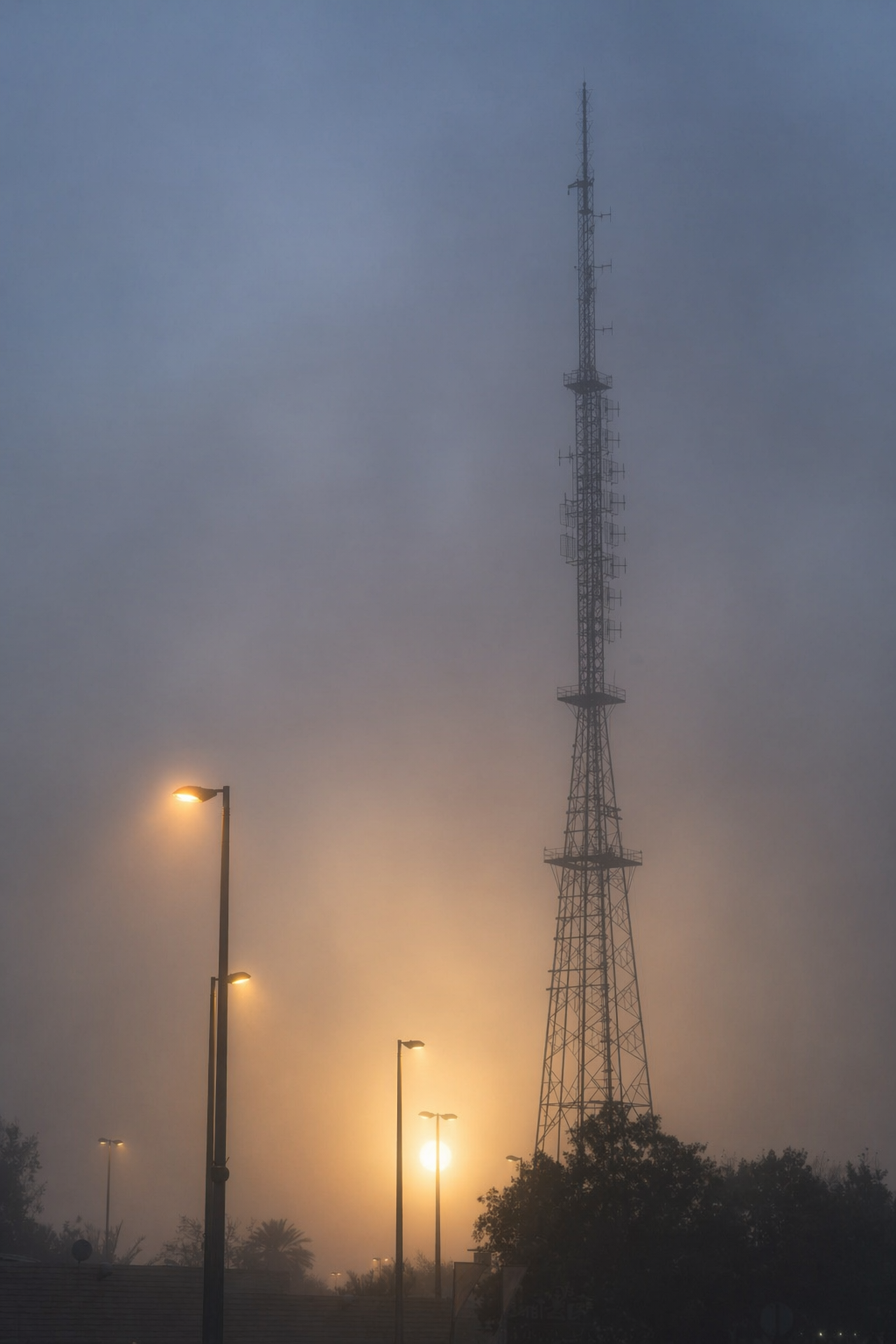
The edit changes weather and time-of-day cues while retaining the tower’s placement and the original camera angle. The fog softens the lattice, the sun disc sits behind the haze, and the street lights gain the expected diffuse glow. The important limitation is equally clear: without a mask, the boundary between protected and editable regions comes from the model’s interpretation of the prompt. Use a mask when a specific logo, face, product edge, or architectural detail must remain untouched.
Run time and cost
No test-specific elapsed time or price was recorded with these six historical runs, and the current model documentation does not publish a fixed per-output price for this 2K Medium configuration. Rather than attach invented averages, this review treats speed and cost as unmeasured for the six outputs. A new run’s task record is the right place to capture those values because queue time, output settings, and account pricing can change. The documentation does confirm that resolution, aspect ratio, quality, format, compression, and sample count are selectable parameters, so those are the controls to keep fixed when comparing a future batch.
When to choose GPT Image 2
Pick GPT Image 2 when the image needs to satisfy several plain-language constraints at once: a product material plus lighting direction, a photo mood plus a short word, or a controlled environment change to an existing image. The results here make it especially suitable for campaign concepts, product-ad explorations, editorial scenes, and early creative direction. For exact compositing, use a mask. For dense typesetting, verify every character or add the final text in a design tool.
Readers comparing text-heavy images can also see GPT Image 2 custom layout tests. For a related benchmark on clean graphic layouts, see GPT Image 1.5: 5 Prompts for Clean Layouts. For an editing-focused comparison, read FireRed Image Edit vs Seedream V5 Lite.
Try OpenAI GPT Image 2 on Wiro with a short, specific prompt first. Then add one constraint at a time. That makes it easier to see whether a result failed on text, composition, material, or the edit itself.