Qwen Image 2.1 review: this new 7B image model was put through five 2K tests covering packaging, portrait work, typography, transparency, and a crowded interior. The strongest result was a quiet olive oil product shot with unusually clean label text. The weakest was supposed to be a transparent asset. It arrived with a solid purple field instead.
That split says a lot. Qwen Image 2.1 produces polished scenes and handles readable display type better than many image models. Its headline RGBA feature needs verification on a real file before it enters a production handoff. The model accepts up to ten references for edits, but these first runs used text only to establish a baseline. It is available on Wiro; the official model card also documents its 2K sizes, editing flow, and research-use license.
In this Qwen Image 2.1 review
- Test method
- Product label and packaging
- Editorial portrait
- Travel infographic typography
- Transparent PNG attempt
- Crowded bookstore cafe
- Verdict
What Qwen Image 2.1 is trying to solve
Qwen Image 2.1 combines text-to-image generation, image editing, and transparent-image output in one 7B model. That is a compact claim for a model that can create at 2K and use a long prompt. It also makes practical sense. A designer should not need one model for a product scene, another for a cutout, and a third for a local edit.
The model card highlights native RGBA output, subject extraction, and multi-reference editing. Those are useful features, but the real question is whether the model follows the brief before the workflow gets complicated. This Qwen Image 2.1 review starts there. The five prompts were deliberately different: one demanded label text, one focused on skin and hands, one tested an information layout, one asked for transparency, and one pushed a busy room.
For a wider look at layout-oriented image tools, see Text-to-Image Models in 2026: Layout Control Gets Easier. The results here are not a benchmark. They are five visible outputs from the same standard setting: 40 steps, guidance scale 1, and a 2K-compatible aspect ratio.
Test method
Each Qwen Image 2.1 review test used one text prompt and one output. No retries were used. That matters because it shows the first result a creator is likely to see. The model was not asked to imitate a named artist or a brand. It was asked to solve ordinary creative jobs with some difficult details: a real label, readable location names, natural fingers, a transparent background, and many people in one scene.
1. Product label and packaging
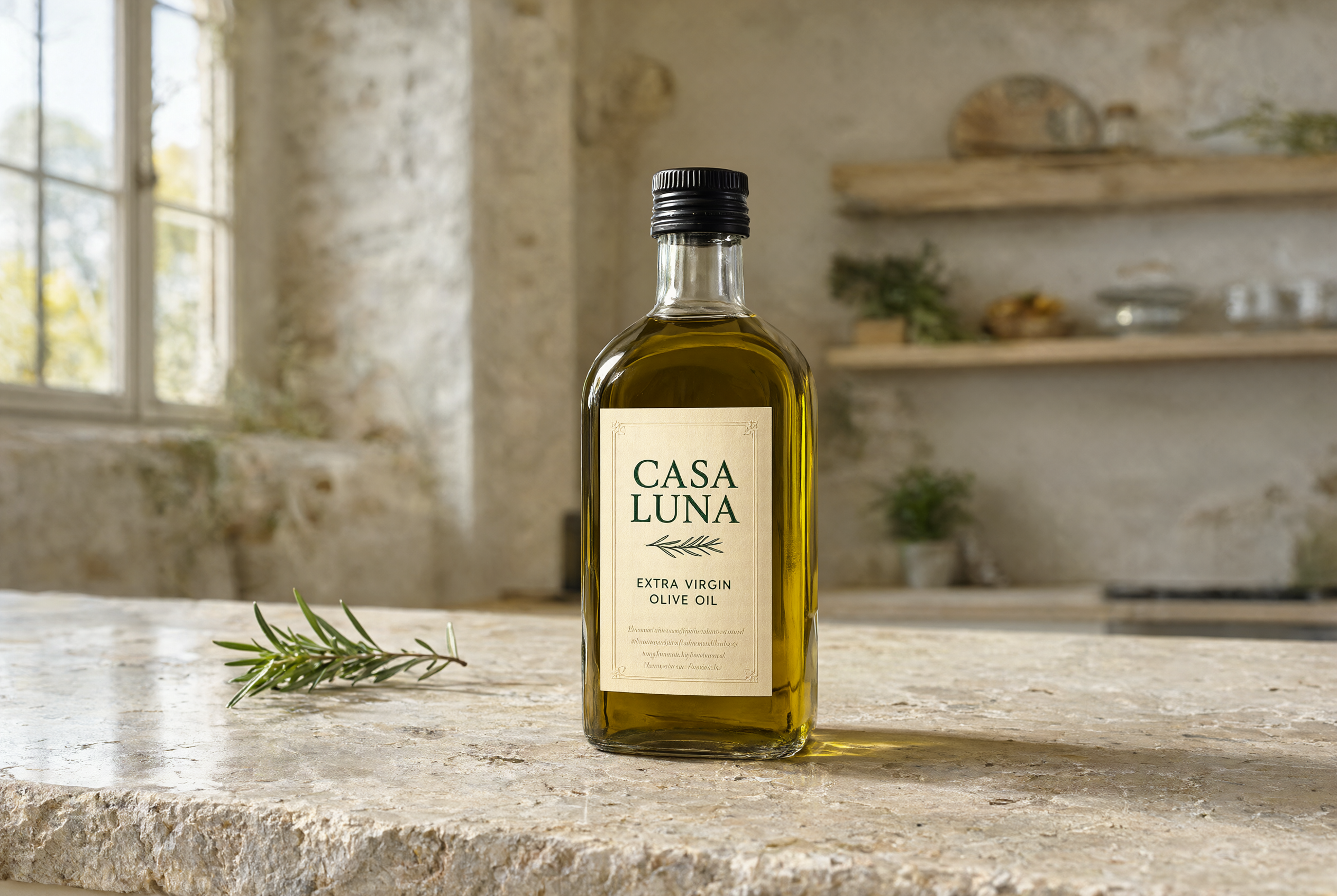
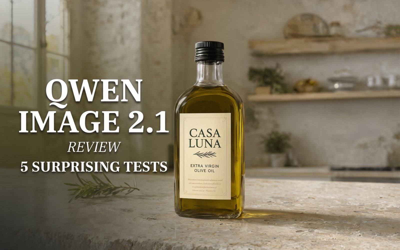
This was the best output in the Qwen Image 2.1 review. The bottle has believable glass thickness, a clear oil color, and a scene that feels like a restrained food campaign rather than a stock render. More importantly, the two requested label lines are legible and correctly spelled. The tiny legal-style text below them is still soft, which is normal at this scale, but it does not turn into distracting noise.
The prompt also asked for an embossed cap and rosemary. Both landed without competing with the bottle. Product teams could use this approach for early art direction or a campaign concept. For final packaging, always check the supplied copy at full size.
2. Editorial portrait and hands
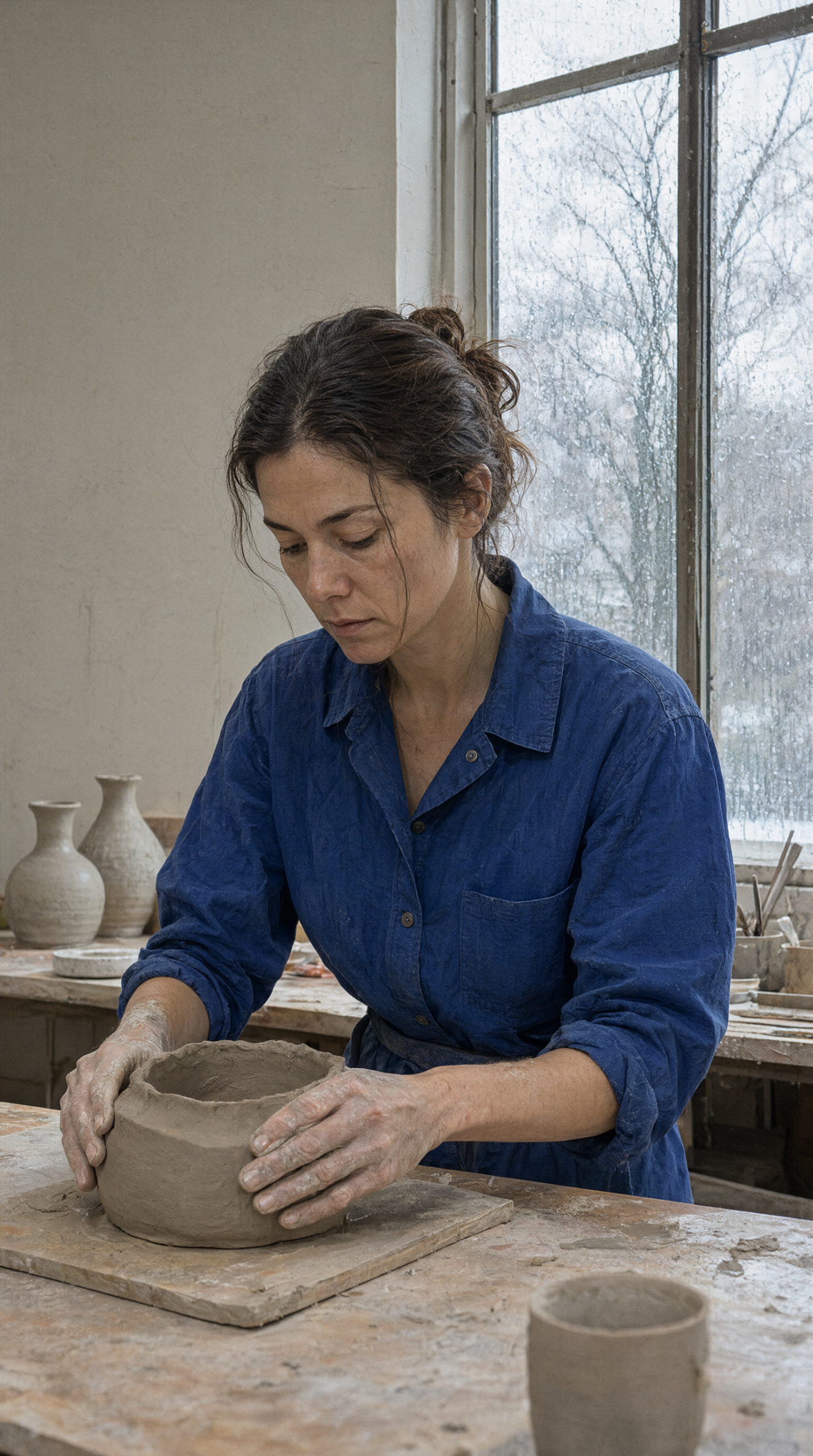
The vertical portrait is calm and convincing. The face has natural texture, the shirt holds its deep blue without crushing detail, and the hands read as hands rather than an obvious failure point. The pottery tools, window rain, and soft light also support the story without becoming a cluttered set.
Qwen Image 2.1 did not create the tall window exactly as described, but it kept the important mood. This is a good result for editorial use where a prompt needs to direct a whole scene, not just place a subject against a clean backdrop.
3. Travel infographic typography
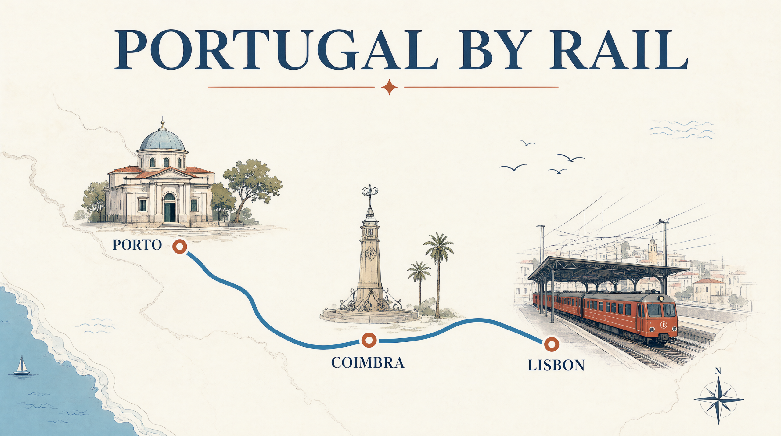
This test aimed at layout control. The result gets the important words right: PORTUGAL BY RAIL, PORTO, COIMBRA, and LISBON. The blue route line makes sense, and the three stops read in the intended order. The model also avoided the common failure where a map becomes a random collage of labels.
There are still limits. The landmark drawings are decorative rather than geographically exact, and a designer would need to correct route data before publishing. Even so, the Qwen Image 2.1 review found this a strong first-pass composition for social graphics, pitch decks, or a travel concept.
4. Transparent PNG attempt
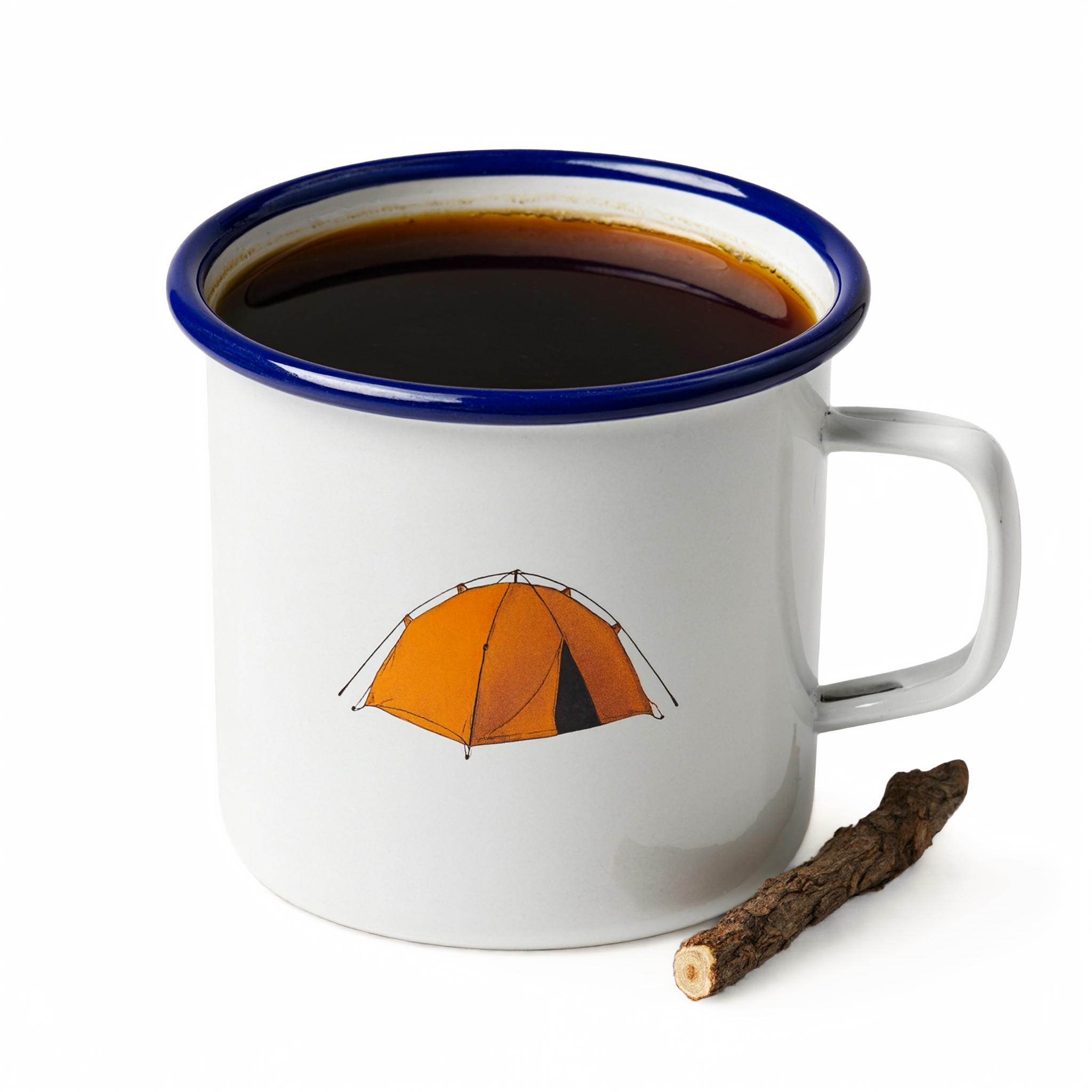
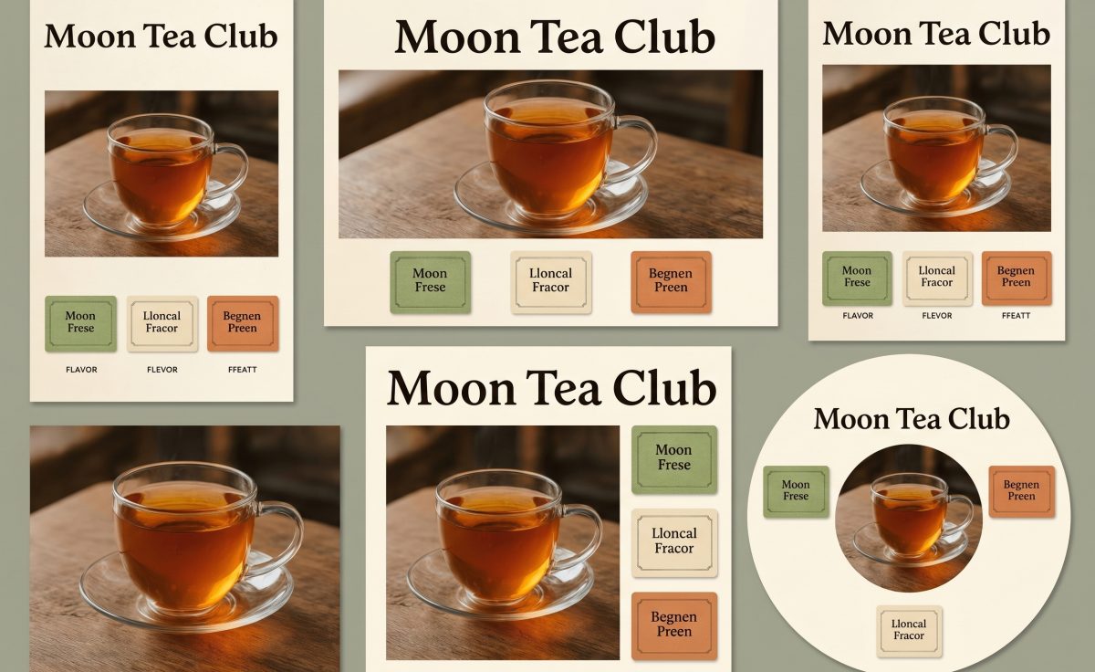
This is where the model missed. The mug itself is clean and the tent illustration is readable, but the requested transparent background did not appear. Instead, the result has a flat purple field and a visible shadow. That makes the image usable as a square social graphic, not as a cutout asset ready for a design system.
The miss does not disprove the native RGBA claim. It does show why a Qwen Image 2.1 review should include a file-level check, not just a visual check. If transparency is non-negotiable, inspect the alpha channel before moving to layout work or rerun with a more explicit output requirement.
5. Crowded bookstore cafe
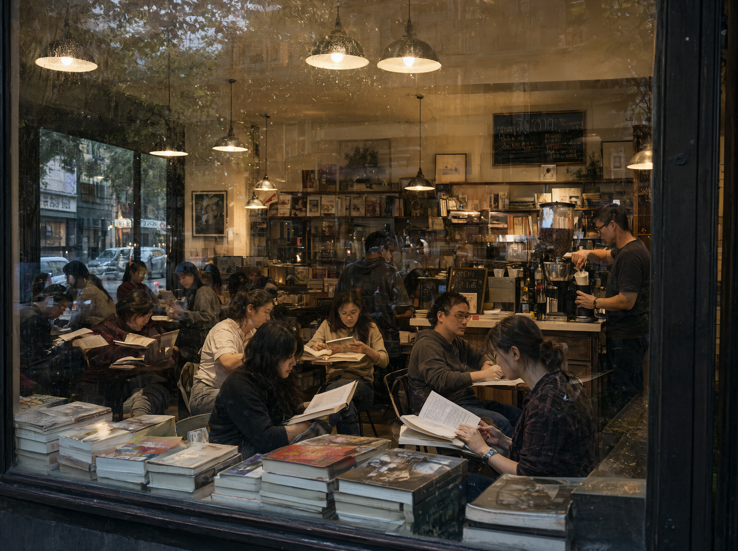
The final Qwen Image 2.1 review test pushed scene density. It produced a believable cafe viewed through wet glass, with readers, shelves, warm pendant lights, and a barista. The people do not look duplicated, and the foreground book stacks help sell the depth. Some small chalkboard writing is not dependable, but it does not break the image.
This is a useful result for a mood-led environment. It is less reliable for a scene where every person, sign, or object must match a production brief. Use it for a starting frame, then edit the parts that matter most.
Verdict: strong scenes, verify the special features
Qwen Image 2.1 earns a place in the image-generation shortlist when the job needs polished photography, readable display text, or a structured illustration. The packaging and travel outputs were the standouts. The portrait and crowded cafe were also solid first attempts with little visible distortion.
The transparency miss is the caution. Do not assume a PNG is transparent because the prompt says RGBA. Check it. The model also ships under a research-oriented license, so teams should confirm usage rights before any commercial rollout. For prompt-driven visual concepts, though, Qwen Image 2.1 is worth testing on the jobs that usually expose weak text and weak composition.
Run the same five prompt styles on Qwen Image 2.1 on Wiro and judge the outputs against the deliverable, not the marketing claim.