Text-to-image models in 2026 feel less like novelty toys and more like layout tools. This draft now uses four prompt tests across the same three models, so the comparison is easier to trust. Each row keeps the prompt fixed and puts the outputs into a horizontal 3-cell grid.
The short version: the gap is narrower than it was last year. The best runs now hold a frame together instead of just painting a scene. Tiny text is still fragile, but headline blocks, card layouts, and visual spacing are much harder to break.
For a baseline on prompt structure and image controls, the OpenAI image generation guide is still a useful reference point.
What is in this scan
- What changed in text-to-image models in 2026
- Test 1: transit app poster
- Test 2: coffee tasting guide
- Test 3: conference schedule poster
- Test 4: museum exhibition poster
- Bottom line
Text-to-Image Models in 2026: what changed
The biggest shift is not style. It is structure. Newer text-to-image models are better at keeping a page-like composition in order. They are placing headline blocks, side cards, and empty space with more restraint. That matters for blog art, ad mockups, slide covers, and product graphics.
Microsoft Lens is a good example of that shift. It is pitched as a fast, high-resolution model with strong prompt following and multilingual support. GPT Image 2 Custom goes hard on exact sizing and edit control. ERNIE-Image-Turbo stays fast and structured, with a bias toward clean scenes over crowded typography.
That mix points to the trend. The category is moving away from pure image novelty and toward production-friendly composition. A model does not need to nail every micro-letter to be useful. It needs to preserve hierarchy, balance, and spacing when the prompt gets busy.
Test 1: transit app poster
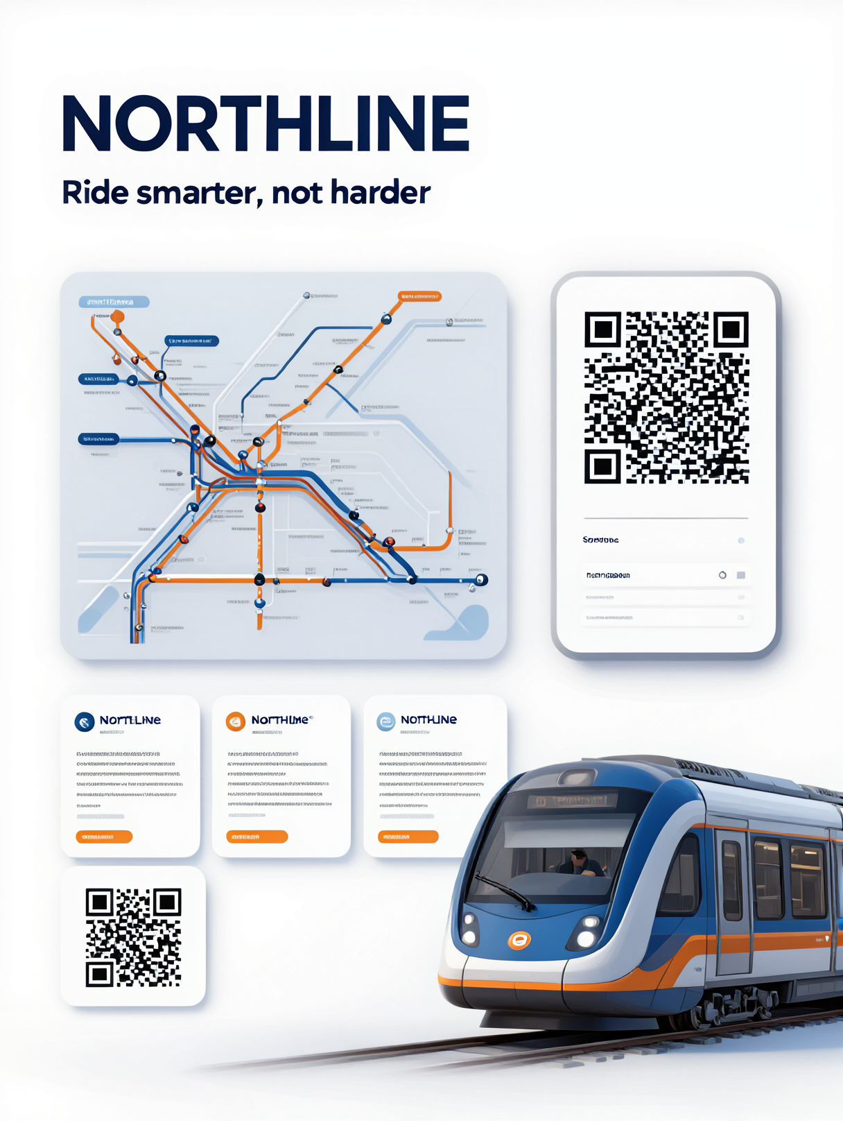
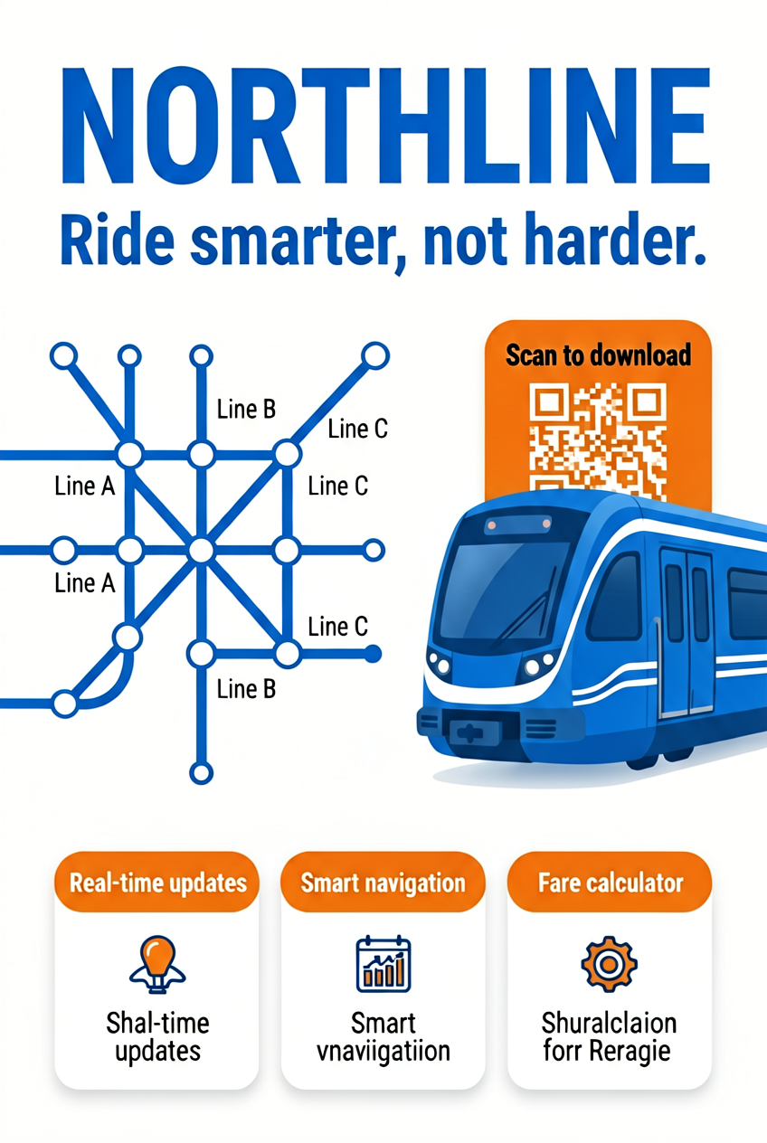
Prompt: Create a clean editorial poster for a fictional transit app called NORTHLINE with a bold headline, a subhead, a simple subway map, three feature cards, and a hero train illustration.
| Microsoft Lens | GPT Image 2 Custom | ERNIE-Image-Turbo |
|---|---|---|
 |
 |
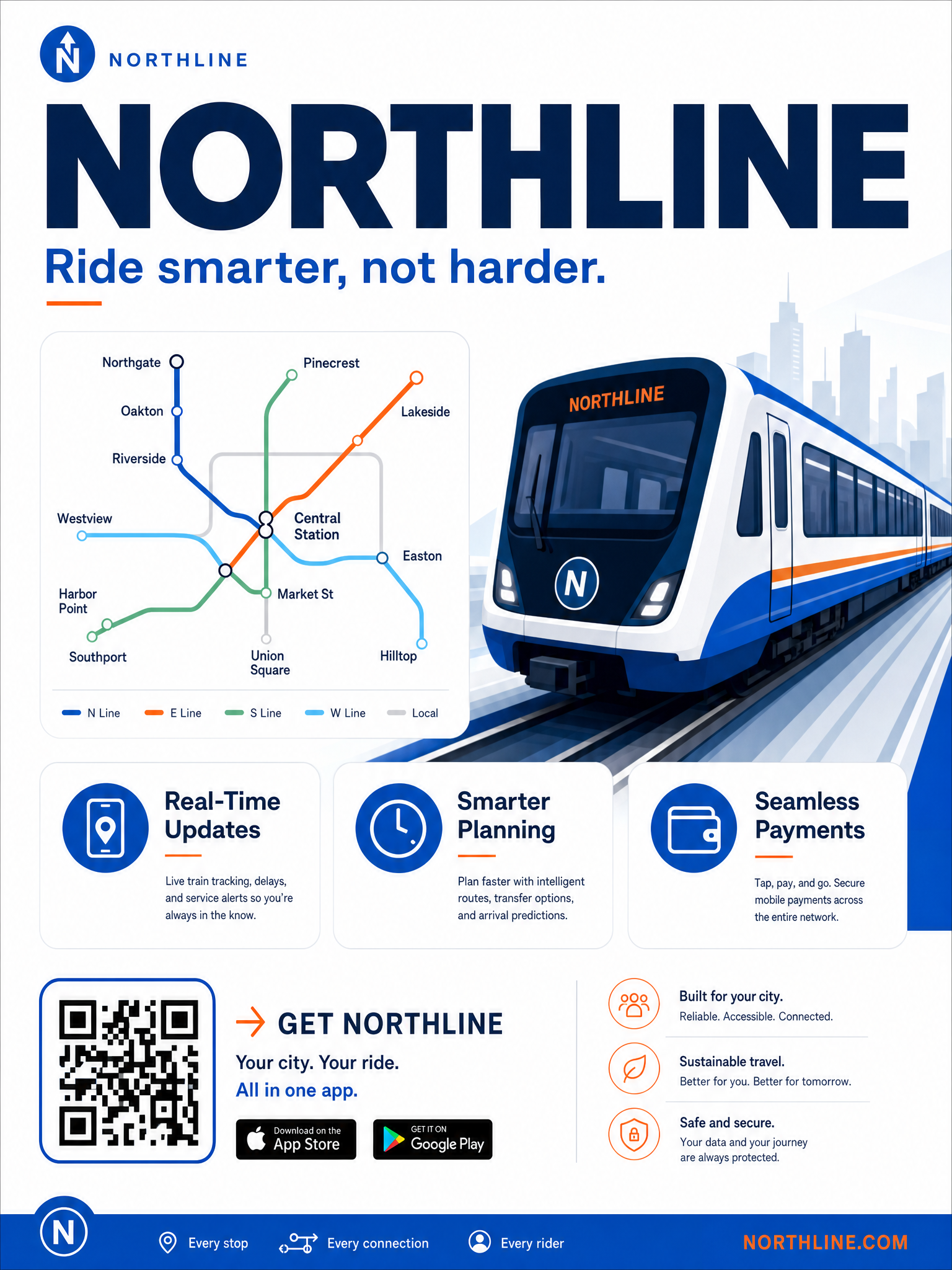 |
This is still the cleanest baseline. All three models understand the idea, but GPT Image 2 Custom looks the most polished, while Lens keeps the strongest poster discipline. ERNIE-Image-Turbo stays readable, though the typography feels softer.
Test 2: coffee tasting guide
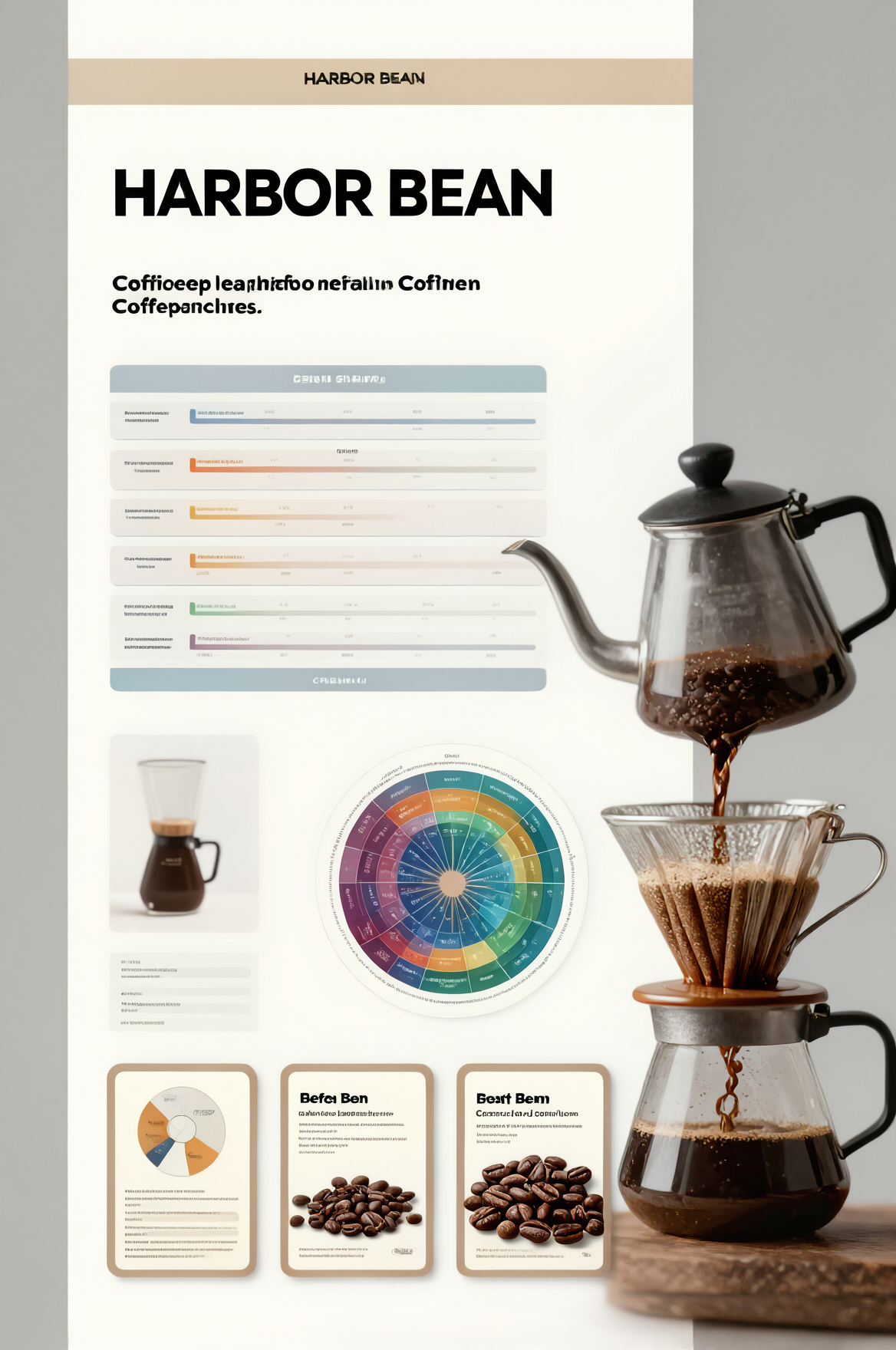
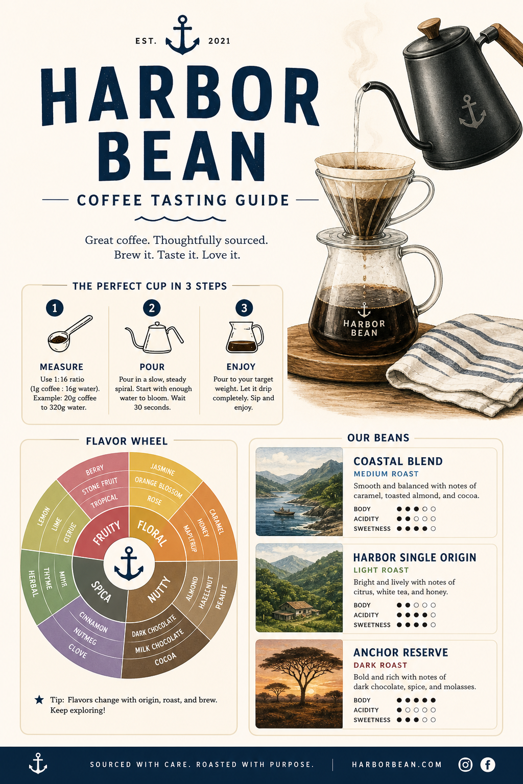
Prompt: Create a clean vertical coffee tasting guide poster for HARBOR BEAN with a bold headline, a short subhead, a three step brew chart, a flavor wheel, three bean cards, and a hero pour over kettle illustration.
| Microsoft Lens | GPT Image 2 Custom | ERNIE-Image-Turbo |
|---|---|---|
 |
 |
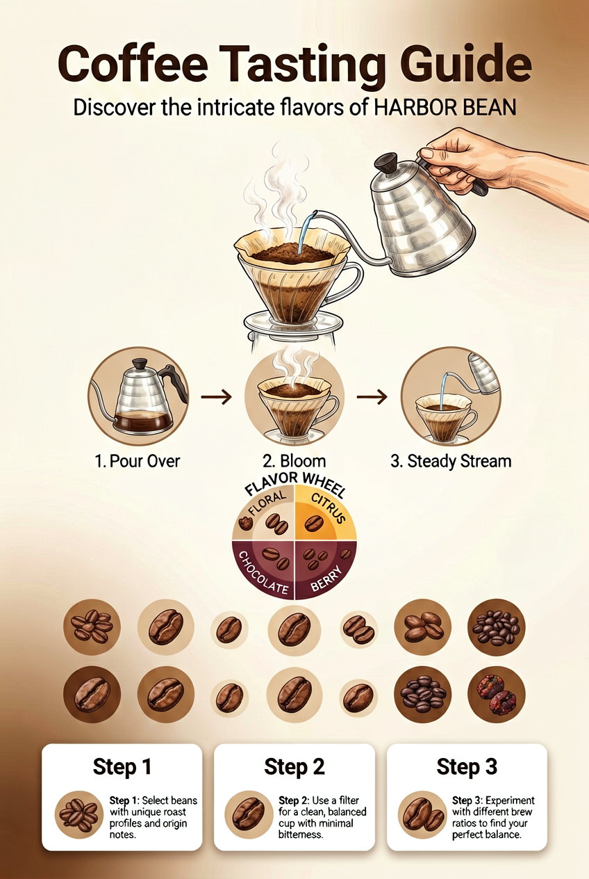 |
This row shows the biggest spread. GPT Image 2 Custom clearly feels most design-led here, with the strongest headline, block spacing, and diagram balance. ERNIE-Image-Turbo keeps the brief intact. Lens lands the general idea, but the copy treatment is looser.
Test 3: conference schedule poster
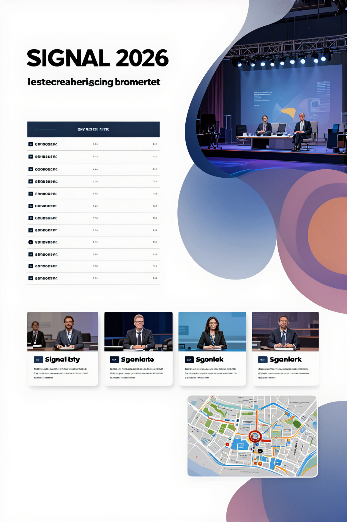
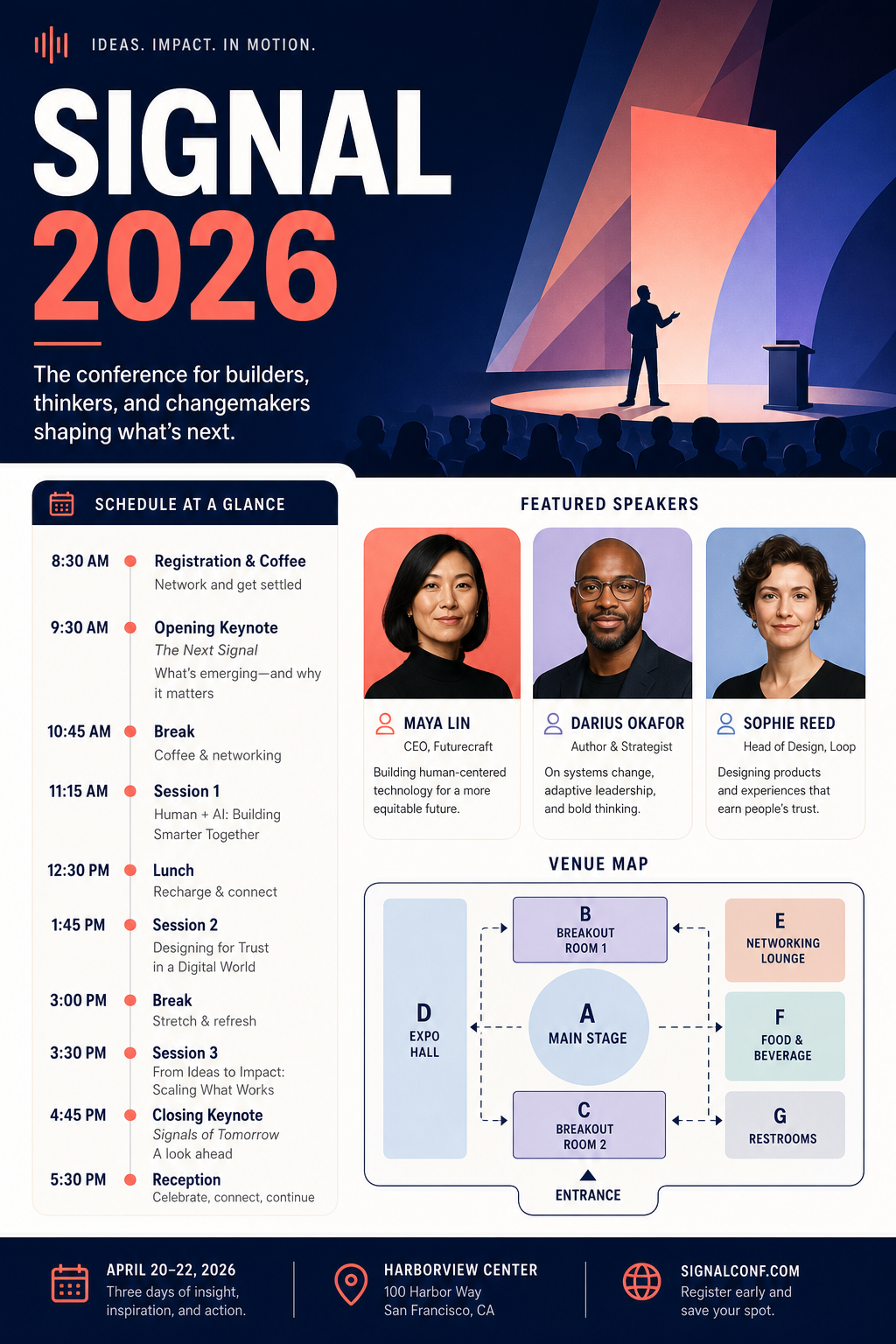
Prompt: Create a clean editorial conference schedule poster for SIGNAL 2026 with a bold headline, a short subhead, a timetable column, three speaker cards, a venue mini map, and a hero abstract stage illustration.
| Microsoft Lens | GPT Image 2 Custom | ERNIE-Image-Turbo |
|---|---|---|
 |
 |
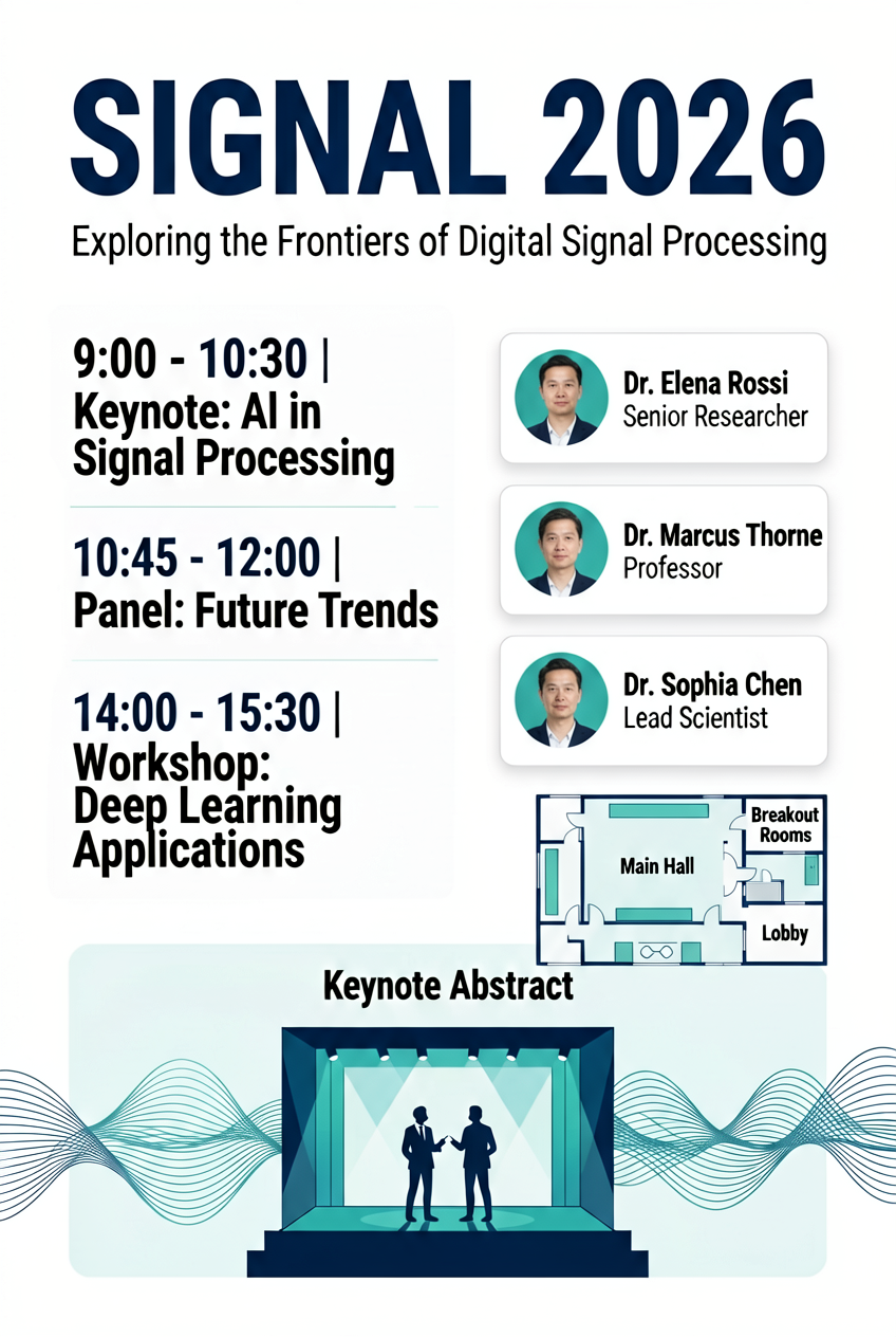 |
The schedule format is a good stress test because it needs both structure and pacing. GPT Image 2 Custom stays the cleanest. Lens keeps the page organized, even if the tiny text is not dependable. ERNIE-Image-Turbo is simpler, but still useful as a quick draft.
Test 4: museum exhibition poster
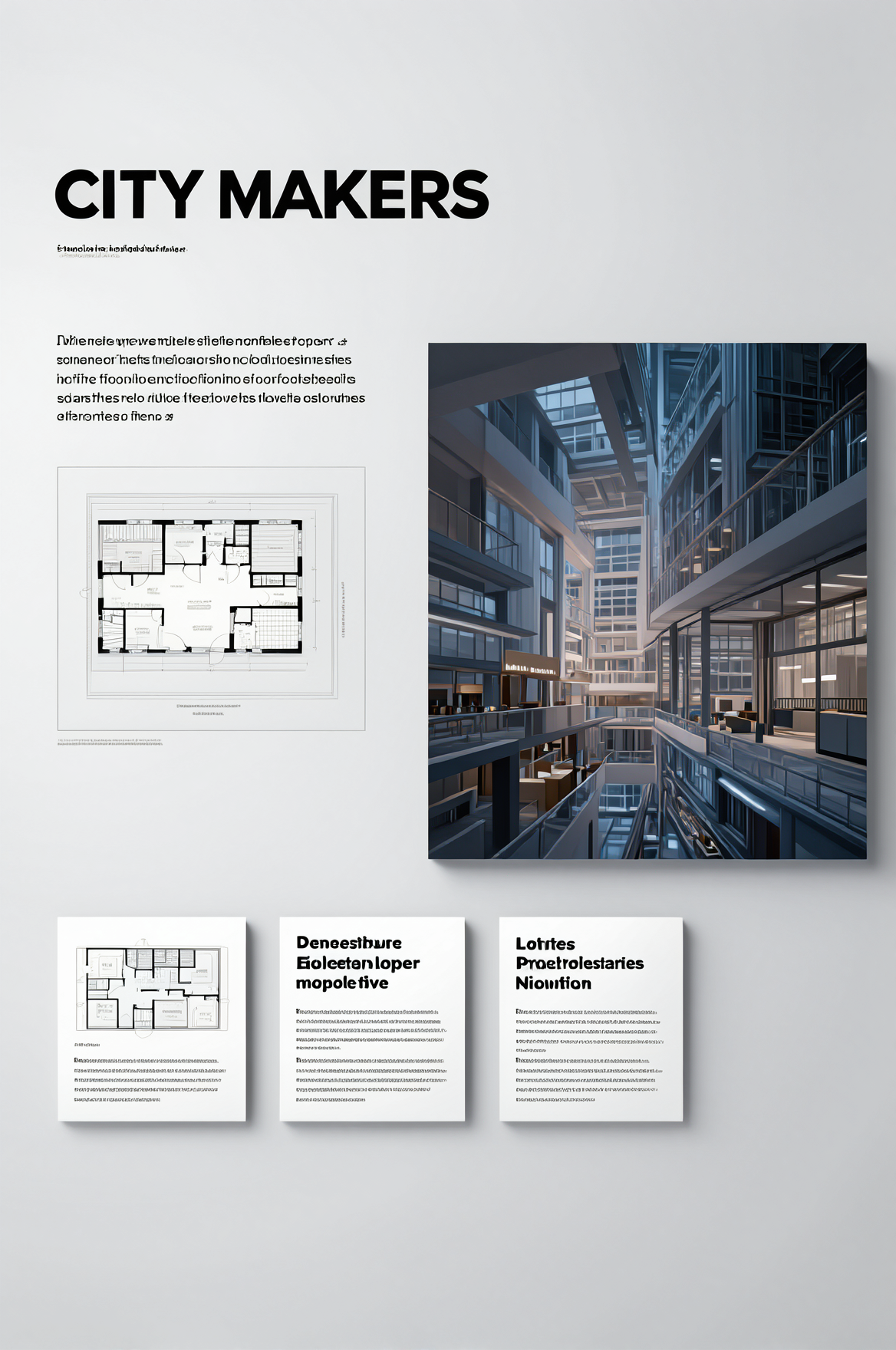
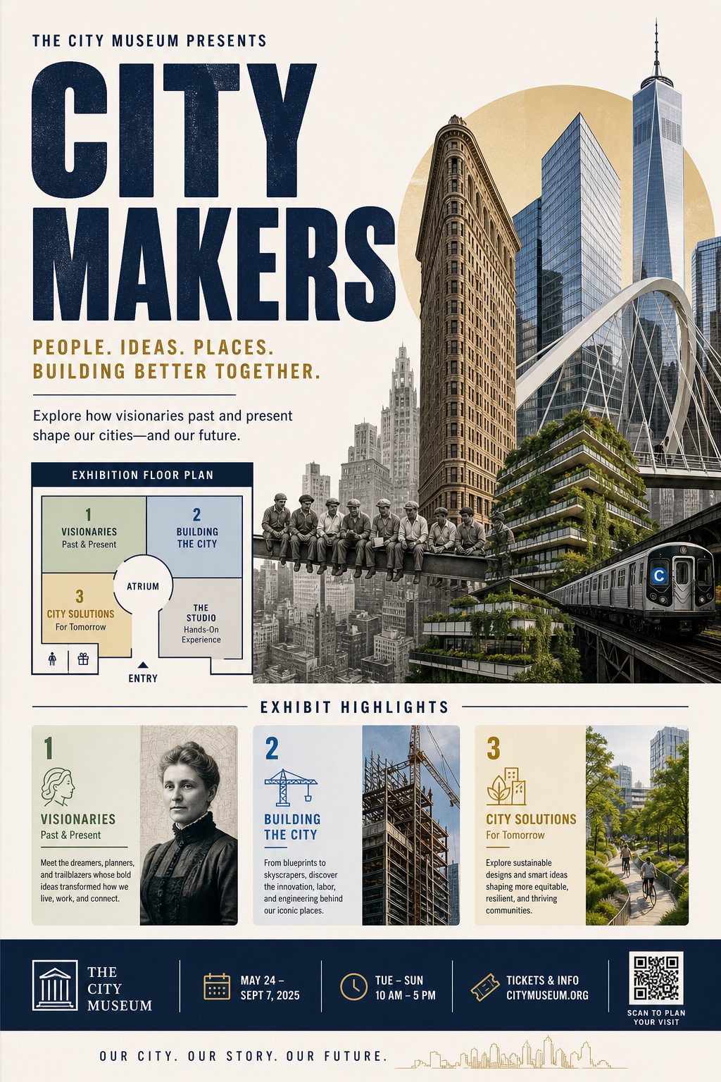
Prompt: Create a clean museum exhibition poster for CITY MAKERS with a bold headline, a short subhead, a floor plan inset, three exhibit highlight cards, and a hero architectural collage.
| Microsoft Lens | GPT Image 2 Custom | ERNIE-Image-Turbo |
|---|---|---|
 |
 |
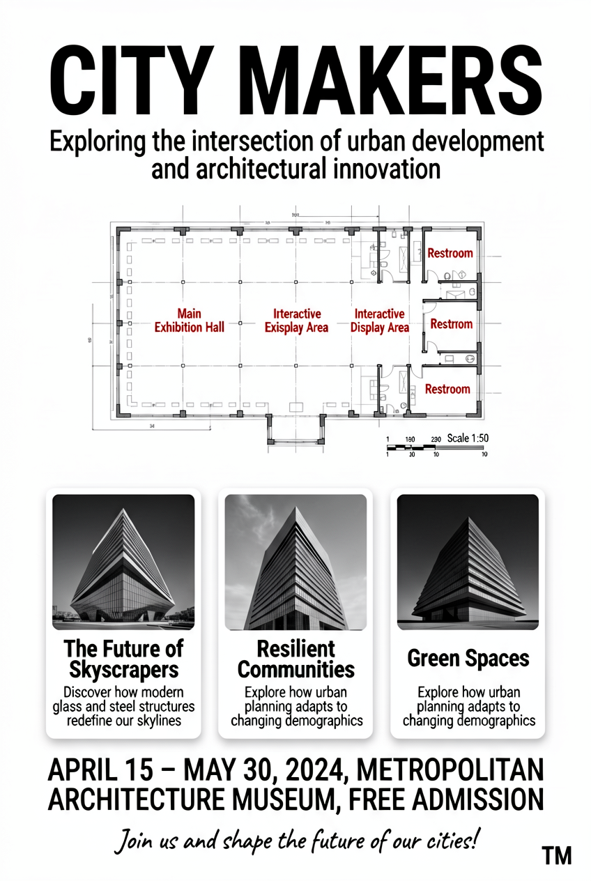 |
This row is more about mood plus structure. GPT Image 2 Custom again looks the most editorial. Lens keeps the architectural framing strong. ERNIE-Image-Turbo preserves the poster idea, but simplifies the collage treatment.
| Model | What looked strongest across 4 rows | What still slips |
|---|---|---|
| Microsoft Lens | Poster discipline, clean framing, orderly page structure | Busy copy blocks can loosen up |
| GPT Image 2 Custom | Most polished composition and best layout control overall | Tiny text still needs human review |
| ERNIE-Image-Turbo | Fast readable drafts with stable overall structure | Typography and dense micro-layouts feel softer |
Bottom line
The category is maturing in a practical way. Across these four same-prompt comparisons, GPT Image 2 Custom looks the most design-minded. Microsoft Lens is close behind when the job is a clean poster frame with good hierarchy. ERNIE-Image-Turbo stays useful for quick structured drafts, even when it is less polished.
The real change in 2026 is not perfect text rendering. It is that layout control is easier to get on the first try. The better test now is simple: run the same prompt, put the outputs side by side, and judge which frame stays usable.
Try the model pages above and run the same brief with your own brand colors, then keep the frame that feels most usable.