Grok Imagine Image text edits get more useful when one prompt has to both restyle a scene and preserve readable poster text.
Grok Imagine Image text edits: what stands out
Model link
xai/grok-imagine-image on Wiro
What Grok Imagine Image does
Grok Imagine Image generates images from text prompts, and it can also edit a single source image using a plain-language instruction. This post runs 6 quick tests that focus on readable typography (labels, posters, neon signs) plus two simple edit workflows (wardrobe + weather, car color + fog).
Test setup
| Text-to-image aspect ratio | 3:2 |
| Resolution | 1K |
| Images per prompt | 1 |
| Wiro run cost used here | $0.02 per image |
| Edit inputs | Single image edit (sample inputs) |
6 prompt tests (with real outputs)
1) Clean product label text
Goal: Check if short, high-contrast label text stays sharp and centered.
Prompt: Studio product photo of a matte white candle jar on a light gray seamless background. Minimal label with the exact text NOVA on the top line and SEA SALT on the second line. Sans serif, centered, sharp letters. Softbox reflections, 85mm lens, high detail.
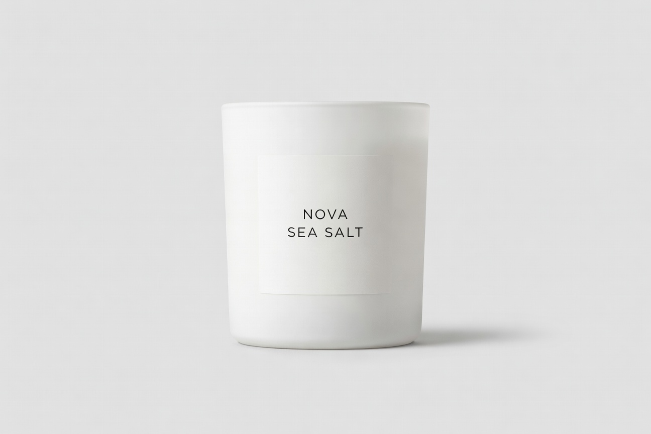
Result: Both lines (NOVA, SEA SALT) appear exactly as requested, with a clean catalog look.
2) Poster layout with two lines of text
Goal: Stress-test a big headline plus a smaller subhead.
Prompt: Minimalist movie poster. Background: deep navy gradient with subtle film grain. Big title text reads GROK IMAGINE. Small tagline below reads FAST IMAGE TESTS. Left aligned, vertically centered, lots of negative space, clean layout.

Result: The headline and subhead both render clearly, and the spacing stays consistent.
3) Neon sign text inside a complex scene
Goal: See if a short sign stays readable inside a cinematic, rainy frame.
Prompt: Cinematic rainy street at night, wet reflections, shallow depth of field. A neon sign on a storefront reads ORBIT DELI in clear block letters. 35mm photo look, high detail, moody lighting.
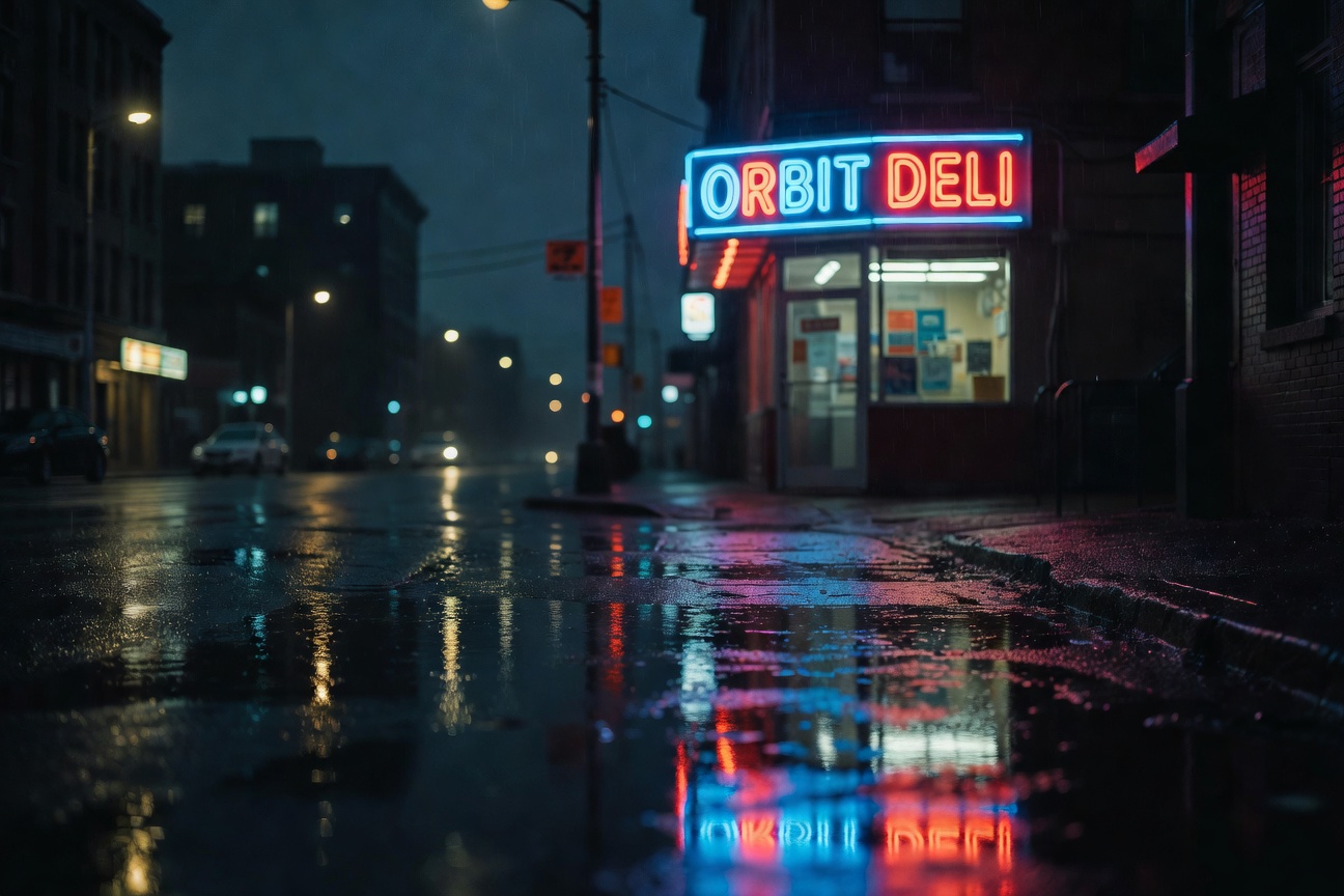
Result: ORBIT DELI appears exactly as requested, with believable neon reflections on wet pavement.
4) Style range check (pixel art)
Goal: Quick style flip without relying on typography.
Prompt: Pixel art scene of a tiny seaside town at night. A lighthouse beam sweeps across the ocean. Small boats in the harbor. 16-bit era style. Crisp edges. Limited palette of navy, cyan, and warm yellow.
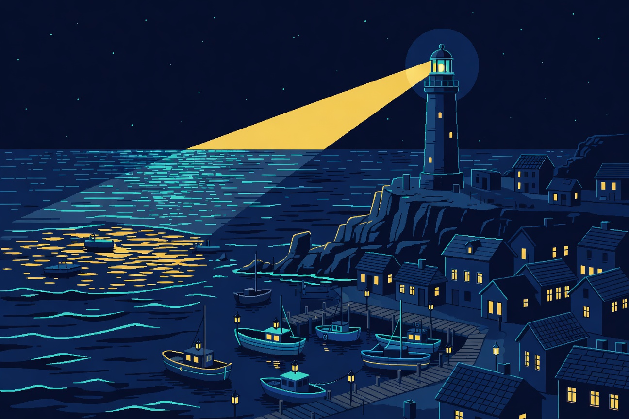
Result: The model switches styles cleanly and keeps the scene readable.
5) Edit: wardrobe + soft snowfall
Goal: Change one clothing attribute and add a gentle weather layer.
Input image:
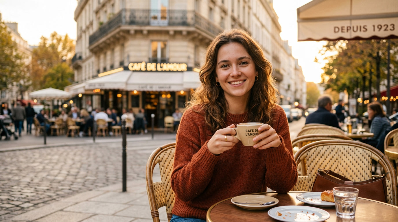
Prompt: Change her sweater color to navy blue and add soft snowfall in the background.
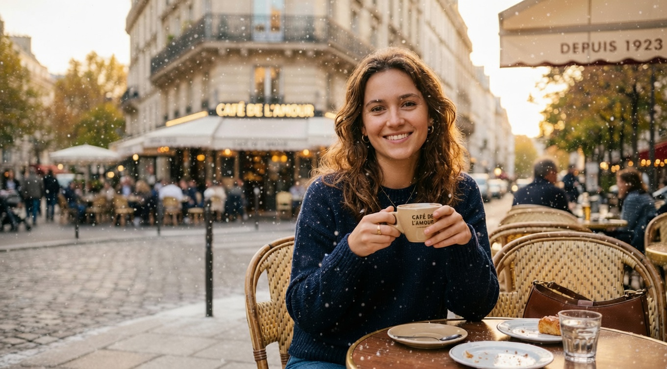
Result: The sweater shifts from warm orange to navy, and a light snowfall layer appears without breaking the portrait.
6) Edit: car color + dramatic fog
Goal: Keep the scene, change the car color, then add a ground-hugging atmosphere effect.
Input image:
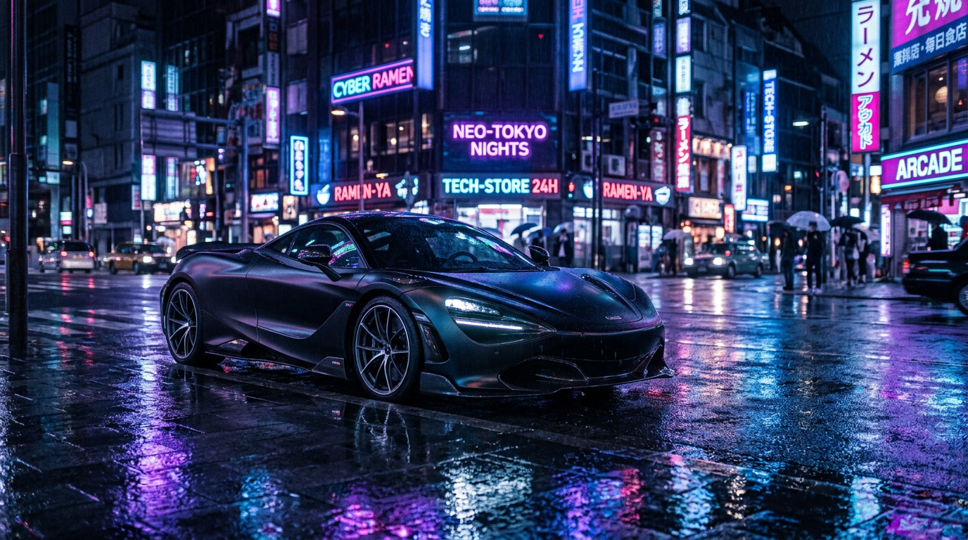
Prompt: Change the car color to cherry red and add dramatic fog rolling across the street.
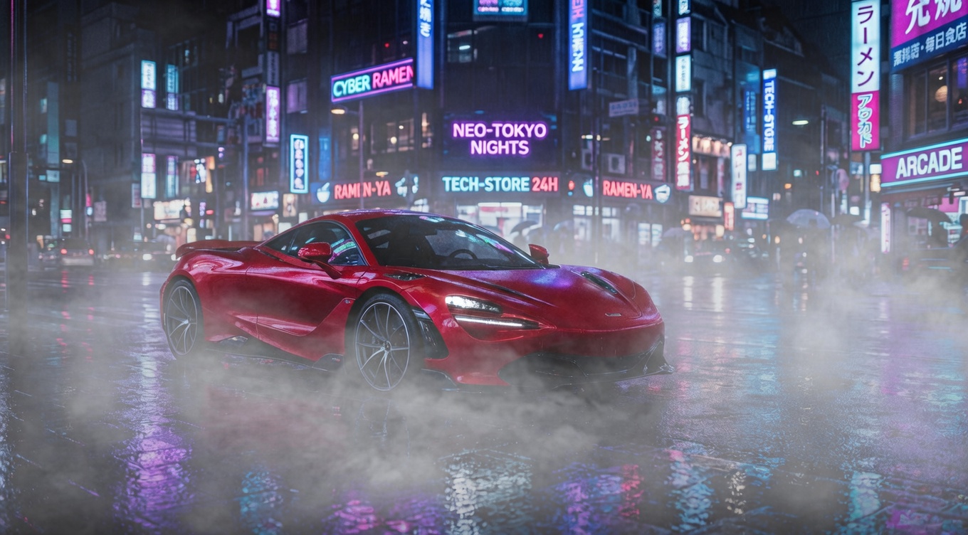
Result: The car turns glossy cherry red, and thick low fog softens the wet reflections near the ground.
Quick takeaways
- Typography holds up well on short, bold words (labels, posters, neon signs) in these tests.
- Edits work best when the prompt names one or two changes, not a full rewrite of the scene.
- For atmosphere effects (snow, fog), ask for a soft layer first, then increase intensity only if needed.
Try it
Run the model here: xai/grok-imagine-image