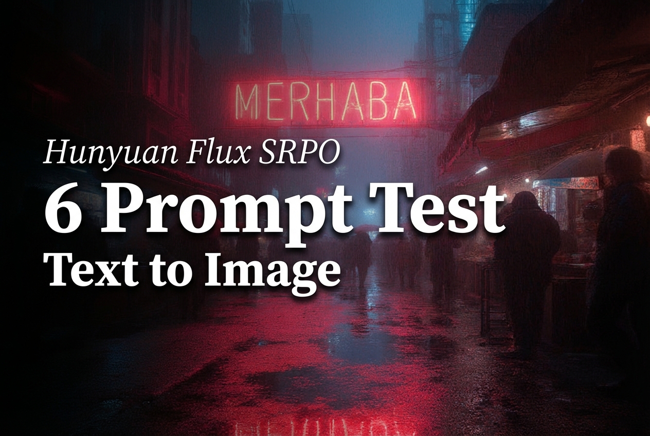
Hunyuan Flux SRPO: a fast text-to-image model in 6 tests
Hunyuan Flux SRPO is a text-to-image model that targets clean aesthetics and strong prompt following. This post tests it with six prompts that cover typography, product lighting, busy scenes, diagram style, portrait detail, and glass realism.
Model link
What the model supports
- Text-to-image from a prompt.
- Optional image-to-image by providing inputImage plus a strength value.
- Direct width and height control for aspect ratios.
Test settings
| Setting | Value |
|---|---|
| Steps | 20 |
| Guidance scale | 3.5 |
| Samples | 1 per prompt |
| Resolution | 1024 px base (varies by test) |
Results (prompt + output)
Test 1: poster typography
This checks basic layout and short text rendering.
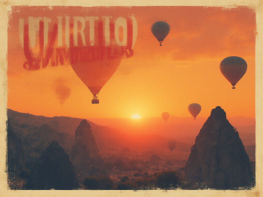
The headline lands clearly. Smaller text holds up better than many older diffusion models, but letter spacing still looks synthetic on close zoom.
Test 2: product photo lighting
This checks reflections, material realism, and depth of field.
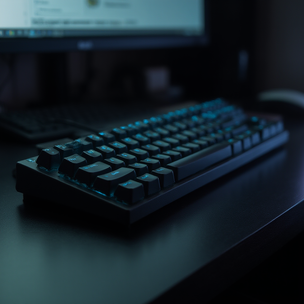
Specular highlights look controlled and not overblown. Key legends can still drift into nonsense, which matters for real product pages.
Test 3: busy scene with a single readable sign
This checks composition under clutter and whether one short sign stays readable.
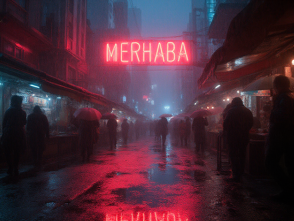
The scene keeps depth and lighting cues without turning into noise. The sign stays close, but some glyph edges melt into the glow.
Test 4: clean diagram style
This checks whether the model can stay in a simple vector look.

Edges stay sharp and the style stays consistent. Labels remain the weakest part, so diagrams that require exact text still need post-editing.
Test 5: portrait detail
This checks skin texture, specular control, and face geometry.
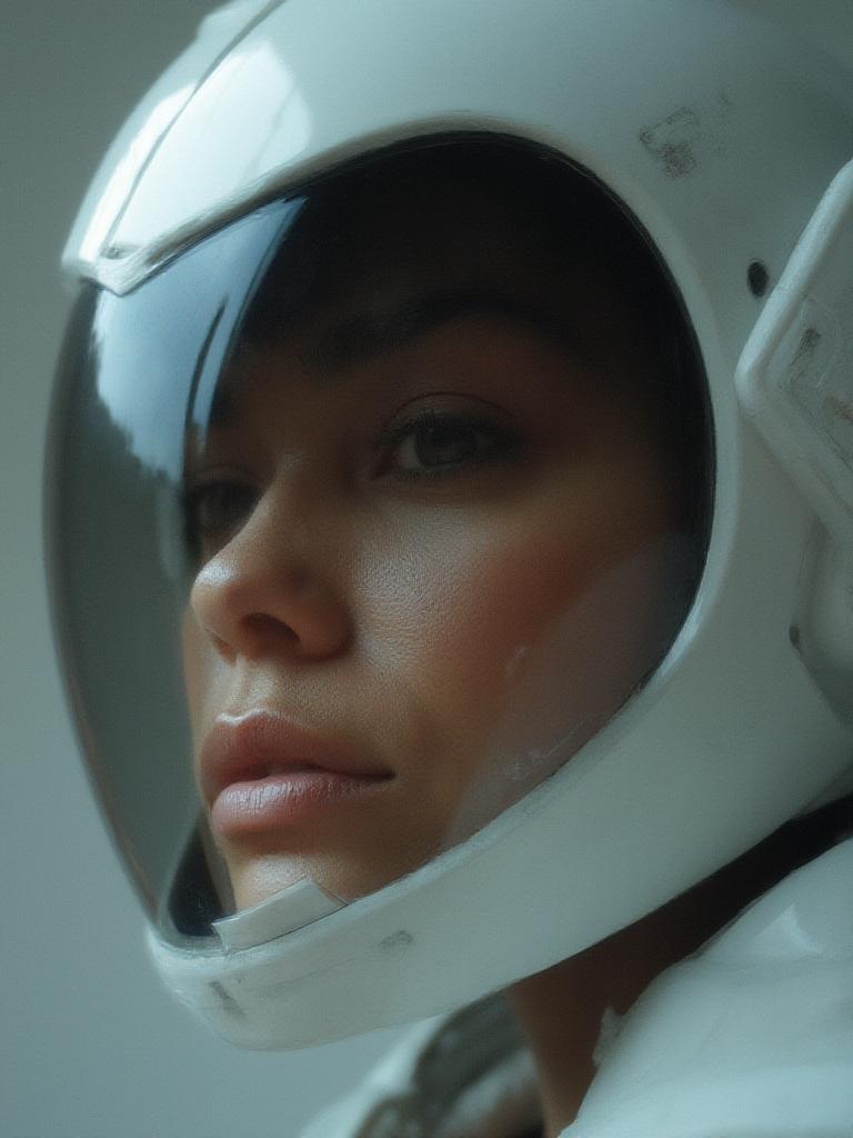
Lighting looks studio-like and the face stays coherent. Fine details can look a bit too smooth, which gives a slight synthetic finish.
Test 6: glass and caustics (hard)
This checks reflections, refractions, and small engraved text.
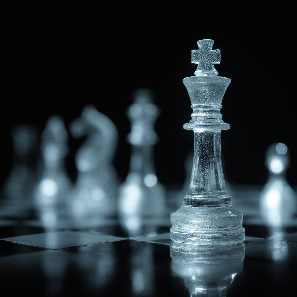
Reflections read well, and the set keeps a believable shape. The tiny engraving does not stay truly readable, which remains a hard failure case for most models.
Where it looks strong (and where it breaks)
- Strong: lighting control and scene clarity at 1024 px.
- Strong: consistent style when the prompt stays specific.
- Weak: small text and label fidelity.
- Weak: micro texture can get too smooth on faces and shiny materials.
Try it
Run the same prompts and tweak width and height to match target placements: