Ovis Image 7B text rendering was tested across six layouts that put different pressure on spelling, hierarchy, spacing, and style. The question was not whether the model could make attractive pictures. It was whether the requested words stayed readable once they had to behave like part of a poster, storefront, interface, book cover, infographic, or menu.
The six images below are the original outputs from the same 1024 x 1024 test set. They are useful because the prompts ask for exact strings, not vague visual themes. A result counts when a reader can find the requested words and the layout still feels plausible. It does not get a pass simply because a few letters look close.
Ovis Image 7B text rendering test setup
Ovis-Image 7B on Wiro is a text-to-image model aimed at typography-heavy image generation. The model card describes a 7B image model built on Ovis-U1 components, with an emphasis on text, layouts, and several aspect ratios. Its published Diffusers example uses a guidance scale of 5.0 and 50 steps. This set held guidance at 5.0, used fewer steps for faster practical runs, and kept the seed fixed at 0.
| Canvas | 1024 x 1024 |
| Guidance scale | 5.0 |
| Steps | 25 for tests 1-4; 30 for tests 5-6 |
| Seed | 0 |
| Outputs | 6, one per prompt |
| Run time and cost | Not recorded for this archived test set; no per-output number is claimed here. |
That last point matters. A model card can describe architecture and suggested inference settings, but it does not turn an unlogged render into a measured latency or price. These results support visual conclusions only. For a current run configuration and availability, use the Ovis-Image 7B model page.
For context, the maker’s Hugging Face model card reports its own benchmark results on text-focused evaluations. Those numbers are not treated as a score for this six-image sample. This post checks visible outputs, including the misses.
Six real layout outputs
1. Product poster: headline, subheading, price
Prompt: A clean product poster on white background for an espresso machine. Big headline text: MORNING ROAST. Smaller subheading: Espresso Maker – 15 Bar. Bottom corner price tag: $199. Modern sans-serif typography, perfect spelling, sharp edges, realistic print texture, studio lighting.
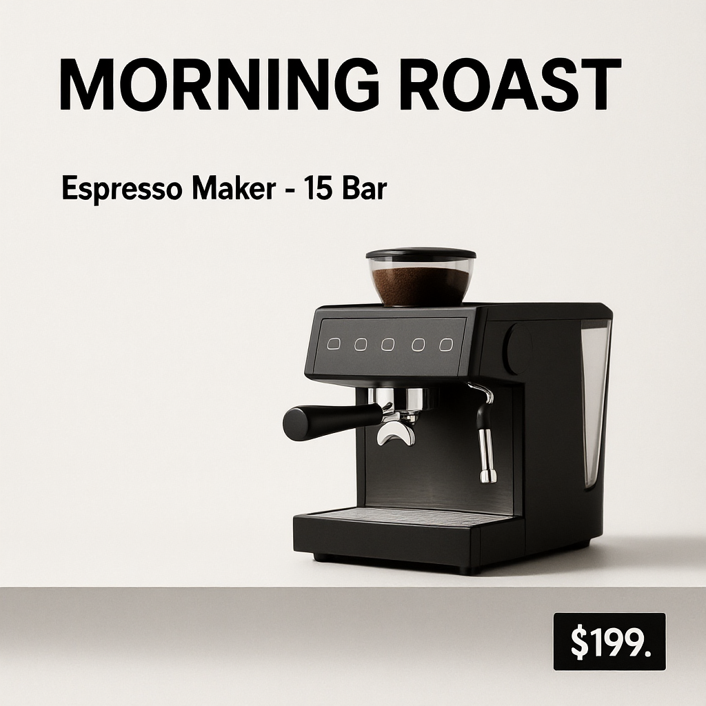
The large headline holds up well. MORNING ROAST is clear, the subheading is readable, and the overall poster has the right retail hierarchy. The price is almost right but gains a trailing period: $199. That is a small error, yet it is exactly the sort of detail that makes an unreviewed ad unsafe. Use this pattern for a concept board or an art direction draft, then set production price text in a design tool.
2. Storefront window: neon and a small sticker
Prompt: A street photo of a small storefront window. A bright neon sign inside the window says OPEN 24/7. A small sticker on the glass says NO CASH. Nighttime, reflections, realistic photo, perfectly legible text, no spelling errors.
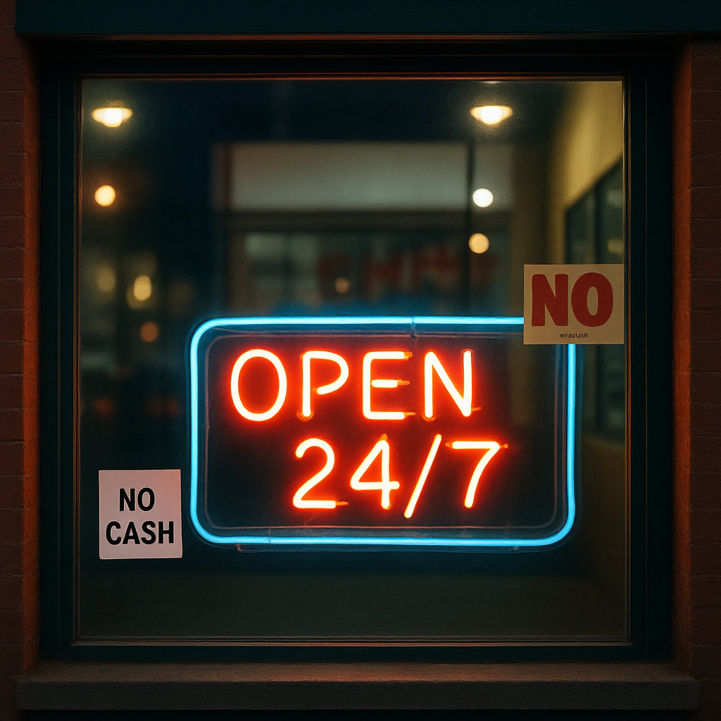
This is one of the strongest samples. OPEN 24/7 stays crisp despite glow and window reflections, while NO CASH remains legible on a smaller flat sticker. It shows that Ovis can keep short, high-contrast phrases intact when they are separated into clear regions. The lesson is practical: give important words room and contrast instead of packing them into decorative detail.
3. Mobile UI: title, tabs, and a location card
Prompt: A crisp mobile app UI mockup screenshot for a weather app. Top title text: Forecast. Tabs: Today, 7-Day, Radar. A card reads: San Francisco 18C. Clean iOS style, rounded corners, perfect spacing, perfectly readable text.
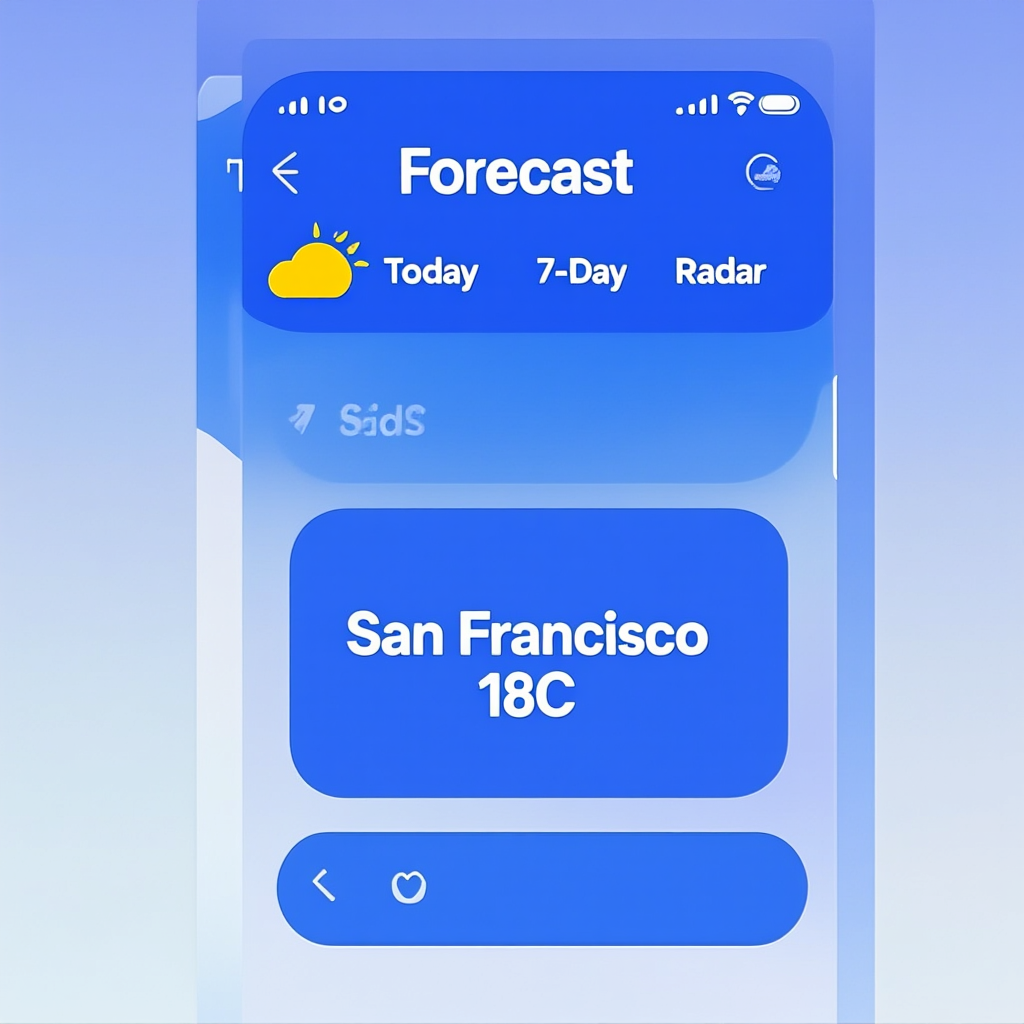
The main labels survive: Forecast, the tabs, and the weather card are understandable. Fine UI details do not. Small iconography and microcopy soften or vanish, which makes this a useful mood-board image rather than a shippable screen. Pick Ovis for early interface exploration or a marketing mockup. Do not use it to generate a final app screen that needs accurate controls, accessibility copy, or pixel-level handoff.
4. Book cover: title, subtitle, author line
Prompt: A minimalist book cover design on a matte paper background. Large serif title text: THE QUIET ALGORITHM. Subtitle in smaller text: A short guide to prompt testing. Author name at bottom: A. Nguyen. Clean layout, perfect kerning, perfectly readable text.
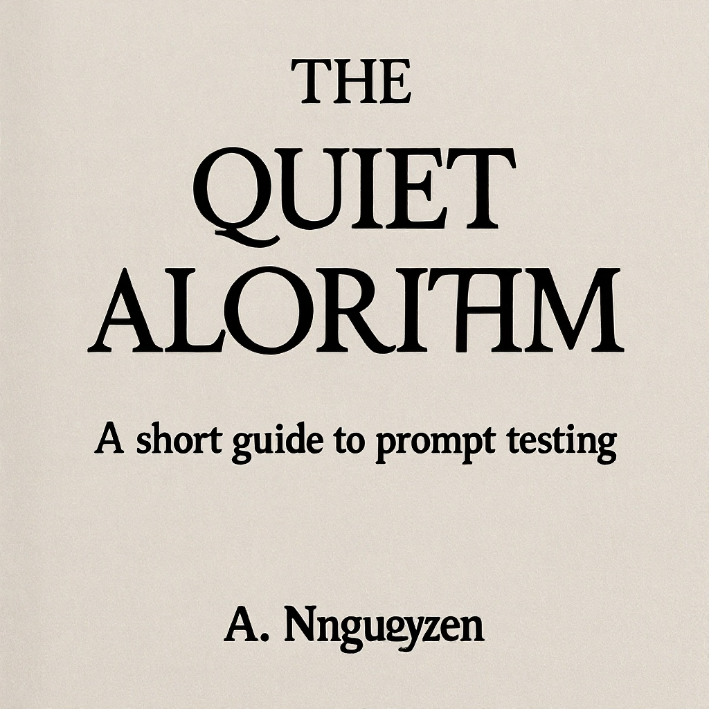
This is the clearest failure. The title drops the G in ALGORITHM, and the author line drifts away from the request. The composition still looks like a plausible book cover, which makes the error easy to miss at a glance. That is the risk with title-led layouts: a nearly correct image can still be unusable. Check every letter at full size before approving a cover, label, or logo.
5. Infographic grid: headings, body copy, and Chinese text
Prompt: A clean infographic poster on a light background with a strict grid layout. Four labeled boxes with bold headings: Latency, Cost, Quality, Text. Each box has one short sentence. Include the phrases Hello World and 你好世界 on the poster. Print-ready, perfect spelling, sharp typography, no artifacts.
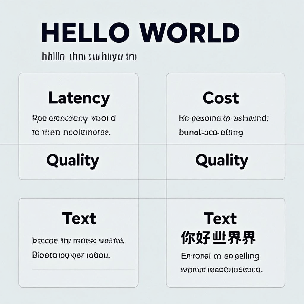
The four large headings work, and Hello World is readable. The compact body lines fall into gibberish. The Chinese phrase becomes 你好世界界, adding an extra character. This is a useful boundary: Ovis handles label-sized text far better than paragraph-sized text, and multilingual text still needs direct review. For an infographic, generate the visual system with Ovis and overlay factual sentences afterward.
6. Chalkboard menu: stylized lettering with several items
Prompt: A restaurant chalkboard menu with hand-drawn chalk lettering, but still clean and readable. Header text: SUNDAY BRUNCH. Menu items: Avocado Toast 12, Pancakes 10, Cold Brew 5. Realistic chalk texture, overhead photo, perfect spelling.
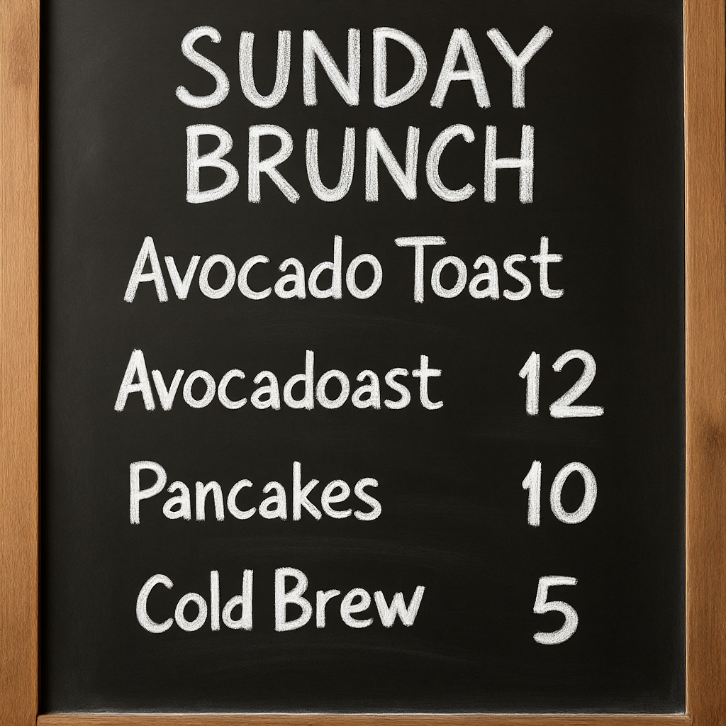
SUNDAY BRUNCH reads well, and the menu structure is convincing. The model joins part of Avocado Toast into Avocadoast 12. Stylized lettering is harder because texture, irregular spacing, and letter shapes compete with legibility. Use this type of output for a social visual or a restaurant mood reference. For anything customers must order from, add the final menu text separately.
What the six tests say
The pattern is consistent. Ovis Image 7B text rendering works best with short, prominent phrases in a clean region: a poster headline, neon sign, tab name, or section label. Accuracy drops as the layout asks for more strings, smaller text, longer lines, or more stylized lettering. The model can make the visual scaffold quickly. It cannot replace proofreading.
The test also separates two jobs that are often mixed together. Generative text rendering is good for discovering a look, placing type in a scene, and deciding whether a layout has enough contrast. Exact copy belongs in a later compositing step when the copy must be legally, commercially, or linguistically correct.
When to pick Ovis Image 7B
Pick Ovis-Image 7B when the image needs a few short words that feel native to the scene: packaging concepts, event-poster directions, storefront scenes, thumbnail ideas, or UI mood boards. Give it clear wording, a visible hierarchy, and enough blank space around the key phrase. It is a better fit for one strong headline than a dense flyer.
Choose a manual design workflow when every character matters, especially for prices, dates, product claims, legal text, menus, interface controls, or bilingual body copy. For related layout experiments, see the GLM-Image, Ovis-Image-7B, and FLUX.2 Dev Turbo comparison, SenseNova U1-8B layout tests, and HiDream I1 Full structured-layout tests.
The model is also open source: the Ovis-Image repository documents the project and its local inference path. Run Ovis-Image 7B on Wiro when a layout needs image-native words, then inspect the final output at 100% before it goes live.