
10 Prompts for Product Marketing with FLUX.2 Klein 4B
FLUX.2 Klein 4B looks like the right kind of model for fast marketing assets: labels, badges, UI mockups, and other text-heavy images.
This post runs 10 prompts through FLUX.2 Klein Base 4B and shows the raw outputs. The focus stays on readable text and layout, not just pretty pictures.
Test setup
- Model: black-forest-labs/flux.2-klein-base-4b
- Resolution: 1024×1024
- Steps: 35
- Scale: 4
- Samples: 1 per prompt
- Seeds: 401 to 410
Quick takeaways
- Short uppercase text works best. It tends to stay sharp and readable.
- Longer words and multi-line layouts can drift. Misspellings show up (LATANTY, FINNAL, BRUNGH, COFEE).
- If a prompt needs exact text, plan for a few retries or keep text short.
The 10 prompts (with outputs)
1) Product label on a mug
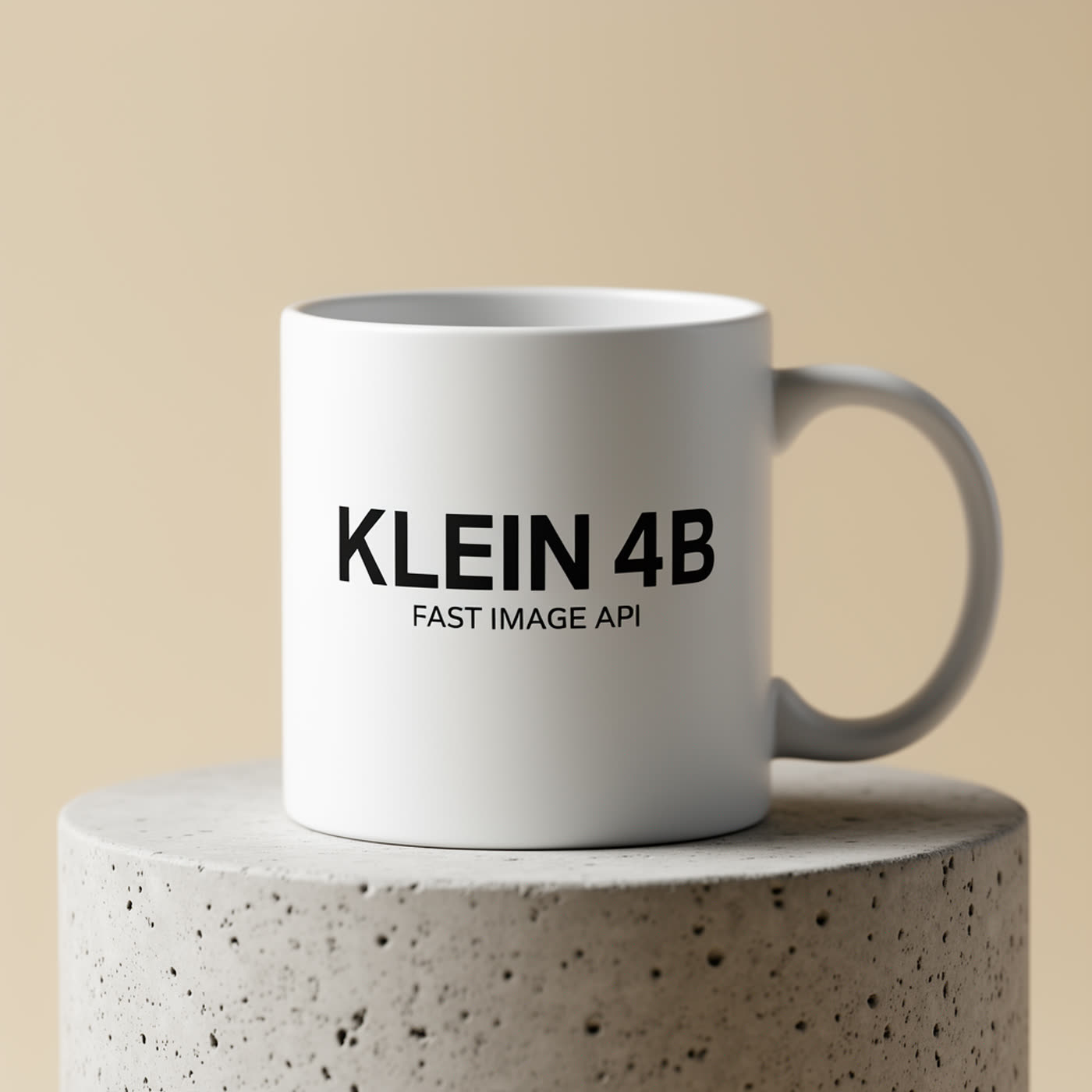
Clean product shot, and the text lands exactly. This style (simple background + short block of uppercase text) fits the model well.
2) Mobile onboarding UI

The big headline reads well. Smaller UI text turns into typical placeholder blur. For real app screens, keep the model focused on layout, then add exact UI copy later.
3) Latency infographic poster
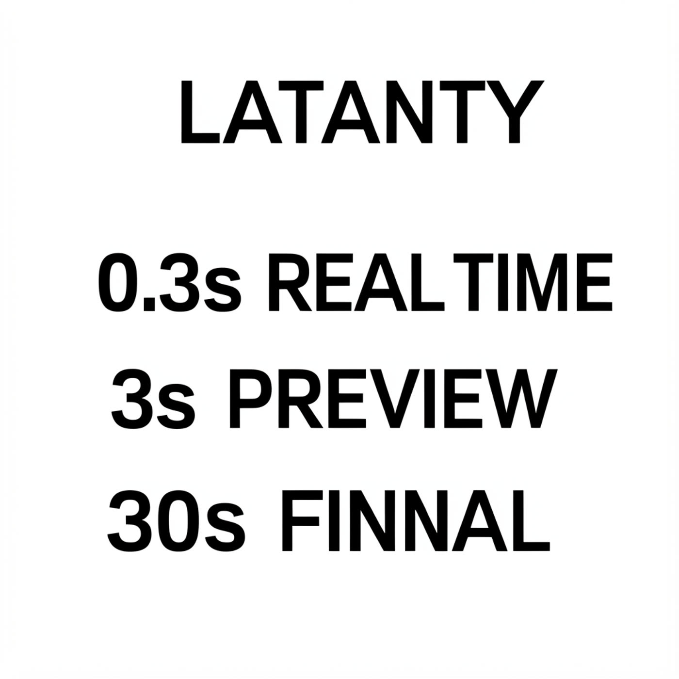
Layout looks right, but exact spelling slips (LATANTY, FINNAL). This pattern shows up a lot: the model nails alignment, then fumbles one or two characters.
4) Neon storefront sign
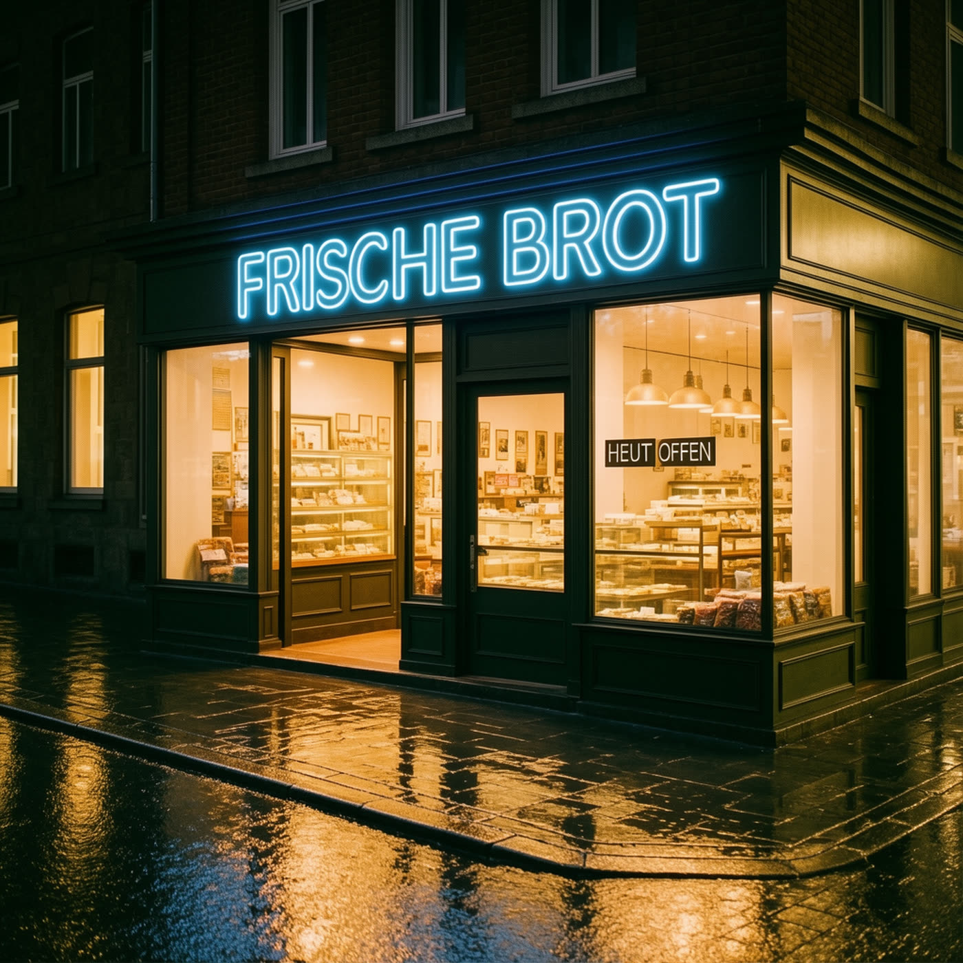
The main sign reads correctly. The smaller sign drops a letter (HEUT OFFEN). Tiny text stays the hardest part.
5) Skincare bottle label
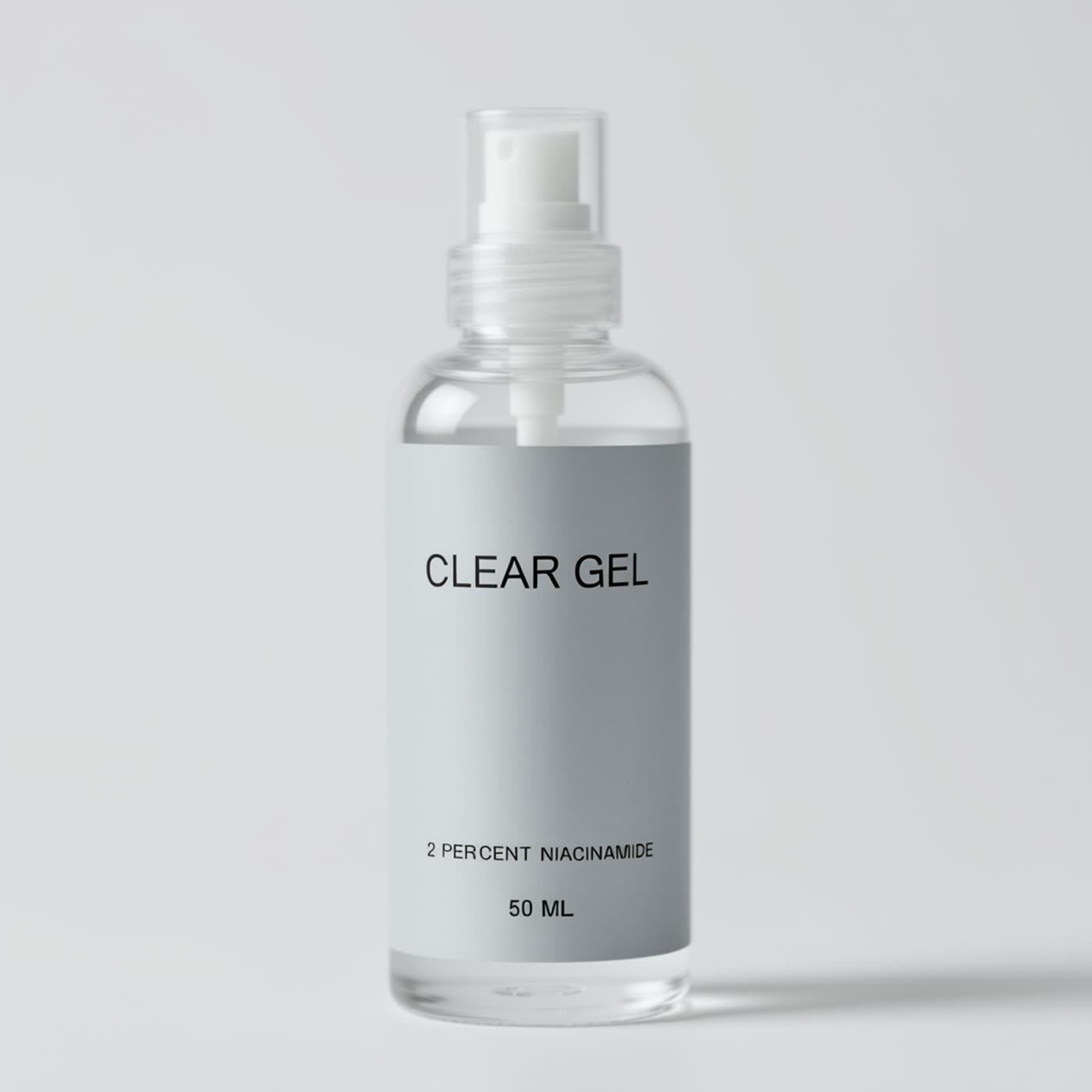
Three lines of label text come out readable. This kind of label prompt works well when the copy stays short and high-contrast.
6) Conference badge

It keeps the main idea but shortens the big line to WIRO DEV. If the badge needs an exact event name, prompt retries help.
7) Chalkboard cafe menu
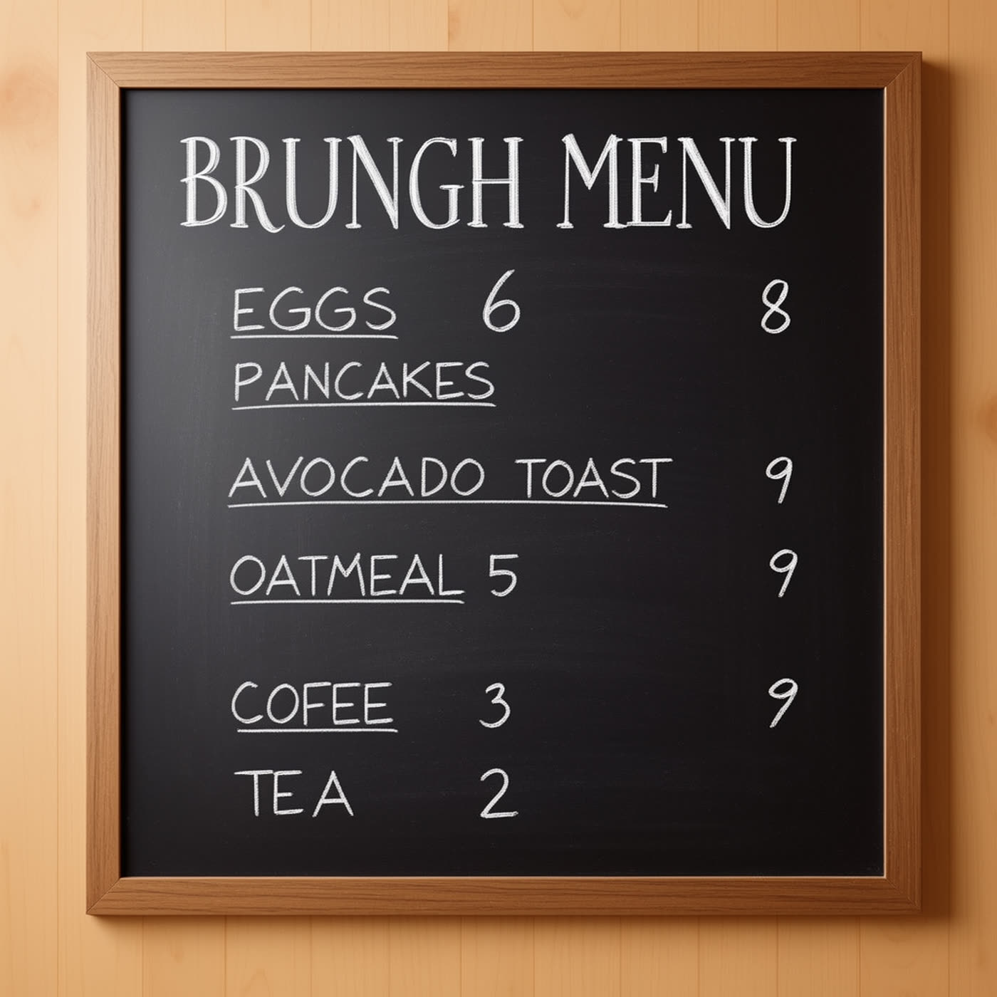
Chalk handwriting looks convincing, but exact spelling drifts (BRUNGH, COFEE). Handwritten styles trade accuracy for vibe.
8) Vintage travel postcard
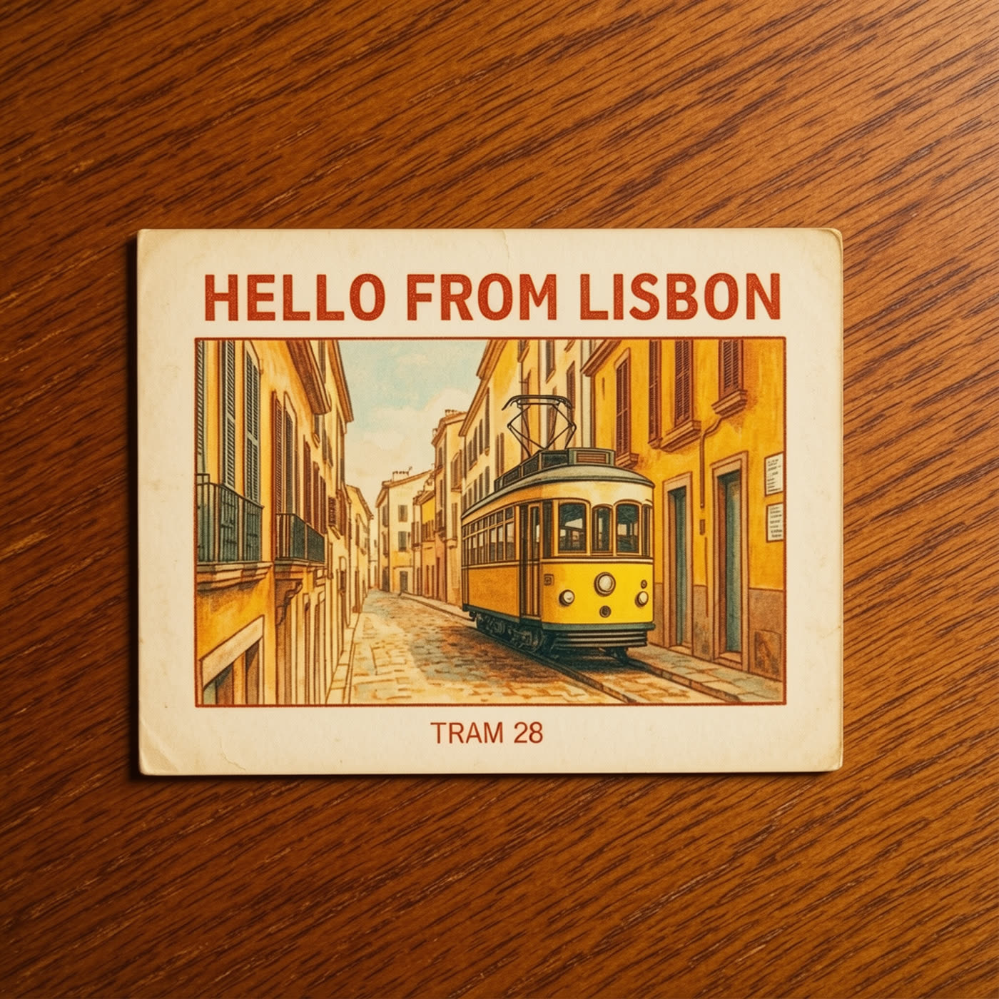
The postcard format gives the model strong structure. Both lines read correctly, and the paper texture sells the print feel.
9) Movie title card
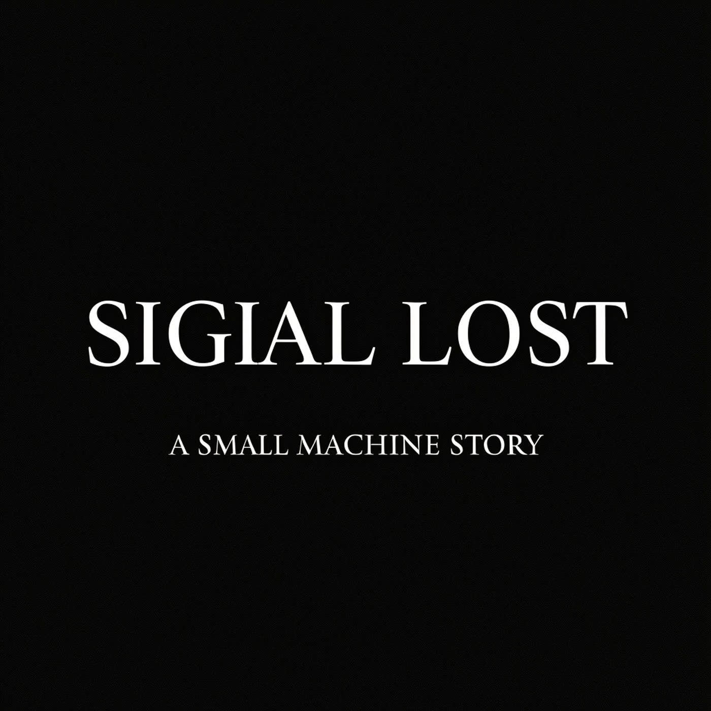
High contrast helps. Still, the main title shifts (SIGIAL LOST). Short words can still break when the model tries to stylize typography.
10) Sticky note handwriting

The note reads cleanly, but the bug number changes (192 vs 142). Numbers can wander even when letters hold up.
Tips to get more reliable text
- Keep copy short. One or two words per line works better than sentences.
- Use uppercase for labels and badges. It tends to stay clearer.
- Ask for high contrast: dark text on light surfaces, or bright neon on dark scenes.
- If exact spelling matters, generate the background and add text in a design tool.
Try the model here: FLUX.2 Klein Base 4B on Wiro.