Z-Image Turbo was tested here for one narrow question: can a fast, few-step text-to-image model keep a designed image usable when the prompt asks for readable words, controlled spacing, and a clear hierarchy? The six outputs are not a beauty contest. They are practical checks for labels, signs, interface mockups, posters, maps, and menus.
All six images below are the original blog-hosted outputs from Tongyi-MAI/Z-Image-Turbo on Wiro. The test used one square image per prompt at 1024×1024, 9 steps, guidance scale 0.0, and seeds 701 through 706. That makes the results useful as a record of this setup, rather than a claim about every possible seed or prompt rewrite.
Z-Image Turbo test setup
- Model: Tongyi-MAI/Z-Image-Turbo
- Output size: 1024×1024
- Steps: 9
- Guidance scale: 0.0
- Seeds: 701, 702, 703, 704, 705, and 706
- One generation per prompt; no cherry-picked reruns
The prompt set deliberately mixes simple display text with harder text-heavy scenes. A single product label checks whether a short brand phrase survives. The bilingual stall asks the model to separate two scripts. The laptop and poster check hierarchy and alignment. The transit map and menu raise the number of independent labels, where image models often start to approximate words rather than reproduce them.
The model card exposes four working controls for this run: prompt, steps, scale, seed, resolution, and aspect ratio. It offers 480P, 580P, 720P, and 1080P output choices plus 16:9, 9:16, and 1:1 aspect ratios. This article used a square composition and the documented default of 9 steps. The creator describes Turbo as a distilled Z-Image variant built for eight function evaluations, so a nine-step run stays close to that fast-use intent. For model background and installation details, see the official Hugging Face model card and the Tongyi-MAI GitHub repository.
What the six outputs actually show
1. Product can: good materials, failed brand word
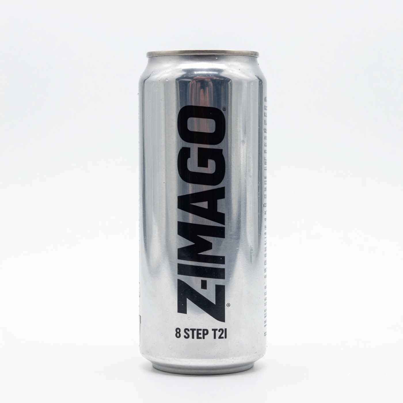
The can has convincing studio light, a tidy silhouette, and plausible printed texture. The important failure sits in the largest word: Z-IMAGE TURBO becomes ZIMAGO. The smaller line remains readable. That split matters. Z-Image Turbo can make a credible packaging concept, but it should not be the final source for an exact product name. Generate the can, then add approved brand type in a layout tool.
2. Bilingual stall: one short phrase survives, the rest does not
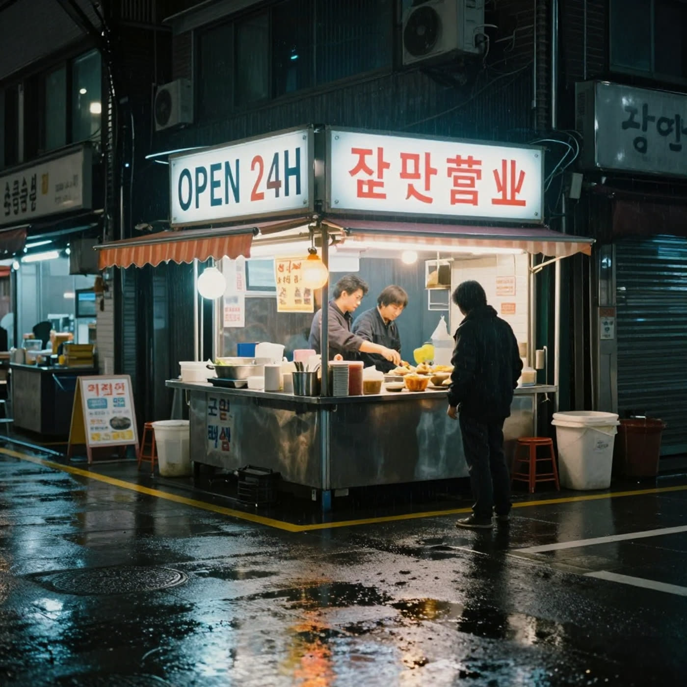
The image gets the atmosphere right: wet pavement, neon spill, and a compact stall that reads quickly. OPEN 24H is legible. The secondary characters are not stable enough to publish as real bilingual copy. This is a useful reminder that an output can look convincing from a distance while failing a close reading. Use the model for mood boards, campaign backgrounds, or a placeholder sign. Do not use it alone for regulated, translated, or customer-facing text.
3. Laptop landing page: the strongest fit in the set
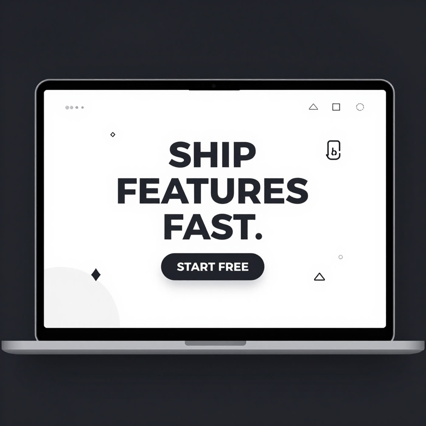
This is the cleanest success. The laptop perspective, screen framing, heading scale, and call-to-action all cooperate. The output works as a visual concept for a landing page or a slide, even though it should not replace a real UI implementation. Big words on a high-contrast screen suit the model better than dense lists. If the goal is a quick art-directed mockup, this is the type of prompt to choose.
4. Infographic: hierarchy lands before exact copy
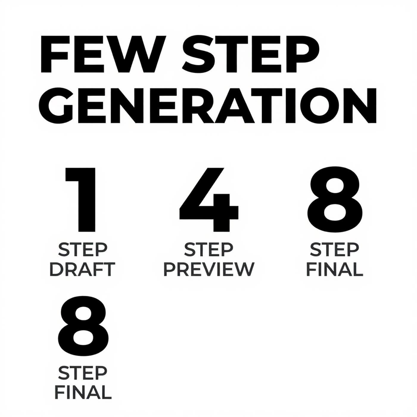
The poster has the right visual grammar: a strong title, separated rows, white space, and a clear reading order. It demonstrates that Z-Image Turbo can establish a useful layout scaffold quickly. It is not proof that every small line is production-ready. For social concepts or pitch-deck visuals, preserve the composition and rebuild the text in Figma, Canva, or a similar editor.
5. Transit map: a near-miss reveals the label limit
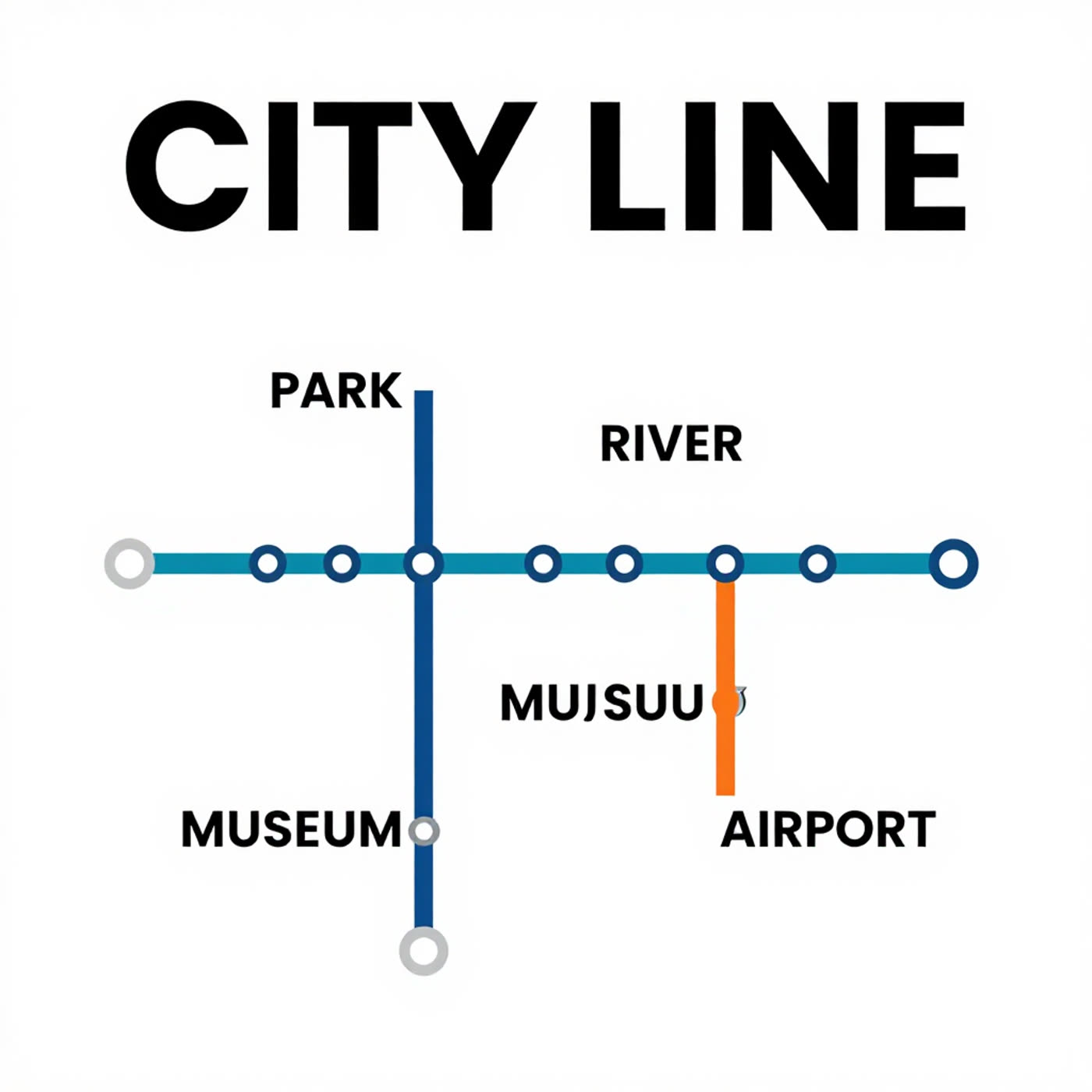
The map design is coherent. Routes, station dots, and the title produce a believable poster at a glance. Then a label slips: MUSEUM appears as MUJSUU. That is the key result, not a minor typo. A map asks the model to preserve several small independent strings while also following a geometric layout. Z-Image Turbo handles the visual system better than the data inside it. Use it for map-like decoration, not wayfinding or information design.
6. Chalkboard menu: a surprisingly usable text case
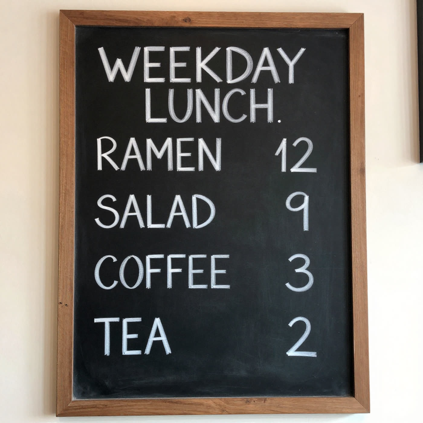
The menu is the best text-heavy result. The requested items, numbers, chalk texture, and lighting remain coherent. It still deserves human proofreading before use, but it shows why structured prompts can work when each item is short and the style gives the lettering room to breathe. A menu mockup, café poster, or event-board concept is a sensible use case. A final menu with allergen details is not.
Run time and cost per output on Wiro
The six original post records do not include task receipts, so no measured duration or charge can be assigned to any individual image without inventing data. Wiro’s current model documentation includes a sample completed task with 6.0 elapsed seconds, but that is an example response rather than a benchmark for these six 1024×1024 outputs. The documentation does not publish a fixed per-image price for this model. Treat the table accordingly.
| Output | Measured run time | Measured cost | Evidence |
|---|---|---|---|
| Prompts 1-6 | Not recorded for the original runs | Not recorded for the original runs | Post assets only |
| Documented sample task | 6.0 seconds | Not a per-output price | Wiro model documentation example |
This distinction is worth keeping. The Turbo name and the published eight-evaluation design support a fast-workflow use case, but they do not justify promising a universal latency or price. Queue time, resolution, traffic, and the selected run can change what a real task costs and how long it takes.
When to pick Z-Image Turbo
Pick Z-Image Turbo when speed matters more than exact typography: product mood boards, campaign directions, poster concepts, stylized menus, cinematic scenes, and quick UI illustrations are strong candidates. Keep the prompt focused. Ask for one dominant phrase, clear contrast, and one visual idea per composition. The laptop, infographic, and chalkboard tests show why.
Choose a workflow with manual typesetting when every word must match, especially for a brand name, map labels, legal text, translated copy, prices, or accessibility-critical instructions. The can and transit-map results show the risk plainly. The model can make an attractive draft, yet one altered word can invalidate the deliverable.
For related tests of structured image generation, compare the layout work in GPT Image 1.5: 5 Prompts for Clean Layouts, HiDream I1 Full: 5 Prompt Tests for Structured Layouts, and SDXL-Turbo: Text-to-Image in 6 One-Step Prompt Tests. For a fast visual draft with short display text, run Z-Image Turbo on Wiro.