Model Comparison

FLUX.2 Klein Base 4B vs 9B: 5 Prompt Image Test

FLUX.2 Klein Base 4B vs 9B: 5 Prompt Image Test

FLUX.2 Klein Base 4B vs 9B looks like a simple question. It is not. Both models move fast, both follow prompts well, and both can render text. This test runs 5 prompts through each model and compares what changes.

The models

FLUX.2 Klein Base 4B targets smaller footprints and quick iteration. FLUX.2 Klein Base 9B pushes detail and text stability with a larger base.

Test setup

  • Resolution: 1024×1024
  • Steps: 30
  • Guidance scale: 4
  • Samples: 1 per prompt
  • Seeds: 42 to 46

5 prompt tests (side by side)

Prompt 1: Soda can label text

Goal: short uppercase copy on a product label, plus realistic lighting and droplets.

FLUX.2 Klein Base 4B FLUX.2 Klein Base 9B
FLUX.2 Klein Base 4B output: chilled soda can with label text LIME SHIFT
Prompt: Photoreal studio product photo of a chilled aluminum soda can on a wet black stone slab. Condensation droplets. Label text: LIME SHIFT. Smaller line: SPARKLING WATER. Minimal design, high contrast, softbox lighting, shallow depth of field, ultra sharp.
FLUX.2 Klein Base 9B output: chilled soda can with readable label text LIME SHIFT
Prompt: Photoreal studio product photo of a chilled aluminum soda can on a wet black stone slab. Condensation droplets. Label text: LIME SHIFT. Smaller line: SPARKLING WATER. Minimal design, high contrast, softbox lighting, shallow depth of field, ultra sharp.

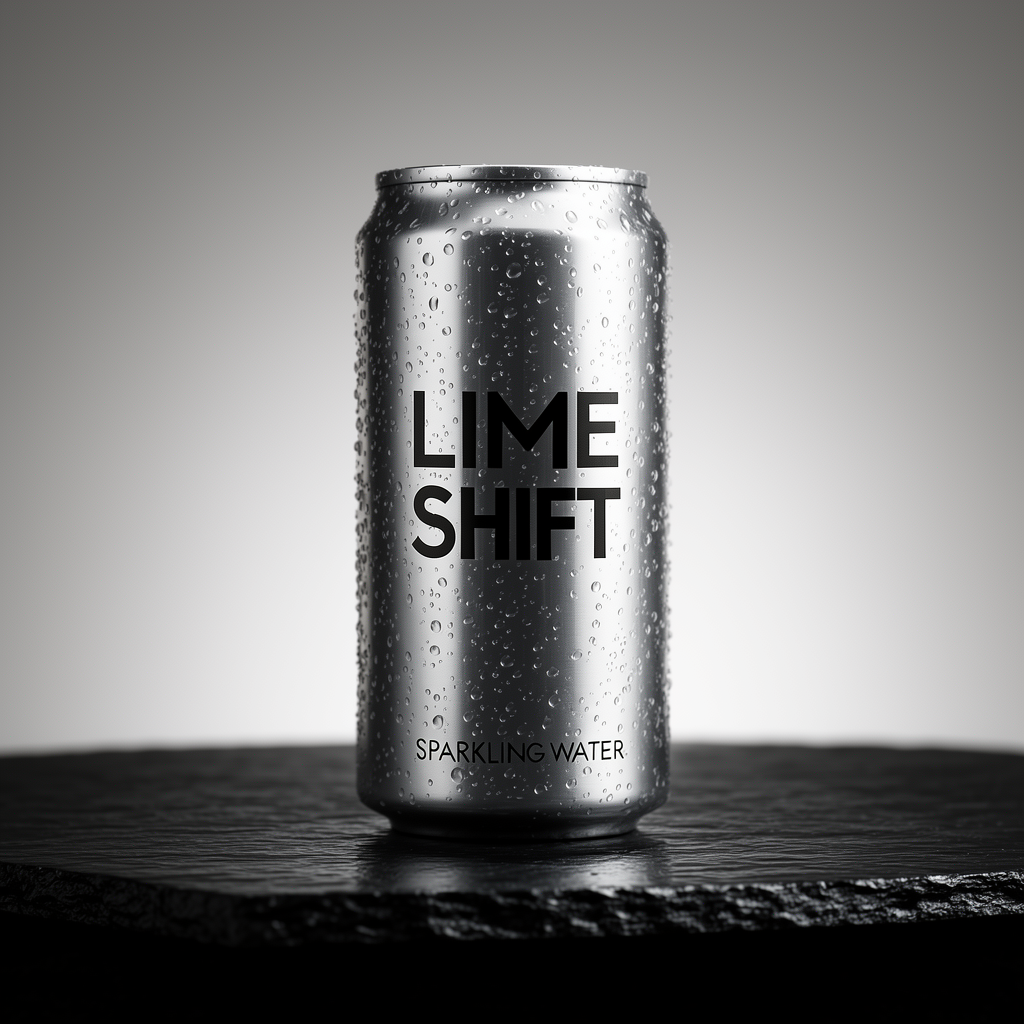
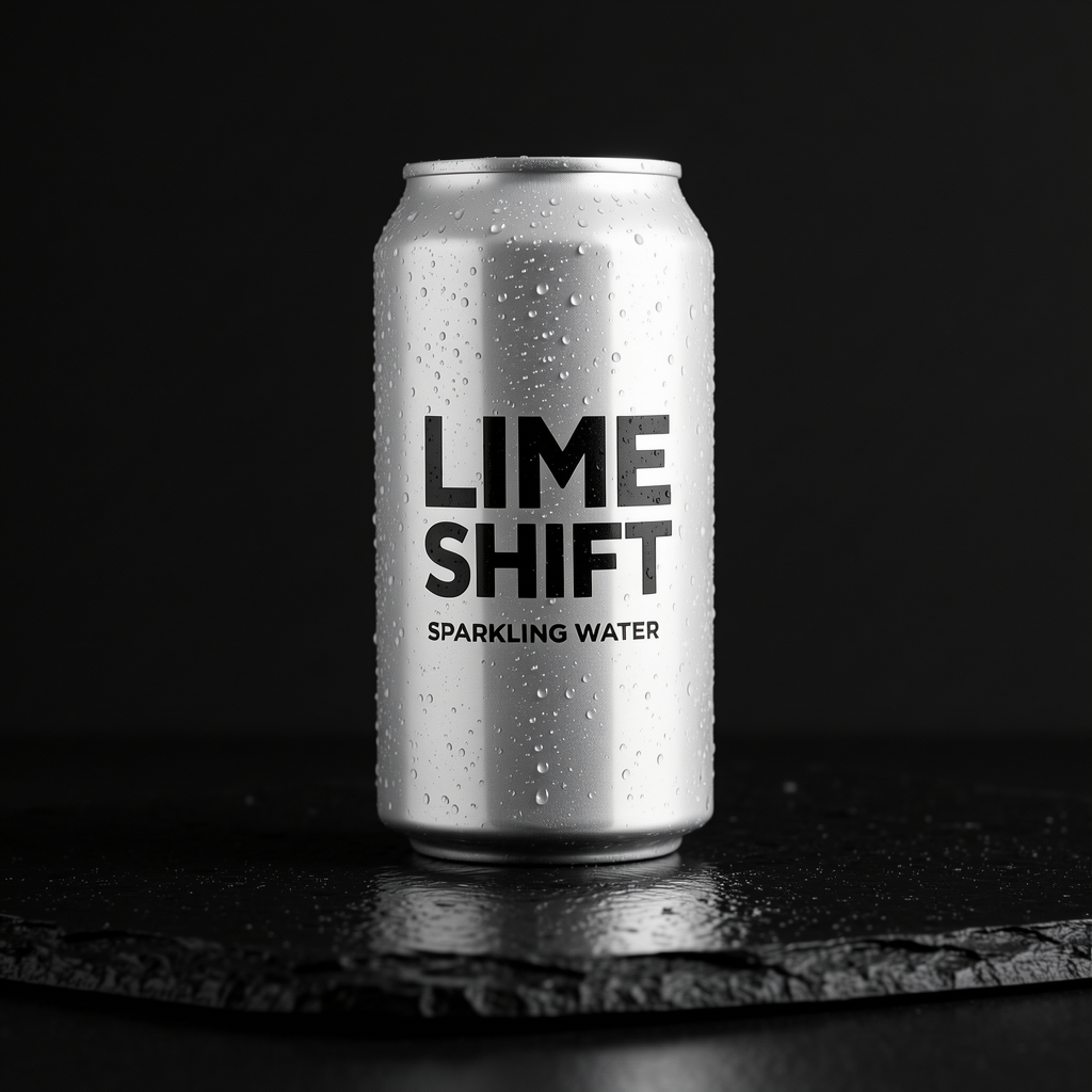
Both models land the main words. The 9B output keeps the small line sharper and the label contrast cleaner.

Prompt 2: Analytics dashboard UI

Goal: headline text plus smaller UI labels. This test usually breaks first.

FLUX.2 Klein Base 4B FLUX.2 Klein Base 9B
FLUX.2 Klein Base 4B output: laptop analytics UI with some garbled labels
Prompt: Isometric UI mockup of a desktop analytics dashboard on a laptop screen. Clean modern design. Large header text: DAILY REPORT. Card titles: SIGNUPS, RETENTION, MRR. Button text: EXPORT CSV. High readability, flat style, subtle gradients.
FLUX.2 Klein Base 9B output: laptop analytics UI with clearer headline and labels
Prompt: Isometric UI mockup of a desktop analytics dashboard on a laptop screen. Clean modern design. Large header text: DAILY REPORT. Card titles: SIGNUPS, RETENTION, MRR. Button text: EXPORT CSV. High readability, flat style, subtle gradients.

The 9B output holds the big headline and keeps more UI text readable. The 4B output shows fuzzy or misshaped small labels.

Prompt 3: Vector instruction diagram

Goal: clean line art plus label accuracy. One missing letter ruins the whole sheet.

FLUX.2 Klein Base 4B FLUX.2 Klein Base 9B
FLUX.2 Klein Base 4B output: camping stove diagram with label typos
Prompt: Technical instruction sheet, white background. Clean vector line art of a compact camping stove. Three callout labels with thin arrows: FUEL VALVE, IGNITER, POT STAND. Bottom caption text: SETUP IN 3 STEPS. Minimal layout, crisp lines.
FLUX.2 Klein Base 9B output: camping stove diagram with clean readable labels
Prompt: Technical instruction sheet, white background. Clean vector line art of a compact camping stove. Three callout labels with thin arrows: FUEL VALVE, IGNITER, POT STAND. Bottom caption text: SETUP IN 3 STEPS. Minimal layout, crisp lines.

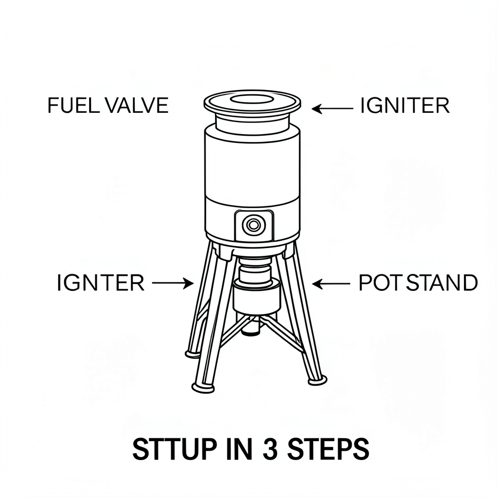
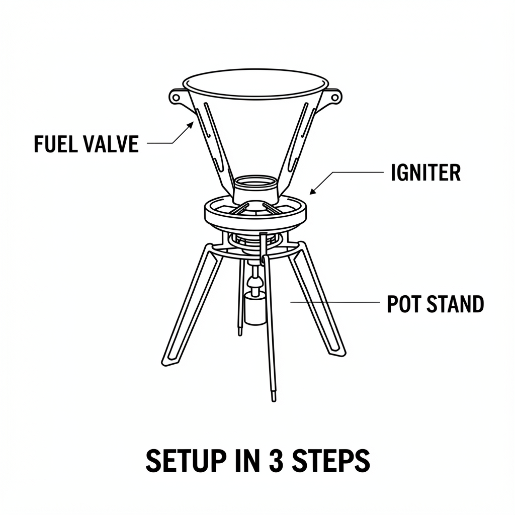
This one splits hard. The 4B output shows visible text errors (like “IGNTER” and “STTUP IN 3 STEPS”). The 9B output keeps the labels correct and looks print-ready.

Prompt 4: Neon storefront sign

Goal: neon text plus wet street reflections. This mixes style with readability.

FLUX.2 Klein Base 4B FLUX.2 Klein Base 9B
FLUX.2 Klein Base 4B output: ramen shop neon sign with text errors
Prompt: Cinematic night street photo in Seoul. Rainy pavement reflections. A small ramen shop with a neon sign that reads: NIGHT NOODLES. Window sign text: OPEN TILL 2AM. 35mm film look, high detail.
FLUX.2 Klein Base 9B output: ramen shop neon sign reading NIGHT NOODLES and OPEN TILL 2AM
Prompt: Cinematic night street photo in Seoul. Rainy pavement reflections. A small ramen shop with a neon sign that reads: NIGHT NOODLES. Window sign text: OPEN TILL 2AM. 35mm film look, high detail.

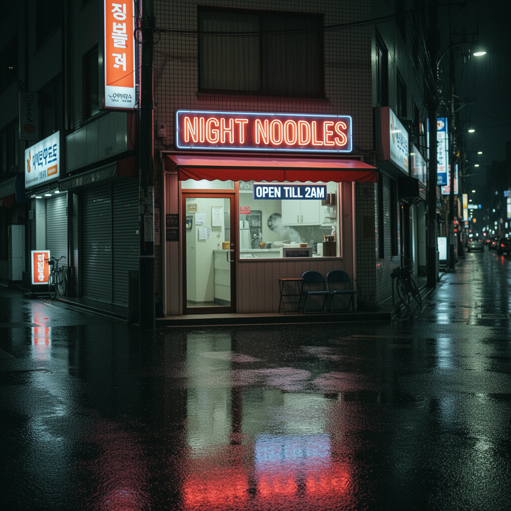
The 9B output keeps the sign clean. The 4B output drifts into “NIGHT NOODES” and the window copy loses clarity.

Prompt 5: Travel flat lay with numbers

Goal: mixed objects, small printed text, and numbers. This is a real ad-style layout.

FLUX.2 Klein Base 4B FLUX.2 Klein Base 9B
FLUX.2 Klein Base 4B output: travel flat lay with AURORA TRAVEL text error
Prompt: Top down flat lay on a wooden desk: passport, boarding pass, headphones, coffee. Passport cover text: AURORA TRAVEL. Boarding pass text: FLIGHT 618, GATE B12, SEAT 14A. Clean print typography, realistic paper texture.
FLUX.2 Klein Base 9B output: travel flat lay with clearer passport text
Prompt: Top down flat lay on a wooden desk: passport, boarding pass, headphones, coffee. Passport cover text: AURORA TRAVEL. Boarding pass text: FLIGHT 618, GATE B12, SEAT 14A. Clean print typography, realistic paper texture.

The 4B output shows an obvious typo (“AURORA TTAVEL”). The 9B output keeps “AURORA TRAVEL” on the passport, but tiny text still drifts in places.

Quick comparison

Model Observed avg task time (sec) Text accuracy (in these tests) Best for
FLUX.2 Klein Base 4B 37 Good on short bold labels. More typos on diagrams and UI. Fast product shots, simple posters, quick iterations.
FLUX.2 Klein Base 9B 18 Cleaner small text and fewer obvious misspellings. UI mockups, instruction sheets, neon signage, layout-heavy work.

Verdict

In this 5 prompt test, FLUX.2 Klein Base 9B wins on text stability. It keeps labels readable and avoids the most visible typos. FLUX.2 Klein Base 4B still looks strong on simple product scenes, but it needs retries when exact spelling matters.

Try them here: FLUX.2 Klein Base 4B and FLUX.2 Klein Base 9B.


Leave a Comment

Your email address will not be published. Required fields are marked *