GLM-Image targets a hard problem in image generation: clean layouts with readable text. This review runs six real prompts that force titles, labels, prices, UI strings, and dense tables into one frame.
What GLM-Image does
GLM-Image is a text-to-image and image-to-image model built for high-fidelity visuals and information-dense designs. It targets posters, infographics, slides, menus, and any scene where text needs to stay legible.
Model page: https://wiro.ai/models/zai-org/glm-image
Test setup: 6 prompts, 1024×1024 output, 30 inference steps, guidance scale 1.5. Each prompt includes exact strings to render.
6 prompt tests
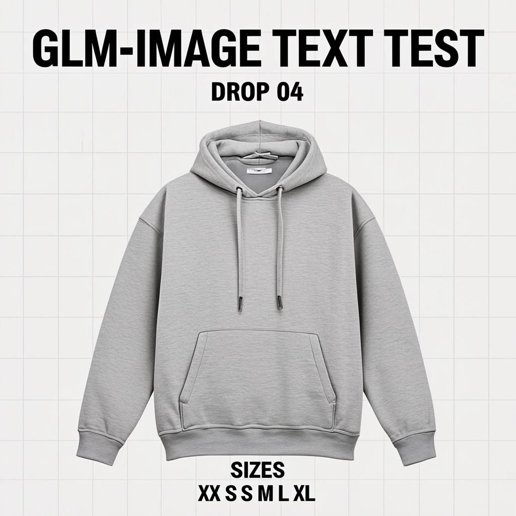
1) Streetwear poster (headline + sizes)
This prompt checks big display type and a short spec line. The headline stays crisp. The sizes line stays readable, but spacing turns a bit weird.
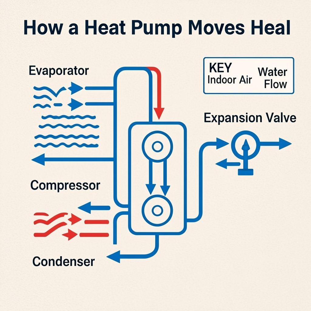
2) Heat pump infographic (labels + arrows)
Infographics show where most models crack. GLM-Image keeps the diagram clean and the component labels readable. One letter slips in the title. Heat becomes Heal.
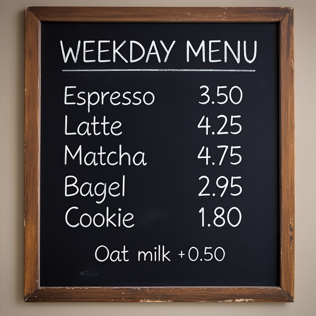
3) Chalkboard cafe menu (items + prices)
Price lists often drift into gibberish. Here the model keeps every item and price intact. The handwriting look stays legible.
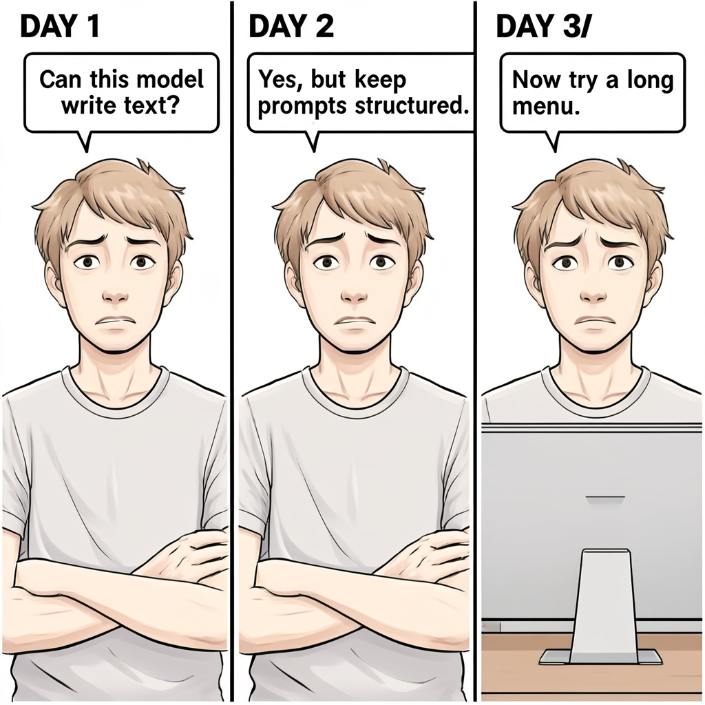
4) Three-panel comic (short captions + speech bubbles)
Speech bubbles act like a stress test for punctuation and line breaks. The bubble text lands clean. The third caption comes out as DAY 3/ with a stray slash.
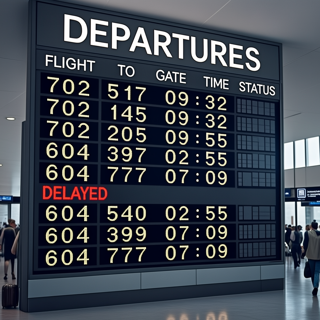
5) Airport departures board (dense table + status)
This prompt pushes alignment, repeated tokens, and table structure. The board looks believable. Column headers read correctly. The red DELAYED stands out. A few times show minor spacing quirks around the colon.
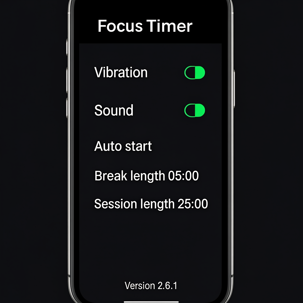
6) Dark mode app settings UI (small text + numbers)
UI text needs crisp edges. GLM-Image renders the screen cleanly, including the timer values and version string.
What worked (and what slipped)
- Short lists with prices work well. The menu stays accurate and readable.
- Medium-length labels work well. Diagram parts read cleanly.
- Very long or prominent titles can drop a character. Heat became Heal once.
- Dense tables hold together, but spacing can wobble on small tokens like times.
Prompt tips for cleaner text
- Keep titles short. Put the must-be-correct text early in the prompt.
- Use lists with one item per line: item name + price. Avoid long sentences inside the design.
- Limit the number of unique numbers in one frame. Tables stay cleaner with fewer rows.
- When exact spelling matters, repeat the key string once. Do not repeat it five times.
Try GLM-Image
Run the same text-heavy prompts and see where it holds up: https://wiro.ai/models/zai-org/glm-image