LongCat-Image: multilingual text rendering in 6 tests
LongCat-Image targets a tricky combo: photoreal images plus readable text in multiple languages. This review runs six prompts that stress posters, labels, neon signs, diagrams, embroidered patches, and tiny engraving.
Model link
Test settings
| Setting | Value |
|---|---|
| Aspect ratio | 1:1 (1024×1024) |
| Steps | 28 |
| Guidance scale | 4.5 |
| Samples | 1 per prompt |
Results
Test 1: clean poster layout (English + Chinese)
The layout stays controlled. The big headline looks close to real type. Small text remains the first thing to blur or drift.
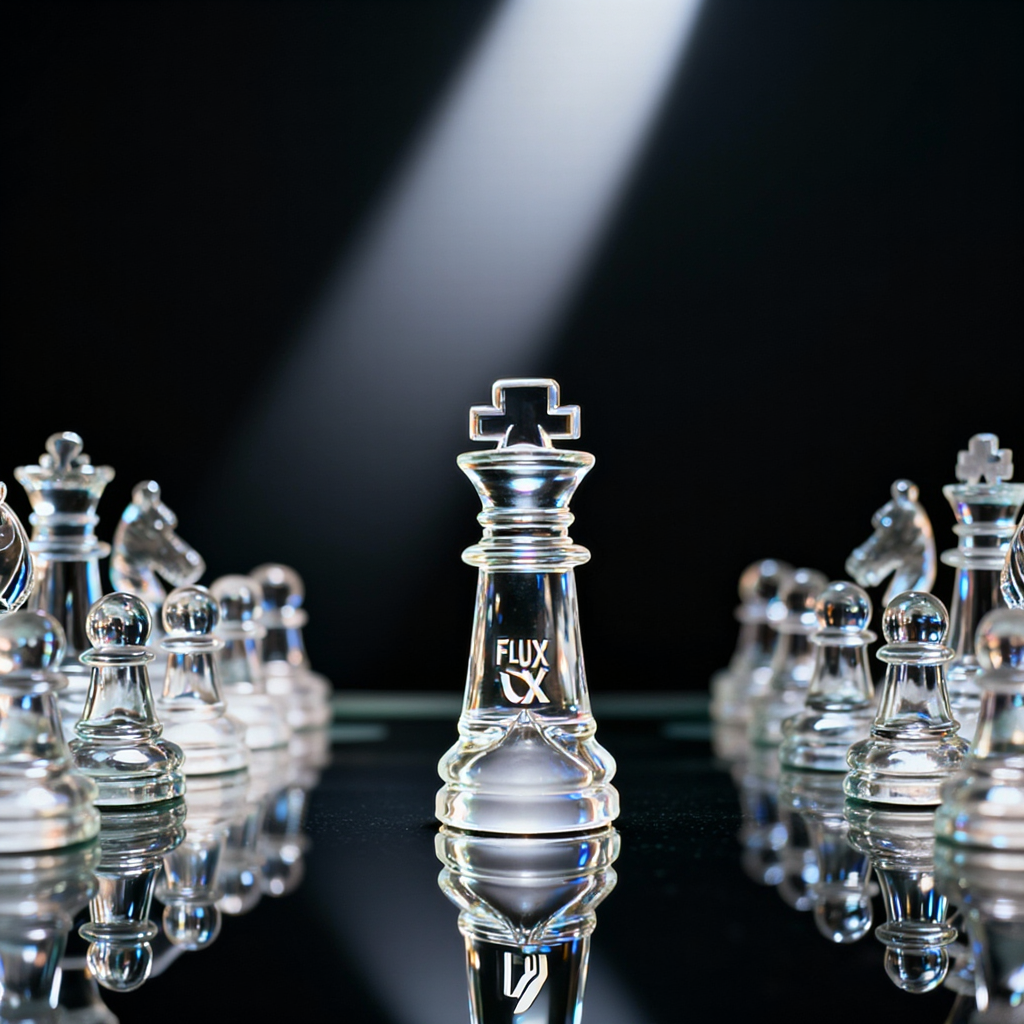
Test 2: product label on glass (short word)

Short label text tends to work better than sentences. This test also shows whether glass turns into plastic under harsh highlights.
Test 3: neon sign in a busy scene
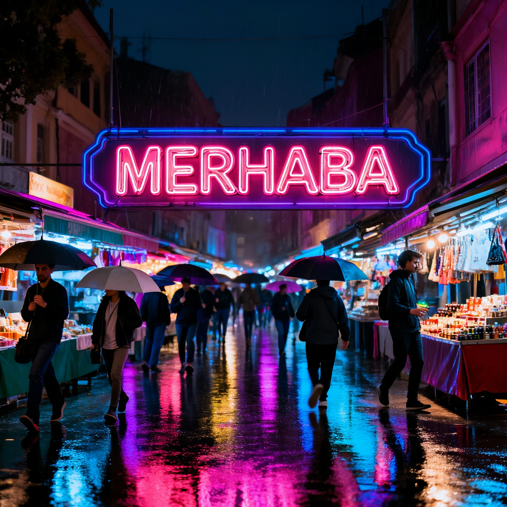
Busy scenes usually break first. A good run keeps depth and readable silhouettes without turning faces into noise.
Test 4: diagram style with labels

Vector style works when lines stay clean. Exact label text still needs a quick edit pass in many cases.
Test 5: embroidered patch (texture + text)

Embroidery pushes the model to keep both texture and letters. This prompt also exposes common face issues like waxy skin and misaligned eyes.
Test 6: tiny engraving on glass (hard)
Tiny text stays hard for most models. Even when the lighting looks right, the letters often melt into the material.
What it does well
- Handles short text better than typical diffusion baselines.
- Keeps a clean look at 1024×1024 without heavy artifacts.
- Scene lighting stays stable across very different prompts.
What still needs work
- Small text and labels still drift.
- Ultra tiny engraving remains unreliable.
- Some prompts can over-smooth fine texture.