SenseNova U1-8B Text-to-Image is built for posters, infographics, and clean UI mockups. The model page at SenseNova U1-8B Text-to-Image makes that clear, and the test set backs it up. Short headlines land. Dense body copy still slips.
Recent posts on Ovis-Image 7B and GPT Image 1.5 pointed at the same gap. Layout has improved fast. Exact text still needs care. This model pushes the structure side harder than most, which makes it useful for first-pass design work.
Quick take
The strongest results came from short, structured prompts. Posters worked best. Infographics and interface mockups also held together well. The model kept the main hierarchy intact and usually placed the biggest text in the right zone. Small lines and lists were less stable. That pattern shows up in every test below.
| Prompt test | Best use | Result |
|---|---|---|
| Espresso poster | Product art | Clear headline, tidy composition, small copy drift |
| Blog scanner infographic | Explainers | Strong flow, readable title, body text weak |
| Festival poster | Event art | Best overall polish and typography |
| Chili oil label | Packaging | Believable shelf look, fine print breaks down |
| AI note-taking landing page | UI mockups | Good layout logic, messy microcopy |
SenseNova U1-8B Text-to-Image test set
- Five prompts, each built to stress a different layout problem.
- One hard case for small text and dense structure.
- One case that leans on poster hierarchy.
- One case that checks product packaging.
- One case that pushes a landing page style frame.
1. Espresso poster
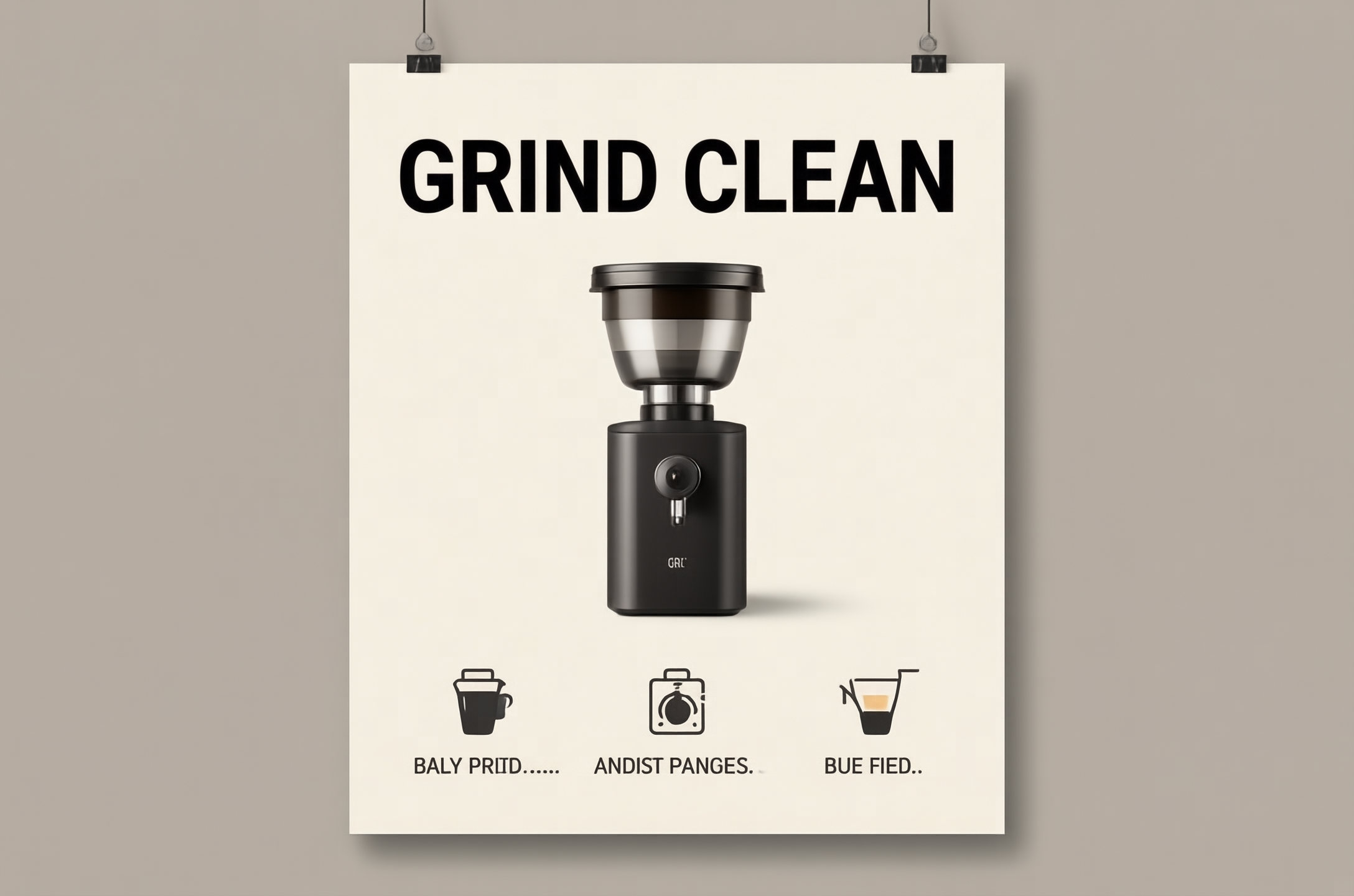
This is the cleanest product-style result in the set. The headline stays sharp, the grinder keeps a solid shape, and the layout reads fast. The small feature line at the bottom is where the model starts to wobble. It invents a few characters and loses some letter shapes. Even so, the frame feels usable. It could work as a first draft for a product launch poster.
2. Blog scanner infographic
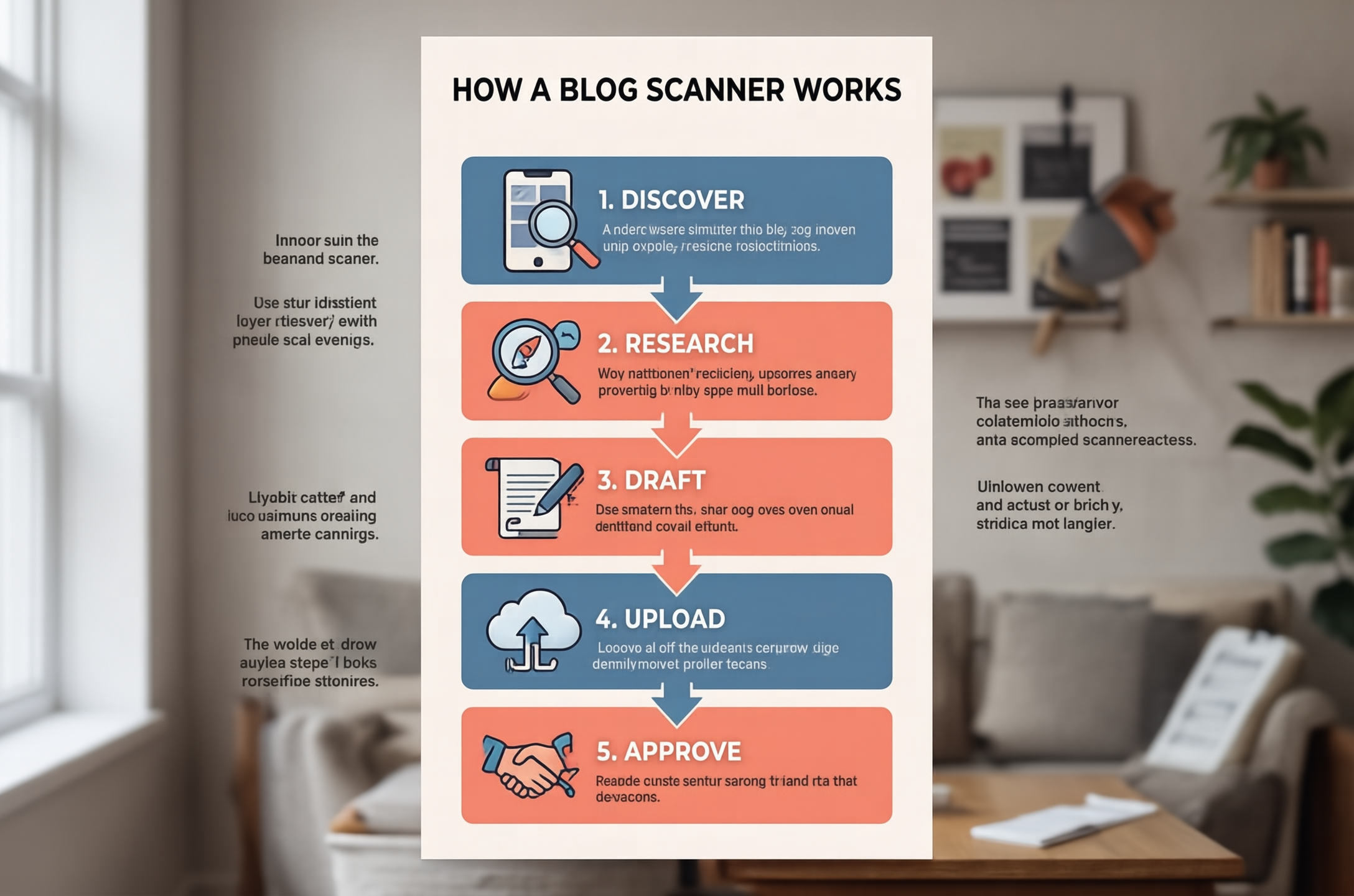
The model understands this structure well. The stacked steps are clear. The arrows point the right way. The color blocks create a nice rhythm. The main weakness is the paragraph copy inside each box. It looks like text, but not quite like real text. That is still a good trade when the goal is a visual explainer rather than a final published infographic.
3. Festival poster
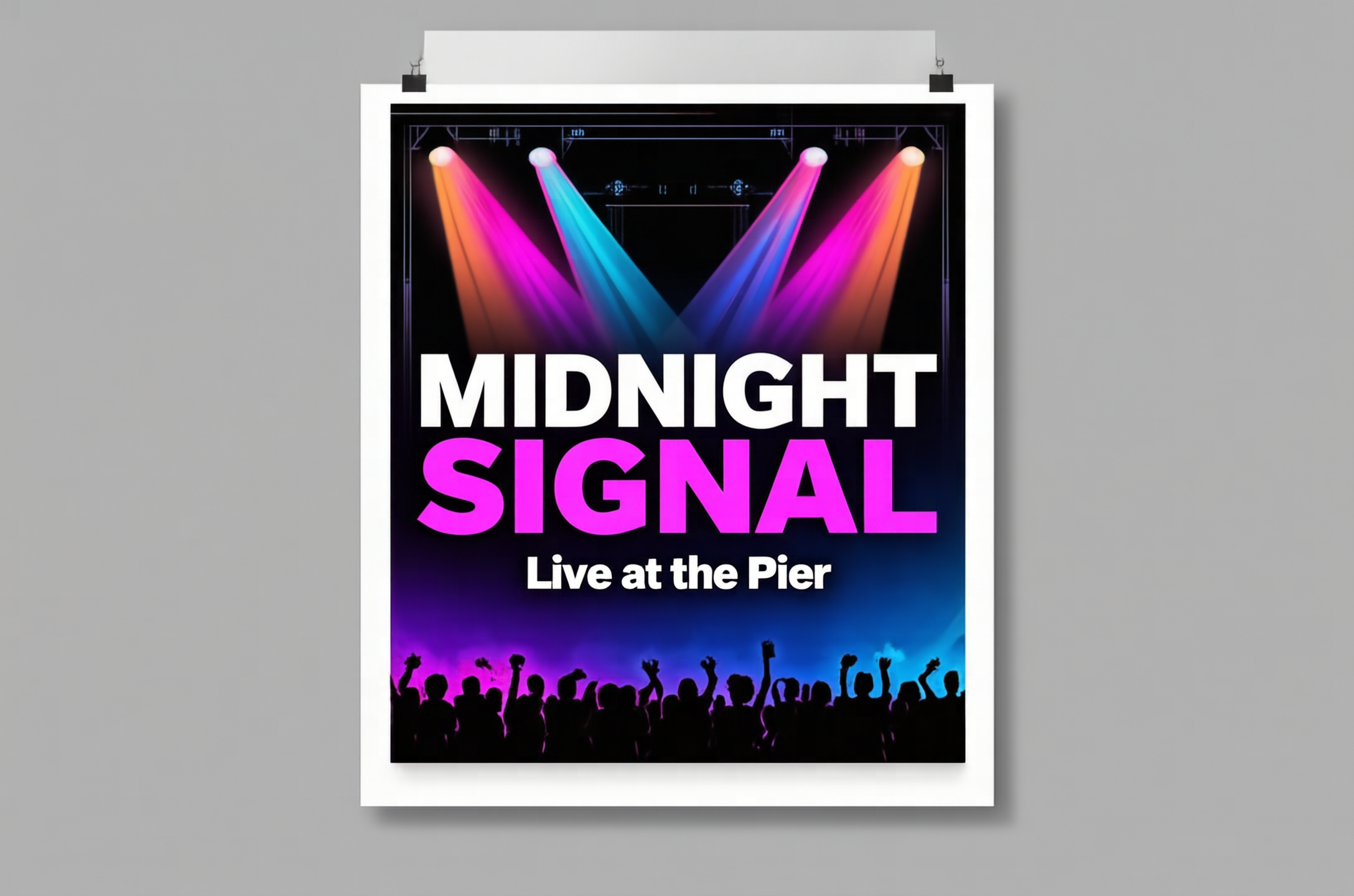
This is the best overall frame in the batch. The title is easy to read. The color contrast works. The crowd silhouette gives the poster a proper base instead of floating text. The model seems most confident when the prompt gives one big headline and one short subhead. That is the sweet spot here. It feels closest to finished artwork, not just a draft.
4. Chili oil label
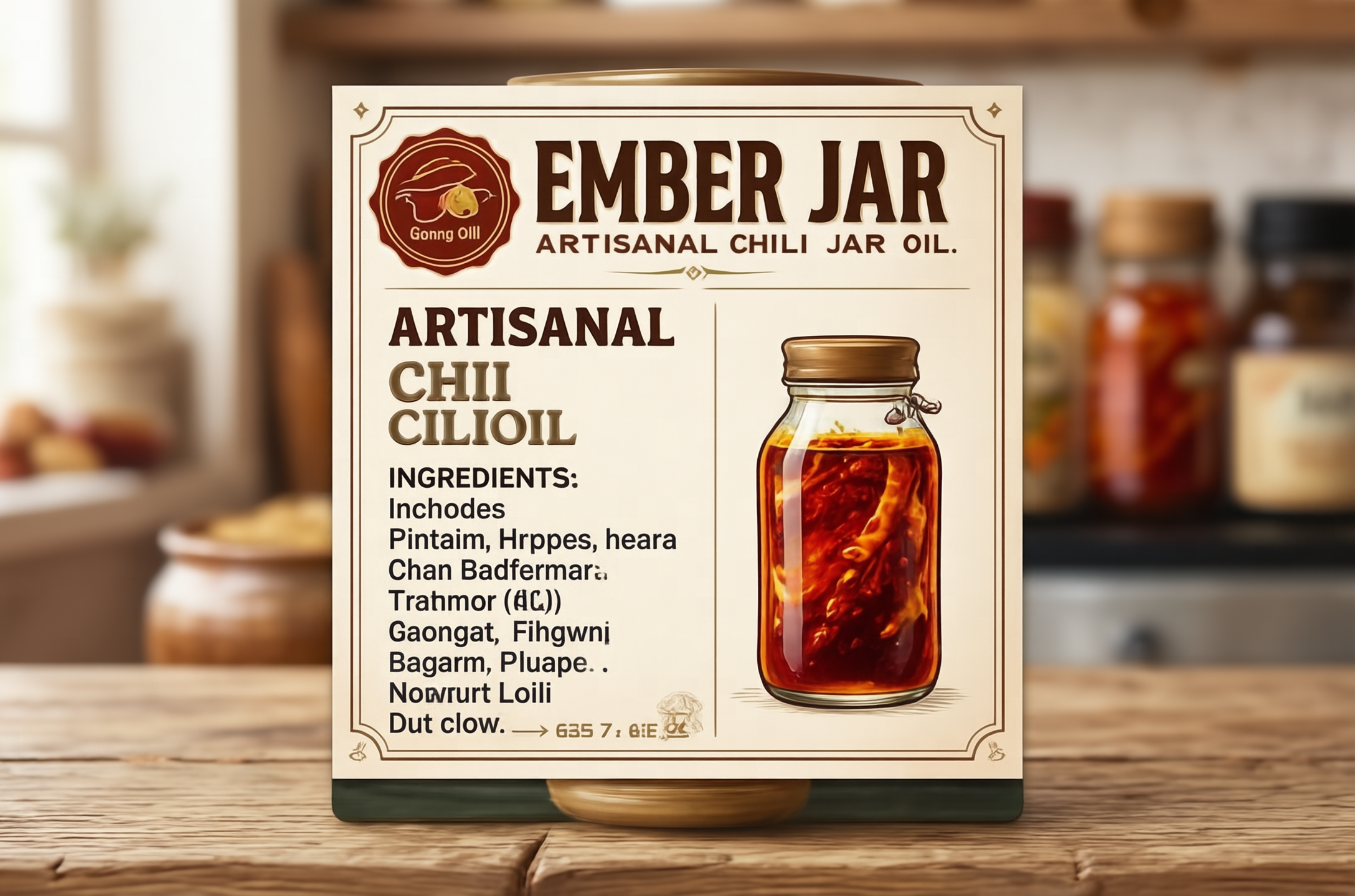
Packaging is another good fit. The jar illustration looks believable. The badge feels like a real shelf label. The layout has enough structure to pass a quick glance test. The ingredients column is where the model falls apart. Tiny lines turn into noisy pseudo-text. For packaging concepts, that is still useful. For anything that needs legal copy, it is not enough.
5. AI note-taking landing page
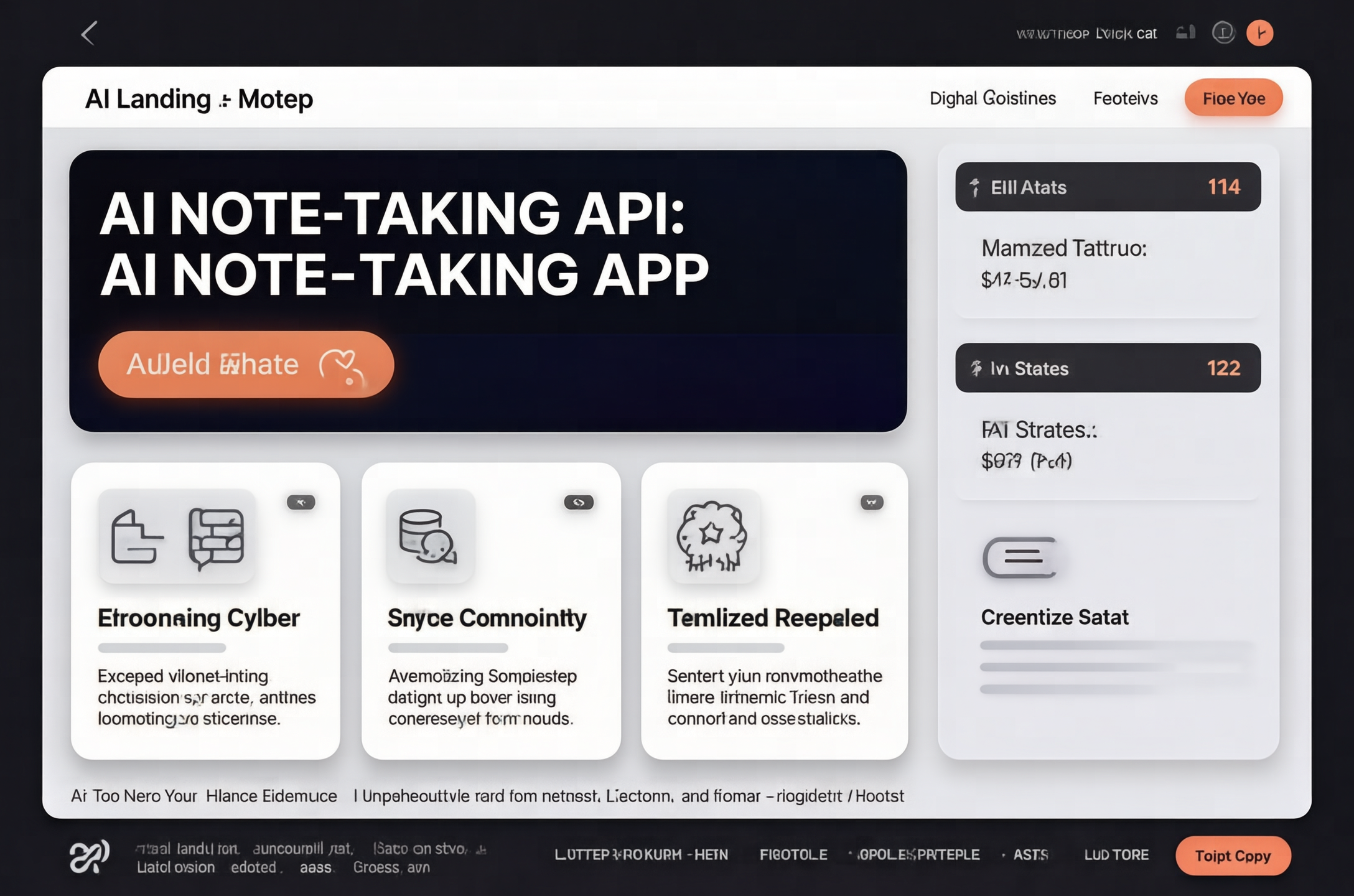
This is the hardest layout test in the set. The model still keeps the main page anatomy in the right place. Hero on top. Cards in the middle. Stats on the side. That is a real strength. The tiny labels and footer text drift, though. It is better at interface rhythm than interface accuracy. That makes it handy for early mockups, pitch decks, and visual direction.
Where this model lands
SenseNova U1-8B Text-to-Image looks strongest when the prompt asks for a poster, label, card, or one-page explainer. It stays weaker on long copy and tiny type. That matches what recent image posts have shown: text rendering keeps getting better, but layout control is still the bigger win. The model feels like a useful designer helper, not a replacement for a layout pass.
The practical read is simple. Use it when the idea needs structure first. Use something else when the job depends on exact copy. For that reason, the model is a solid pick for concept boards, ad drafts, and editorial mockups.
For another structured-layout comparison, see HiDream I1 Full: 5 Prompt Tests for Structured Layouts.
Verdict
SenseNova U1-8B Text-to-Image is worth testing if the goal is a clean first draft. It handles strong headlines and clear composition better than dense body text. The best prompt style is short, specific, and visual. The worst prompt style is paragraph-heavy.
Start with one poster prompt, then move to an infographic or landing page. That gives the fastest read on whether the model fits the job. If the answer needs to be a polished visual with readable small print, the model still needs help. If the answer is a strong layout with a clear headline, it gets there fast.
For technical background, the official SenseNova U1-8B-MoT model card on Hugging Face documents the native multimodal release and its dedicated infographic variant. The official SenseNova-U1 GitHub repository also provides the project’s release and inference materials.