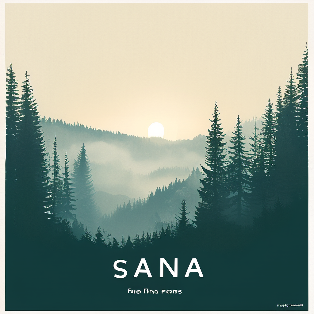
Sana 1600M (1024px): 6 Prompt Tests
Sana is a text-to-image framework built for efficient high-resolution generation. The paper describes design choices like a deep-compression autoencoder and a more efficient attention setup so it can scale to larger sizes while staying fast.
Model link
Test setup
- Model variant: Efficient-Large-Model/Sana_1600M_1024px_BF16_diffusers
- Size: 1024×1024
- Steps: 22 (Test 1 used 25)
- Guidance scale: 3.5
- Negative prompt: “bad, ugly, low quality, watermark, blurry, deformed”
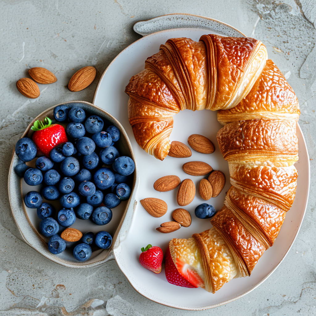
Test 1: Studio product shot + simple label text
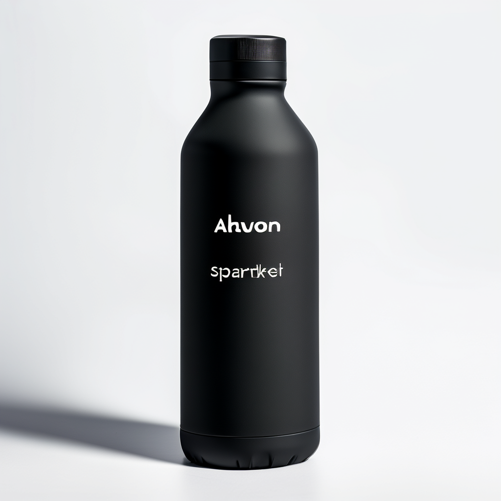
The lighting and reflections land well for a clean product look. The label placement looks plausible, but the text itself does not stay perfectly crisp. For branding work, expect to add text in post.
Test 2: Pixel art scene (style control)

This prompt checks whether the model can lock into a constrained style. The result reads as retro pixel art with clean shapes and a coherent palette. Small details can still blur into painterly texture if the prompt asks for too much realism.
Test 3: Double exposure portrait (composition and blending)
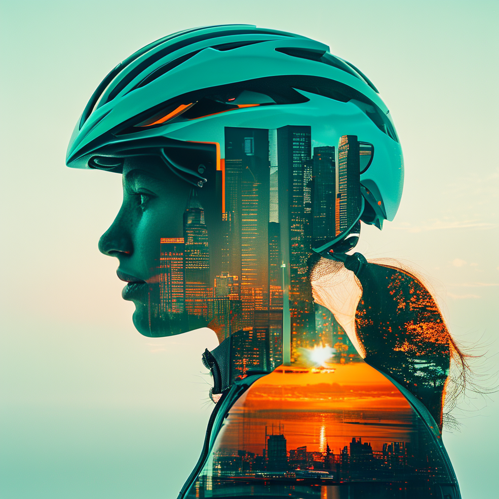
Double exposure stresses masking and edge handling. The silhouette stays readable and the skyline blend looks intentional. This type of prompt benefits from simple subject shapes and a strong color grade callout.
Test 4: Minimal movie poster + typography
The layout and mood look poster-like, but the letters may come out imperfect or stylized. If the goal is production typography, generate the background first, then set type with a design tool.
Test 5: Counting + exact object list
This checks if the model respects exact counts. The image often gets close, but it can still miss the exact number when objects overlap or look similar. Keep objects large and separated if counting matters.
Test 6: Cinematic wildlife photo (texture + lighting)
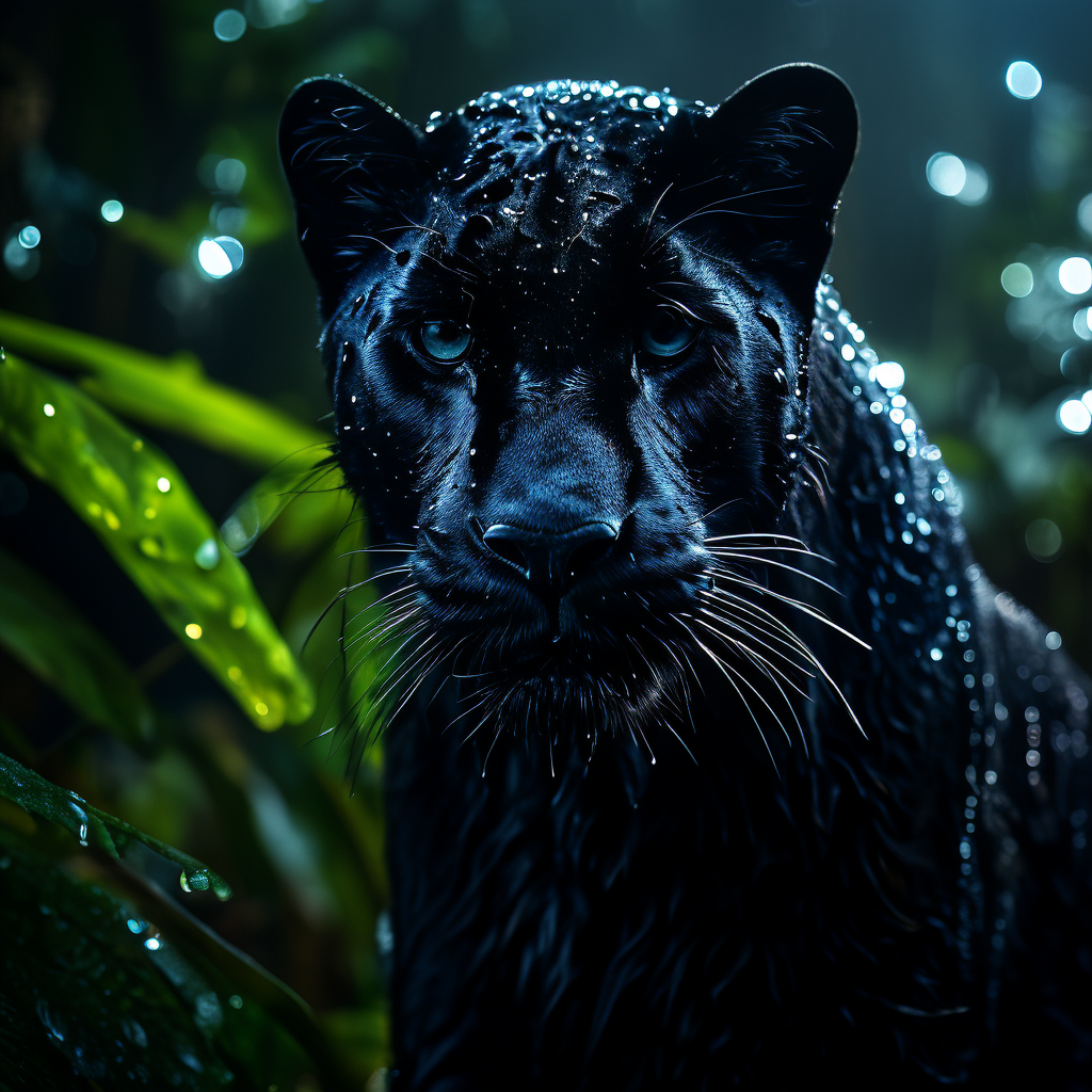
This is a good fit for Sana: a clear subject, strong lighting direction, and a tight scene. Fur texture and rim light read well, and the background stays soft enough to keep focus on the subject.
Quick takeaways
| What was tested | What worked | What to watch |
|---|---|---|
| Product lighting | Clean studio reflections | Text on labels needs cleanup |
| Style control (pixel art) | Strong palette and shapes | Over-detailed prompts can soften edges |
| Poster composition | Readable layout and mood | Legible typography remains hard |
| Exact counting | Close on simple layouts | Small repeated objects drift in count |
Where Sana fits
- Fast iteration on 1024px concepts with solid style control
- Background plates for posters, ads, and product comps
- High-resolution pipelines when paired with post tools for text and strict counts