Stable Diffusion 3.5 Large: a 1024px test of text, placement, light, and mood
Stable Diffusion 3.5 Large prompt tests are more useful when the prompts ask for things that can be checked at a glance. This six-image set was built to test exact text, product surfaces, object order, directional portrait lighting, geometric style, and a simple surreal scene. These are not benchmark scores. They are six fixed 1024 x 1024 outputs that show where a general-purpose image model holds together and where an art director still needs to intervene.
What this Stable Diffusion 3.5 Large test set checks
Stable Diffusion 3.5 Large is Stability AI’s 8.1B-parameter MMDiT text-to-image model, aimed at professional work around one megapixel. The model card describes improved typography, image quality, prompt understanding, and efficiency. That makes it sensible to test more than a scenic prompt. A good review needs requests that can fail in visible, useful ways: a sign must spell correctly, three objects must stay in order, and a lighting instruction must land on the named sides of a face.
All six images used the same Wiro model endpoint: Stable Diffusion 3.5 Large on Wiro. The fixed settings were 1024 x 1024 pixels, 28 inference steps, guidance scale 7.0, FlowMatchEulerDiscreteScheduler, and the negative prompt “bad quality, lowres, blurry, watermark.” The original runs did not record seeds, so this page does not present them as reproducible seed-matched comparisons.
For background, see the Stable Diffusion 3.5 Large model card on Hugging Face and Stability AI’s SD 3.5 announcement. Both explain the model family and its intended use. They do not make the individual images below more accurate; the evidence here is the output itself.
What each output actually shows
1. Storefront typography: a clear pass at display scale
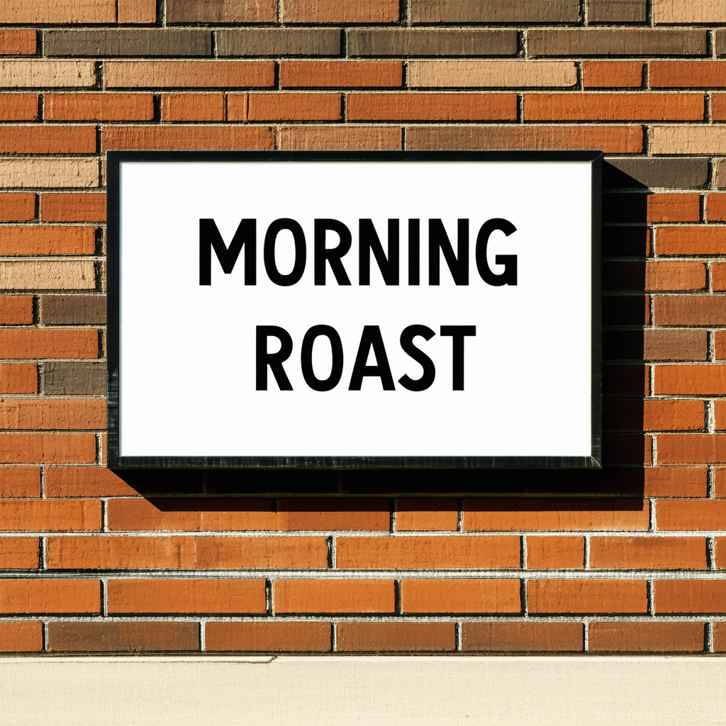
The requested words, MORNING ROAST, are readable and centered in two lines. Letter shapes look stable enough for a large sign, and the black frame, brick texture, and hard sunlight make a convincing storefront photo. This is the strongest text result in the set. It still should not be treated as production typography: the image contains no small supporting copy, where text models often fail. Use this model for a concept image with a short headline, then typeset final marketing text separately.
2. Perfume bottle: strong material rendering, weak fine label detail
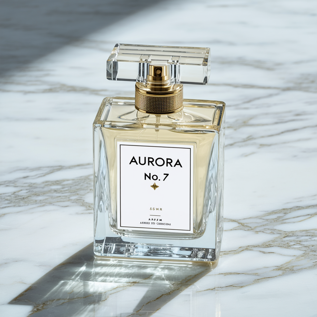
The bottle has convincing thick glass, liquid tint, metal hardware, and a long soft-edged shadow on marble. AURORA and No. 7 are legible, which is useful. The tiny line near the base of the label dissolves into nonsense characters, and the extra mark below the name was not requested. This is a good example of the difference between a plausible product visual and a usable package asset. Pick SD 3.5 Large for a mood board, ad background, or unbranded packshot. For a regulated label or SKU copy, composite the real label after generation.
3. Three-object placement: the requested order survives
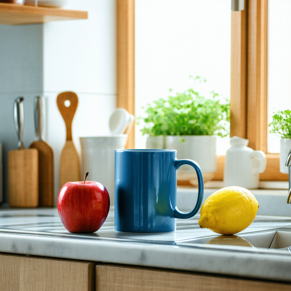
The red apple sits on the left, the blue mug occupies the center, and the yellow lemon sits on the right. That sounds basic, but three-object prompts reveal whether a model swaps attributes as it fills in a scene. Here, color and order both hold. The kitchen props and plants add visual context without hiding the test objects. This is a practical strength for simple ecommerce compositions and editorial still lifes. If the order matters more than atmosphere, keep the scene this short and avoid adding a second list of objects.
4. Portrait lighting: good face detail, incomplete rim-light separation
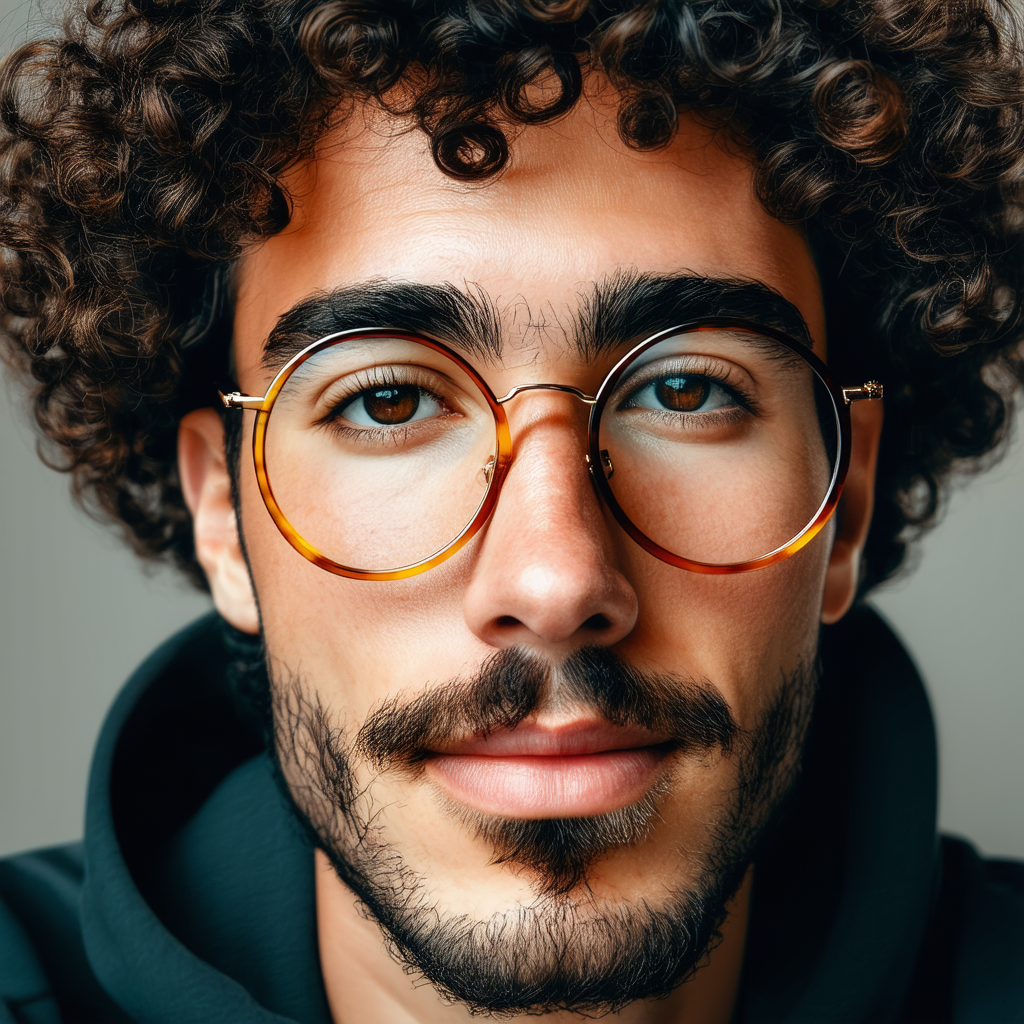
The face, curls, glasses, beard, and pores are sharply rendered. Warm light is visible across the left side of the face, while the right edge does not separate as clearly with a cool rim light as the prompt asks. There is also a small faint artifact between the brows. The result works as a close portrait, but it does not fully prove precise two-color lighting control. Use a short lighting recipe and one subject. For a campaign shot where lighting must match a real product photo, generate options and select rather than expect one deterministic pass.
5. Desk scene: clean rendering, but not a true isometric view

The requested objects are present: laptop, notebook, mug, lamp, and desk. Surfaces are crisp and the object spacing is tidy. Yet the camera sits in a conventional elevated perspective, not an isometric projection. The lamp and laptop also read more like a photoreal product scene than a 3D render. That distinction matters for UI assets, game icons, and technical illustrations. Choose this model when clean object arrangements matter more than strict projection. For an isometric deliverable, use a reference image, a model designed for layout control, or redraw the chosen result.
6. Surreal illustration: coherent central subject and palette
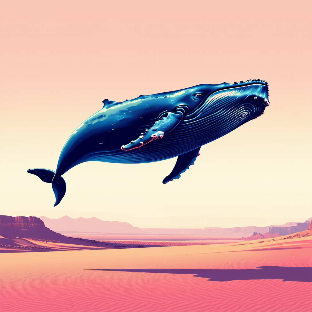
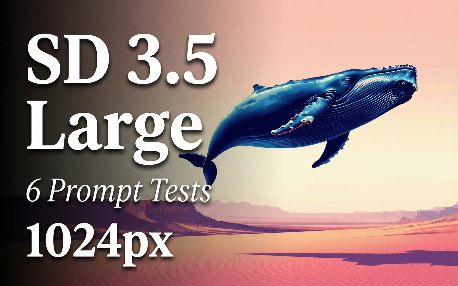
The output delivers a large blue whale suspended above a pastel desert, with a clear horizon and a long shadow below. The composition is simple, readable, and closer to the requested mood than the more technical tests. The whale’s small pink details and the highly smooth sky show the model’s stylization, but they do not break the image. This is the right kind of brief for SD 3.5 Large: one dominant subject, a restrained palette, and a clear spatial relationship.
Parameters, run time, and cost on Wiro
The parameters above are the only settings retained with these six published outputs. Wiro’s model documentation shows 1024 x 1024 as the default size, with 30 steps and guidance 7.0 as defaults; this test used 28 steps. The documentation’s completed example task reports 6.0 seconds elapsed. That example is useful as a reference, not a promised latency for these six historical images: queue time, hardware assignment, scheduler choice, and prompt processing can change a real run.
No per-output cost or elapsed time was stored with the six original runs, and the model documentation does not publish a fixed price for this configuration. Rather than attach a made-up number, this review leaves cost as unreported. Check the task record after a live Wiro run for the actual charge and elapsed time attached to that output.
When to pick Stable Diffusion 3.5 Large
Pick SD 3.5 Large when the job needs a high-resolution square concept image with a clear subject, controlled palette, plausible materials, or a small number of positioned objects. It performed well on the storefront headline, glass bottle, ordered still life, detailed portrait, and whale scene. It is less dependable for fine print, strict isometric geometry, and lighting instructions that need to be exact at the edge of a subject.
For layout-heavy images, compare the approach with GPT Image 1.5 clean layout tests, HiDream I1 Full structured layout tests, and SenseNova U1-8B layout tests. The practical choice depends on the failure you can tolerate. If a beautiful scene can be selected from several options, SD 3.5 Large is a strong fit. If every line of text, camera angle, or product label must be exact, generate the image for its visual base and finish the controlled elements in a design tool.
Try the model
Run Stable Diffusion 3.5 Large on Wiro with the same 1024px setup, then inspect the task record for its actual output time and cost.