Nano Banana product prompts work best when they describe the product, the setting, the camera language and the detail that matters most. Nano Banana 2.1 Advanced has room for that level of direction. It can generate at 1K, 2K or 4K, use several reference images, and accepts a higher thinking setting for crowded scenes. This guide uses eight fresh 2K tests aimed at product teams, designers and marketers who need more than a pretty object on a blank backdrop.
How to use Nano Banana product prompts
Each test starts with a clear subject, then adds material cues, light, composition and a commercial use case. That sequence is more useful than a pile of style words. It tells the model what must stay readable and what can remain atmospheric. The model page on Wiro lists 2K output, multiple aspect ratios and optional image inputs, so these text-only prompts are a good starting point rather than the only way to work.
Use the prompts as briefs, not fixed formulas. Keep a product name or headline short. Put it near the front of the label instruction. Then run a second pass if the first image gets the lighting right but misses a small line of copy. Google also documents known limits around tiny text, long paragraphs and occasional spatial confusion in its Nano Banana 2.1 model card.
8 Nano Banana product prompts tested
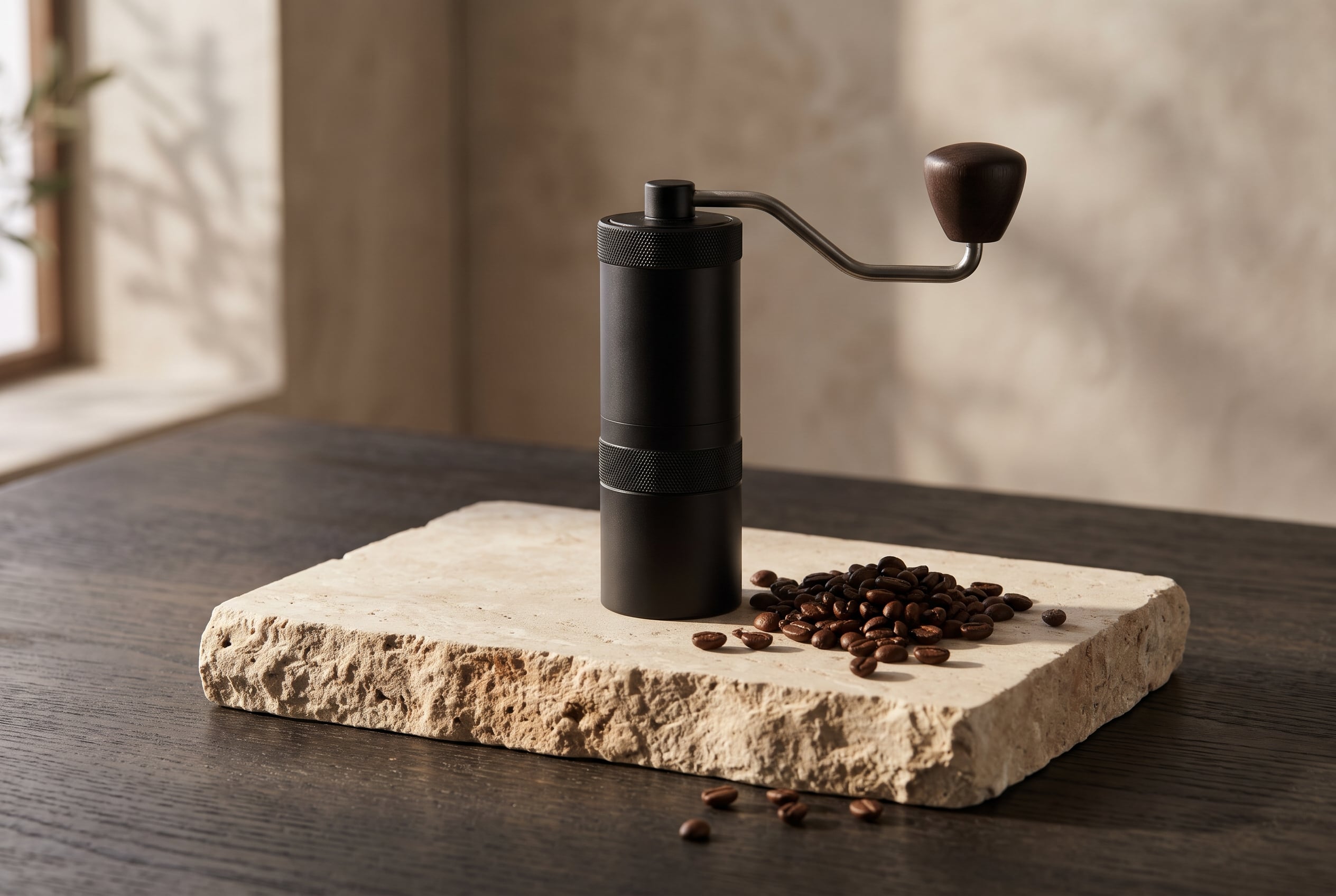
1. Coffee grinder with material detail
This prompt asks for matte metal, stone and beans without turning the frame into a generic kitchen shot. The low side light gives the grinder a clear silhouette while the limestone keeps the image quiet.
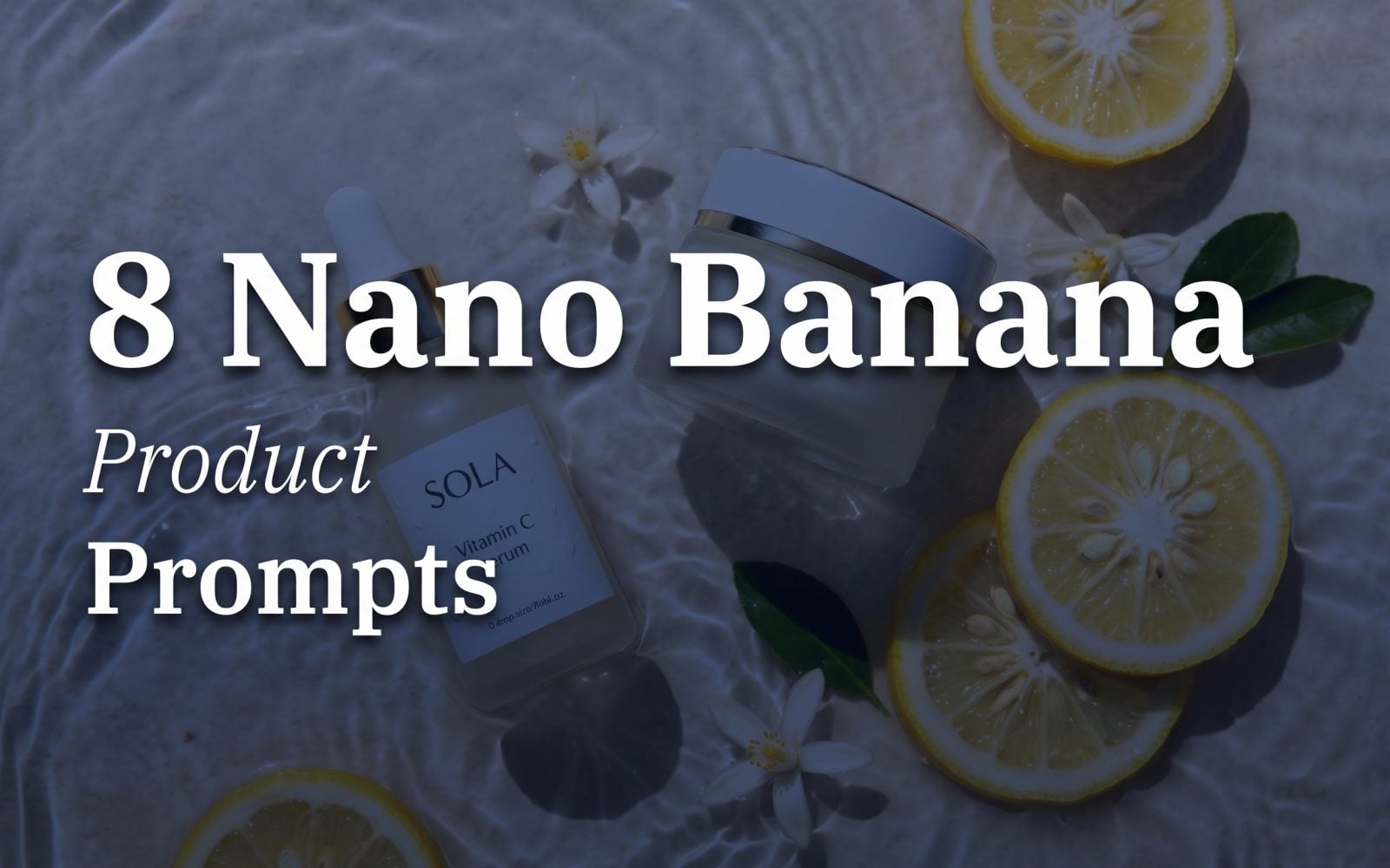
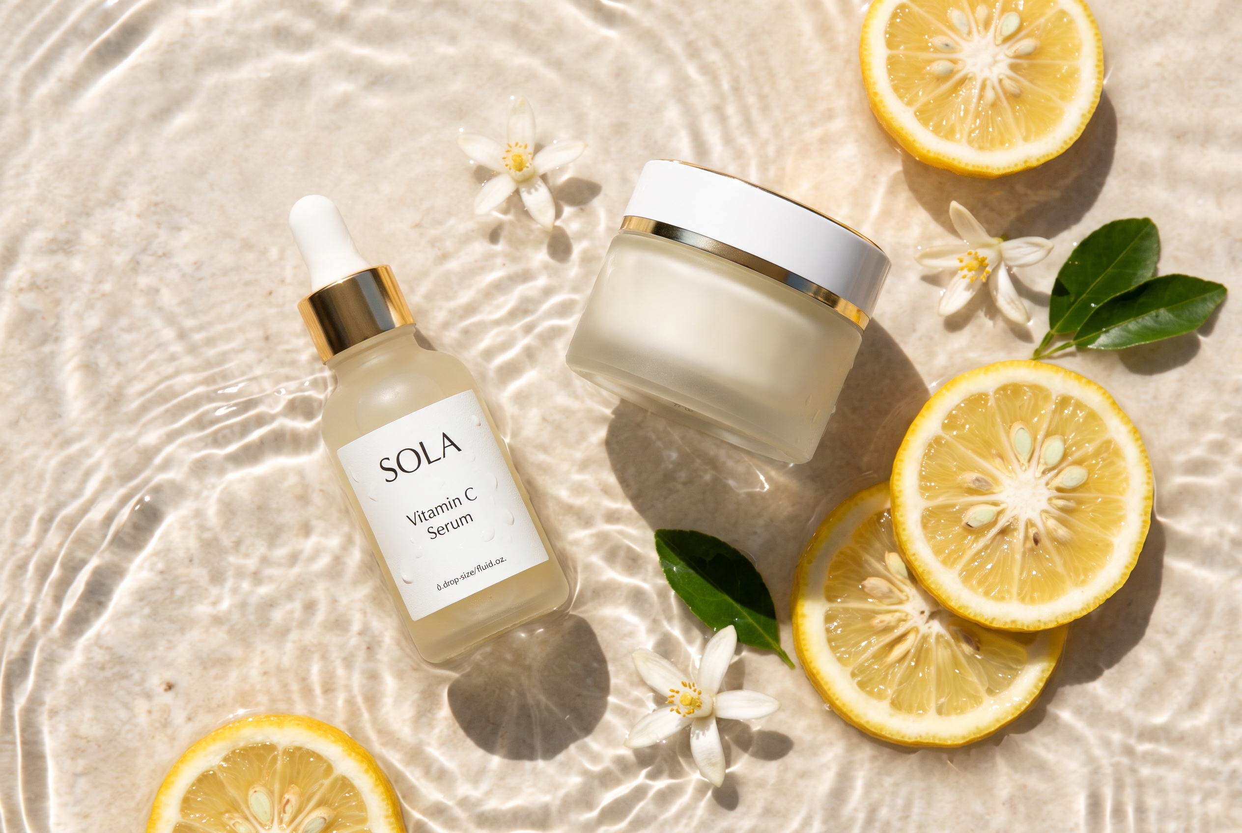
2. Citrus skincare with controlled label copy
Skincare needs clean surfaces and believable reflections. The phrase readable small black type deliberately pushes the model on text while the water and yuzu add a color story. For a production label, treat the generated wording as a visual test and add final legal copy in design software.
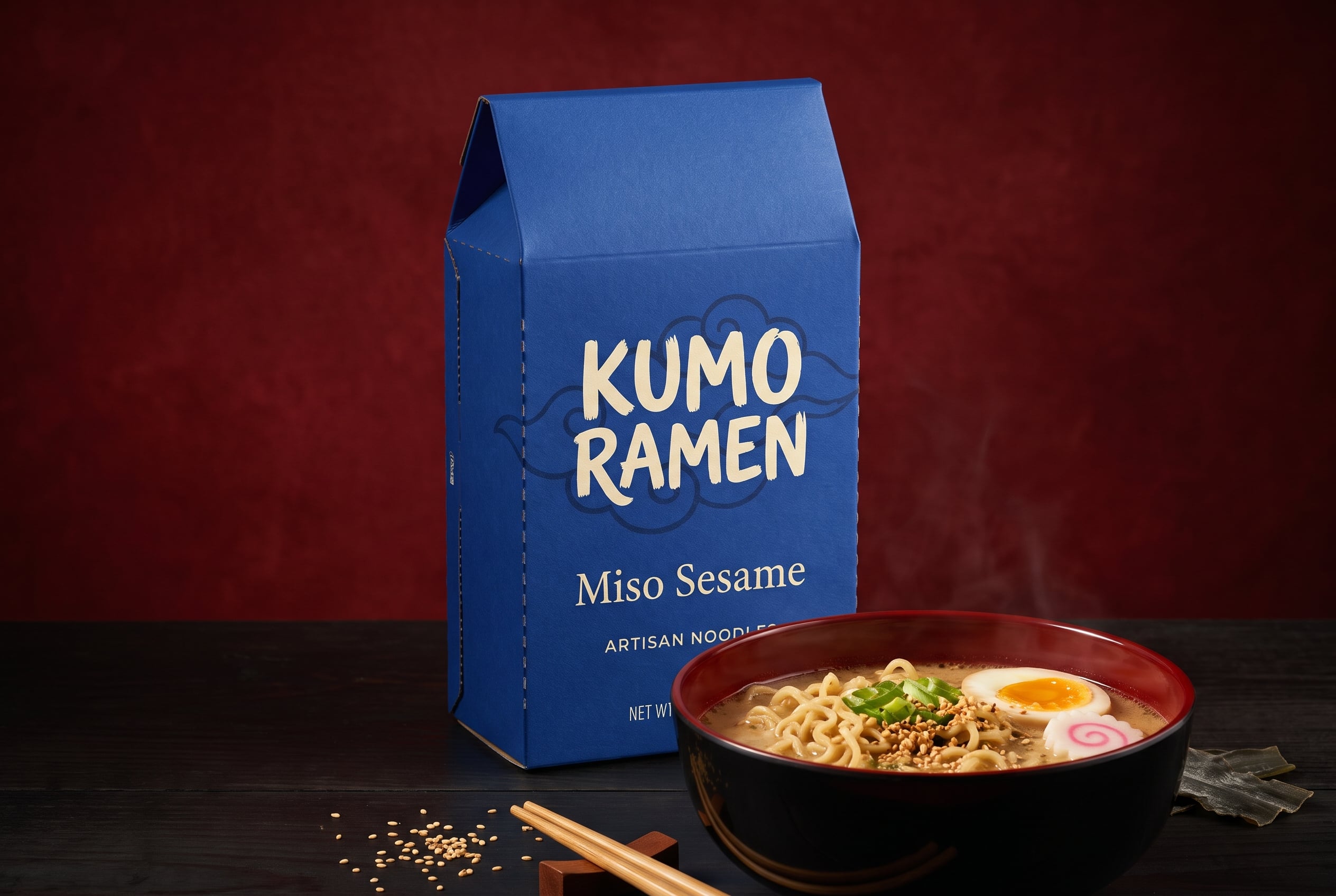
3. Shelf-ready ramen packaging
Package work benefits from a front-facing instruction, a limited palette and a concrete hierarchy. The carton remains the lead object. The bowl supports the food cue instead of stealing attention.
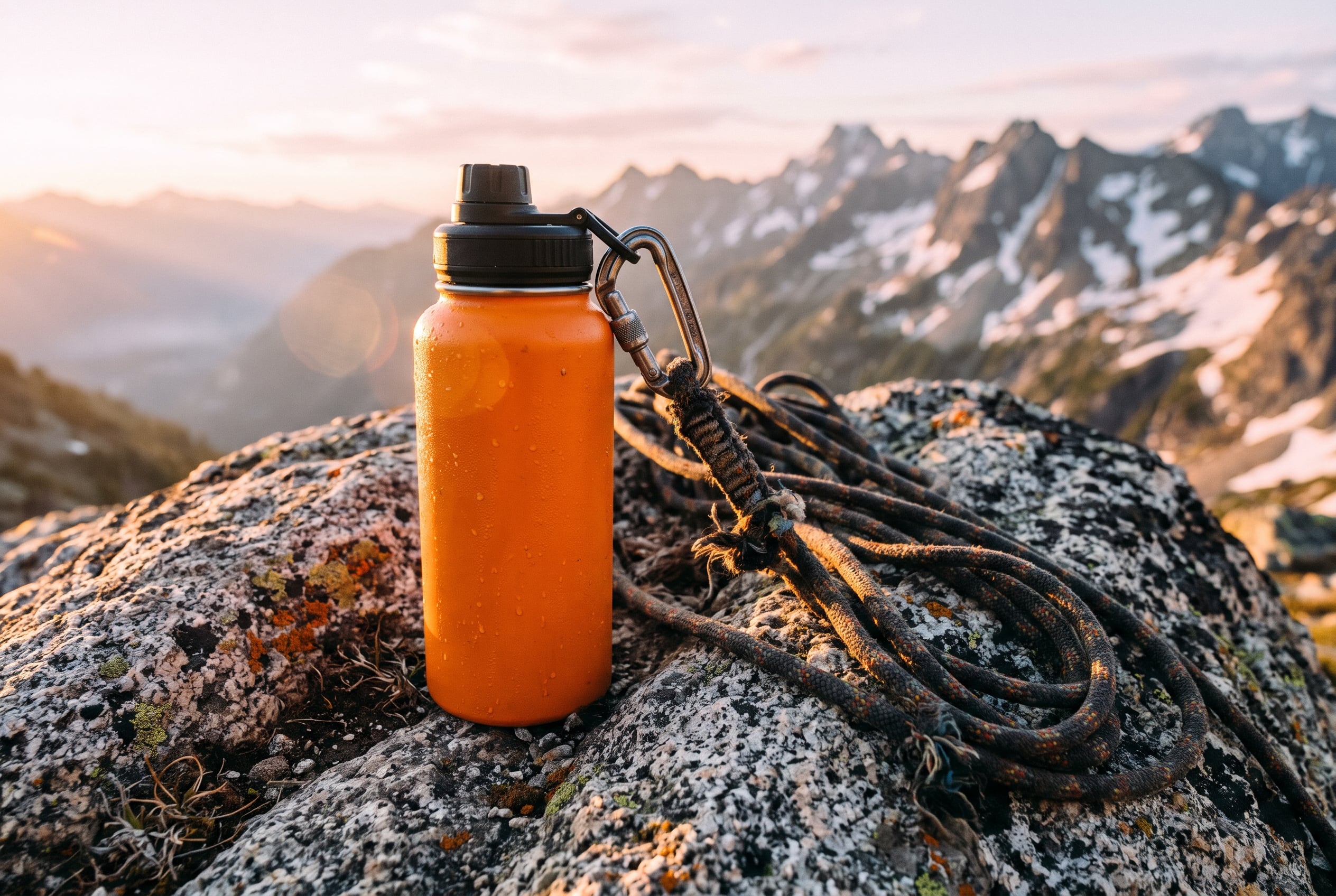
4. Outdoor bottle with campaign energy
For sports goods, location does part of the selling. The rope, granite and condensation explain use without placing a person in the frame. It is a useful format for web headers and paid social crops.
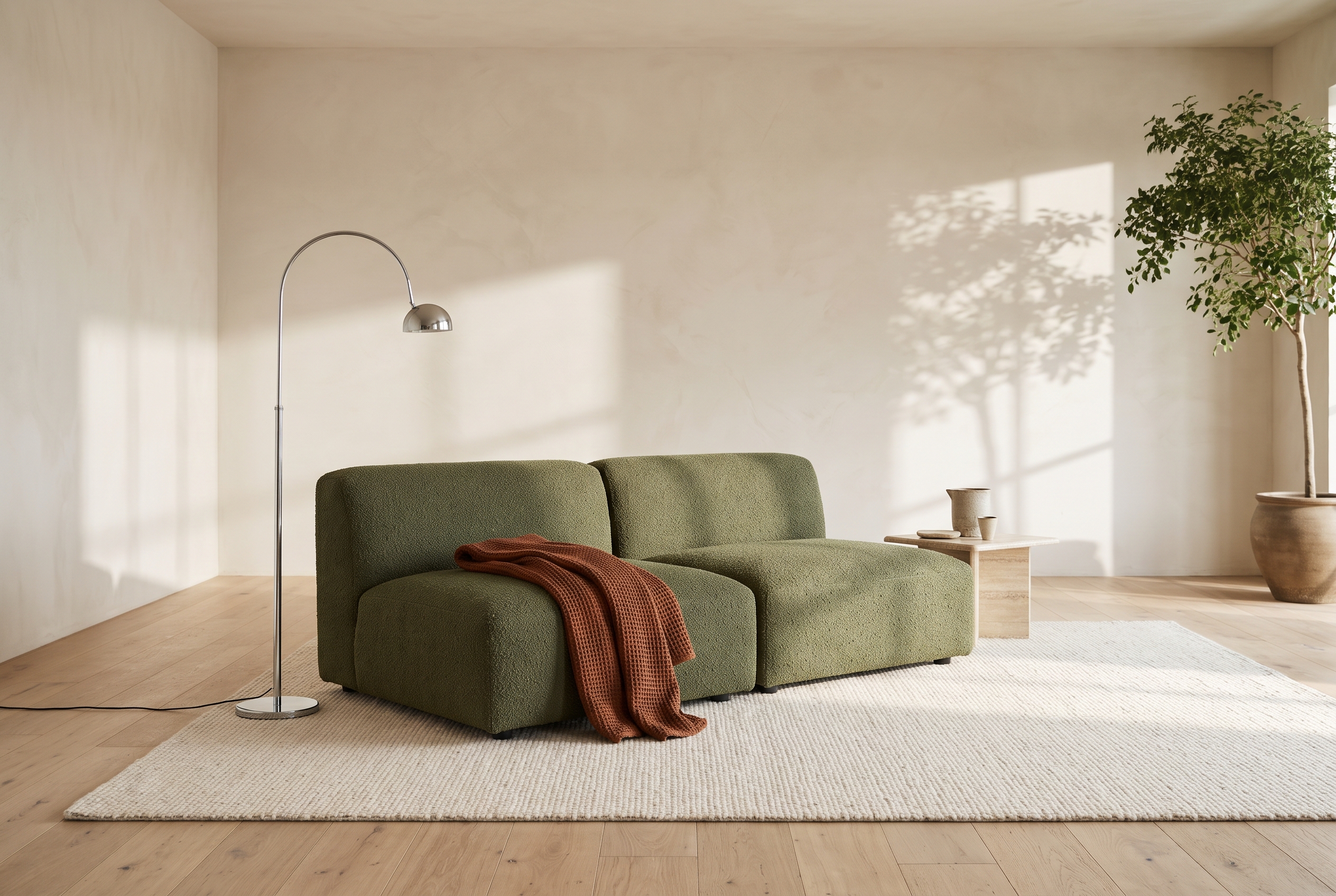
5. Lounge chair in an architectural setting
Furniture images often look better when the room gives scale but stays restrained. The plaster, chrome and rust throw set the scene while the chair still carries the frame. Ask for fabric weave when the surface finish matters.
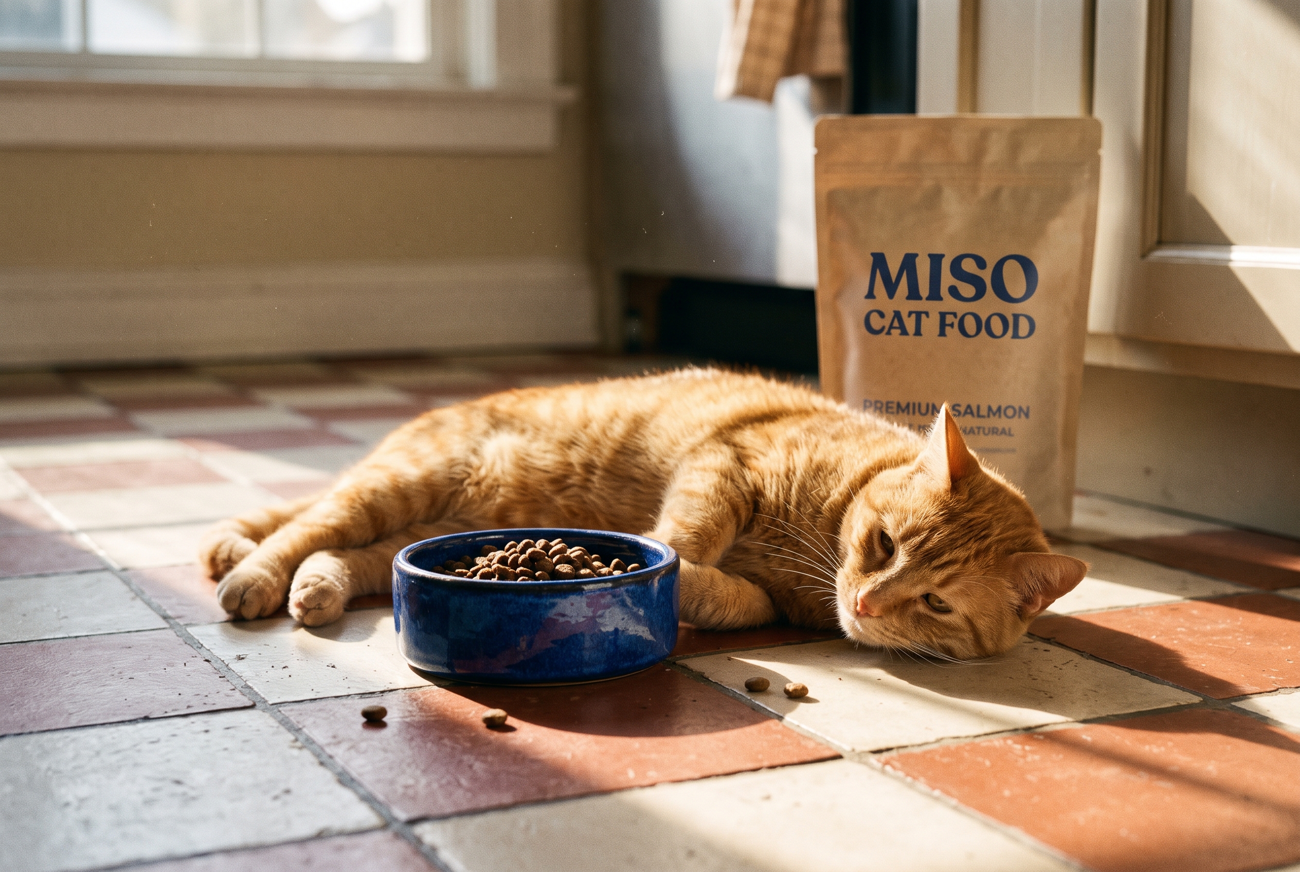
6. Cat food that keeps the animal natural
Animal product scenes can fail when the pet becomes too posed. Here the instruction puts the pouch in the background and calls for a relaxed cat. That gives the image a more usable editorial feel while retaining a readable product signal.
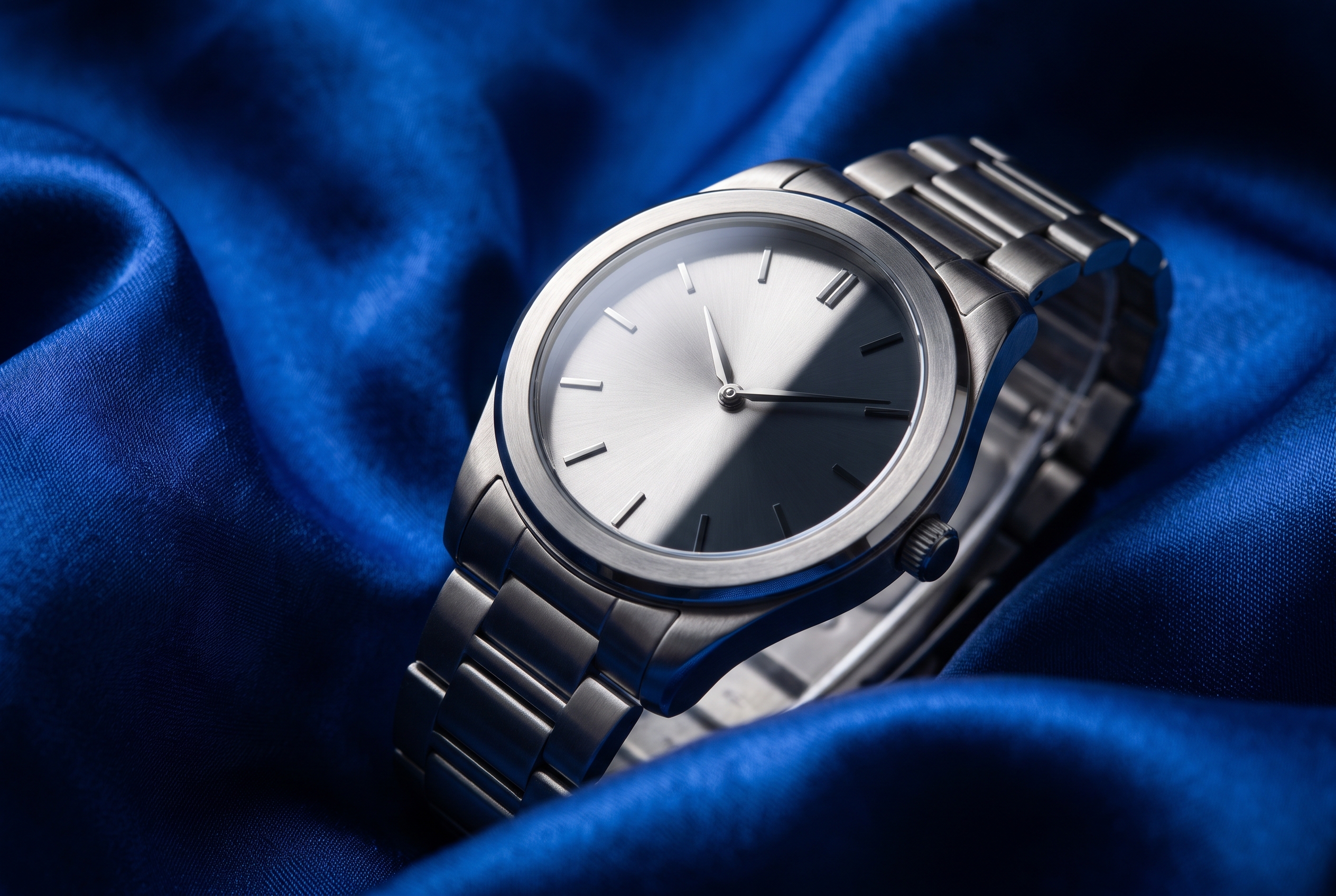
7. Wristwatch macro with graphic light
A tight prop list makes a luxury image easier to control. The cobalt silk adds contrast, while the shadow and 10:10 dial are focused checks for precision. Avoid a real brand name when testing a concept.
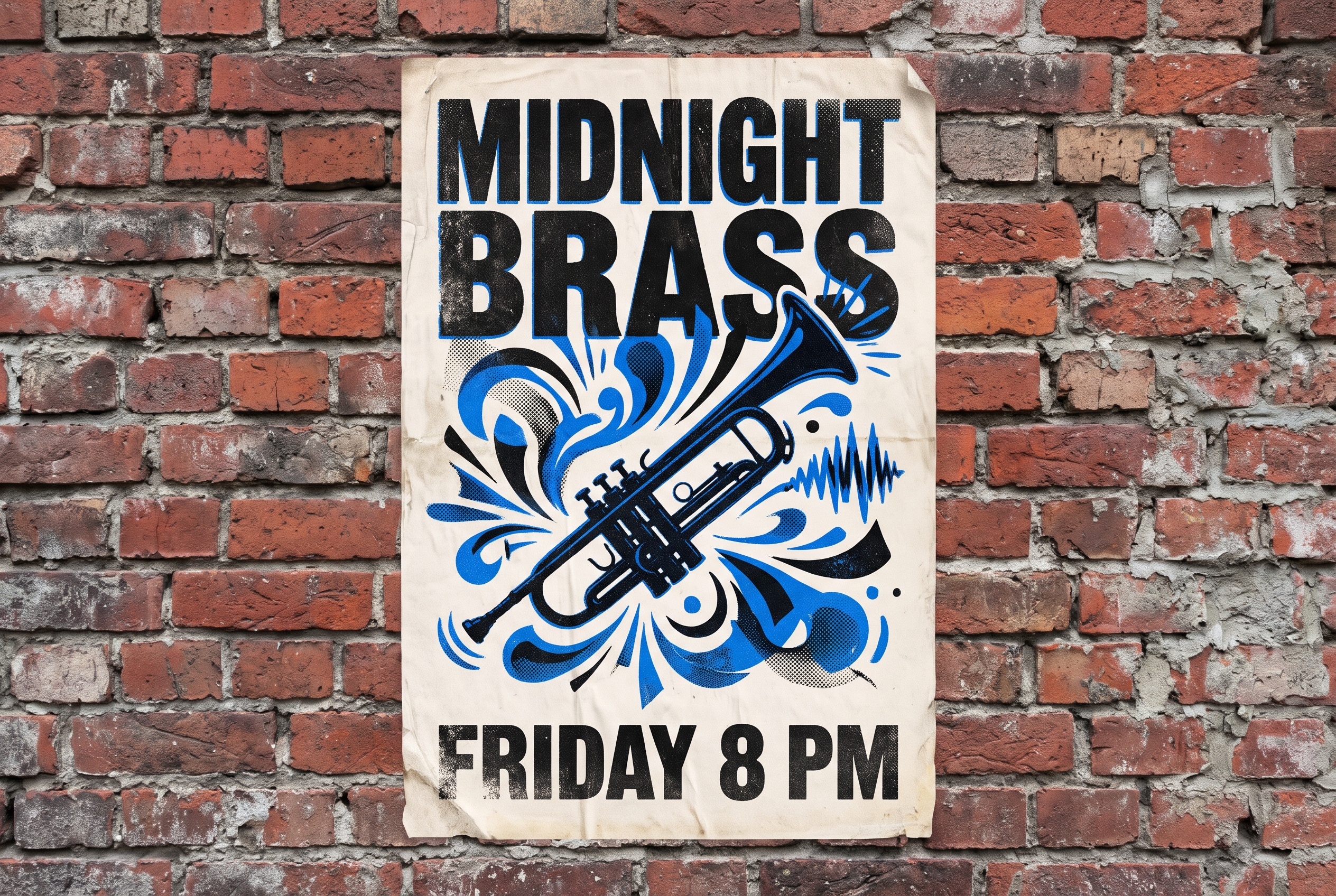
8. Poster typography as a hard prompt
This is the hard test. It asks for exact headline copy, a supporting line and controlled empty space. The result is useful for judging layout and visual hierarchy, but it should not replace a final typeset poster. Small changes in text are still possible.
What worked and what to watch
These Nano Banana product prompts produced stronger images when the request named one visual priority. For the grinder, that priority was surface texture. For the ramen carton, it was label hierarchy. For the poster, it was readable type. The rest of the prompt supports that main job.
The model is a good fit for product concepts, mockups and campaign directions where art direction matters. Start at 2K for a practical balance of detail and speed. Use 3:2 for a web hero or product story. Move to 4K only when the image will be reviewed closely or printed large. If a scene needs an exact object, upload a reference image and describe what must remain unchanged.
For final brand work, check spelling, anatomy, small type and left-right placement before publishing. The fastest workflow is usually a strong first prompt, one targeted revision and a final human design pass. Try the model on Wiro with one product brief that has a clear hero object and a simple visual goal.