FLUX.2 Klein 4B product ads can look polished fast when the prompt stays focused on one hero product, one lighting idea, and one clear surface or backdrop. This run used the non-base FLUX.2 Klein 4B model for 15 ad-style prompts built around commercial product photography, not text rendering. That matters because the older product marketing prompt post already covered labels, posters, and UI layouts. This one is about cleaner hero shots.
The short version is simple. FLUX.2 Klein 4B works best when the product stays centered and the art direction is easy to read in one glance. It does well with tech, beauty, food, and watch-style lighting. The harder prompts were the ones that needed complex splashes, fabric motion, or too many props at once.
For official background on the FLUX model family, Black Forest Labs is the source to watch. For a side-by-side look at the smaller and larger base variants, the earlier 4B vs 9B comparison is still useful.
Test setup
- Model: black-forest-labs/flux-2-klein-4b
- Resolution: 1024 x 1024
- Steps: 4
- Scale: 1
- Samples: 1 per prompt
- Seed range: 201 to 215
The prompt pattern stayed consistent across the whole run. Each one named the product first, then the surface, then the lighting, then the mood. That structure gave the model less room to drift.
Prompts 1 to 5
1) Lime soda can on crushed ice
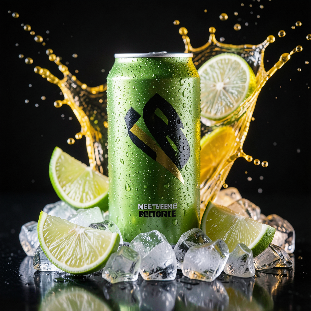
This is a strong opener because the scene is easy to parse. The product, droplets, and citrus color contrast all read fast. Beverage ads are a good fit for this model.
2) Amber perfume on volcanic stone
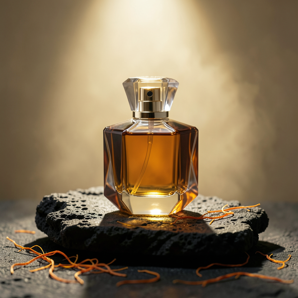
Perfume is another natural lane. The model handles moody reflections well when the bottle shape is simple and the prop count stays low.
3) White running shoe with blue powder burst
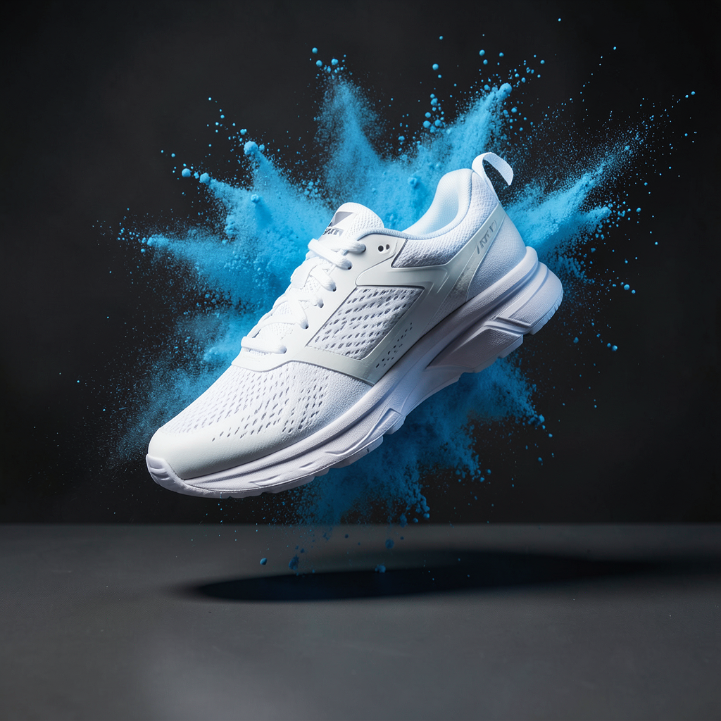
This prompt pushes motion more than the first two. The result still feels ad-ready, but the powder shape matters a lot. A weaker run here would look fake fast.
4) Frosted serum bottle in a water ring
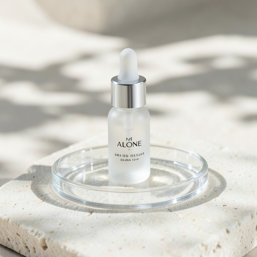
Beauty prompts with soft daylight work well. The model keeps a clean premium feel when the palette stays narrow and the materials are easy to separate.
5) Matte black headphones on cobalt acrylic
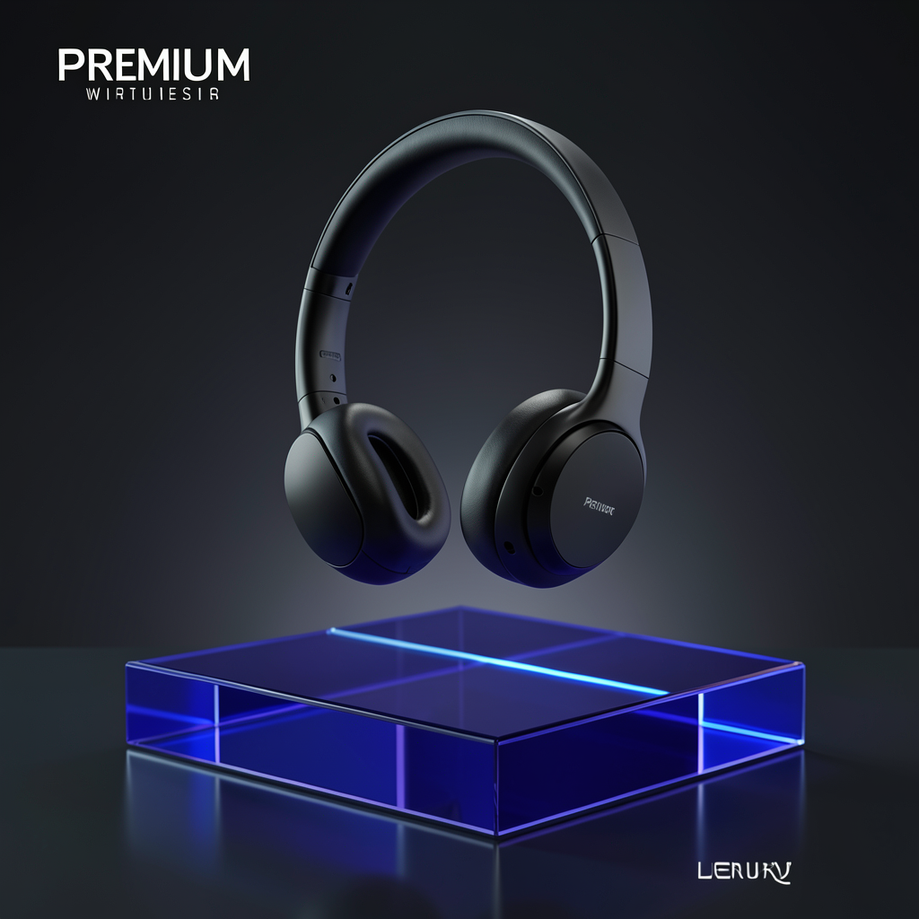
This was one of the cleanest images in the batch. The subject separation is strong, the background stays usable, and the lighting feels like a real campaign concept.
Prompts 6 to 10
6) Dark chocolate with cocoa dust
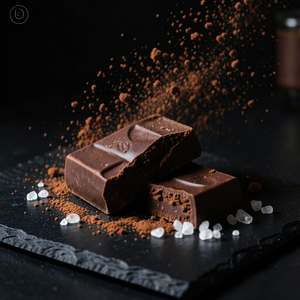
Food ads look good when texture is the point. The model has enough realism here to sell crumbs, powder, and surface detail without overcomplicating the scene.
7) Chrome espresso machine in a dark kitchen
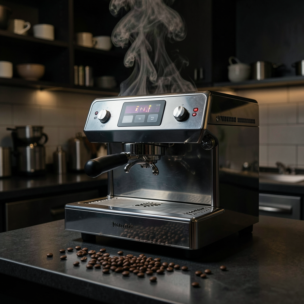
This is another standout. Metal reflections and steam can break quickly, but this setup gives the model enough structure to keep the machine readable.
8) Sunscreen tube on beach sand
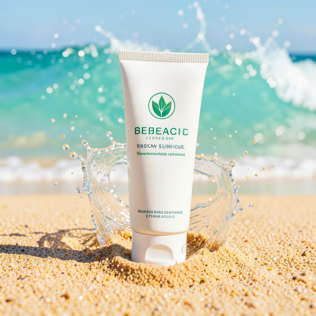
The summer look lands, but water effects are a little harder to control than stone or acrylic surfaces. This kind of shot usually benefits from a few reruns.
9) Steel watch on wet slate
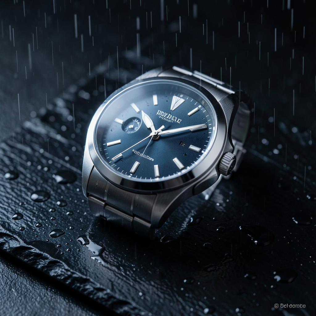
Watch prompts are a good stress test for edges and reflections. This result holds up well and feels close to a real luxury ad mockup.
10) Smoked glass candle jar at dawn
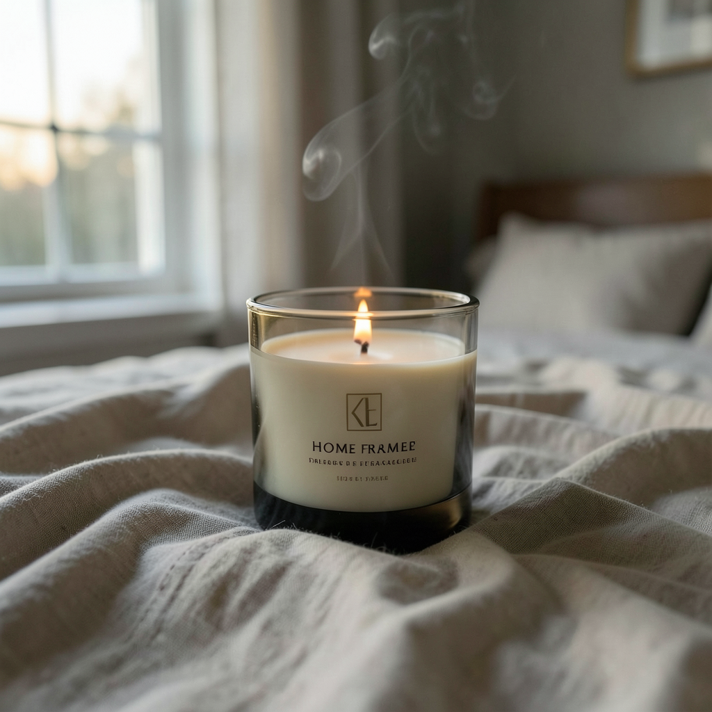
This is softer than the tech and sports images, but it still works. The fabric folds and smoke add atmosphere without taking attention away from the jar.
Prompts 11 to 15
11) Fitness supplement jar with chalk dust
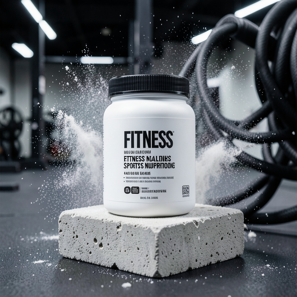
The contrast works well here. The jump rope stays secondary, which is exactly what a good hero prompt should force.
12) Deep red lipstick with a curved smear
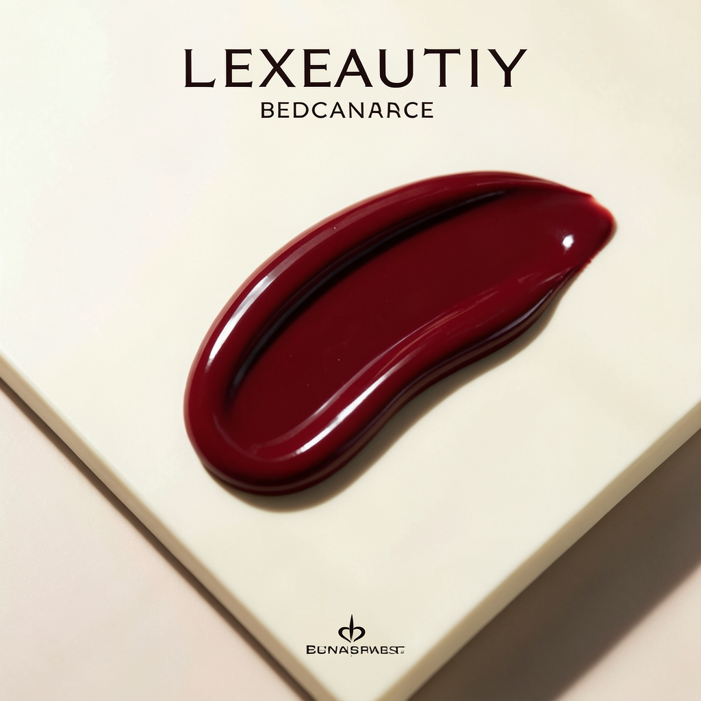
This one is simple in the best way. Clean geometry gives the model less to invent, so the result feels more controlled.
13) Olive oil bottle with olive branches
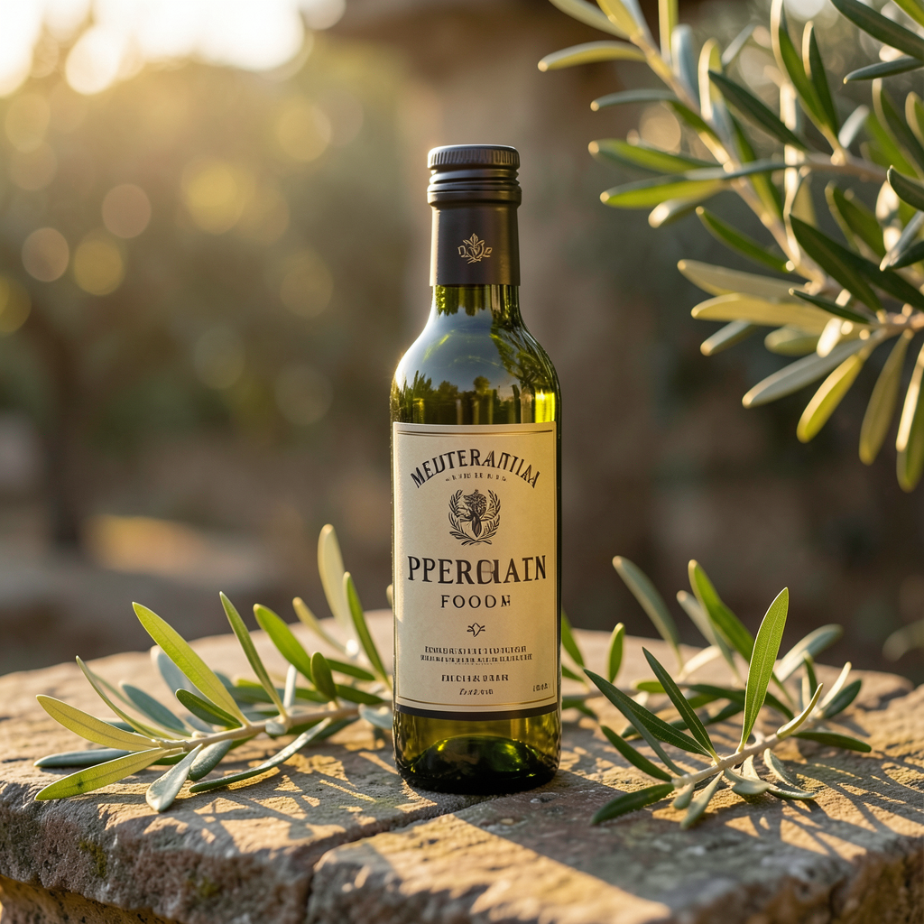
Warm food-lighting prompts look strong when the surface and prop story are obvious. This would work well for ecommerce headers and social creative.
14) Structured black backpack on a stairwell
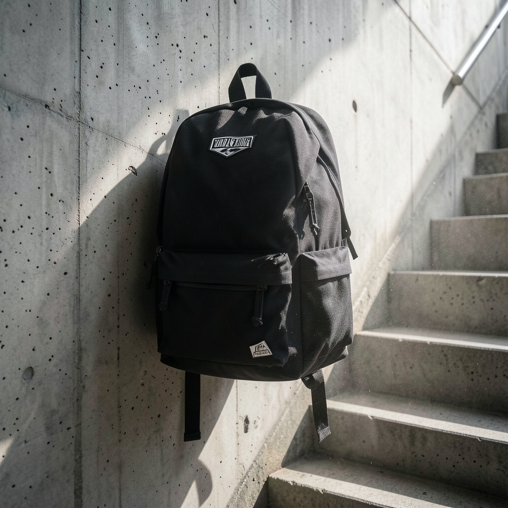
This is one of the harder prompts because the environment has more geometry than the tabletop shots. The result still feels usable, which is a good sign for fashion accessory work.
15) Cold brew bottle in an open fridge
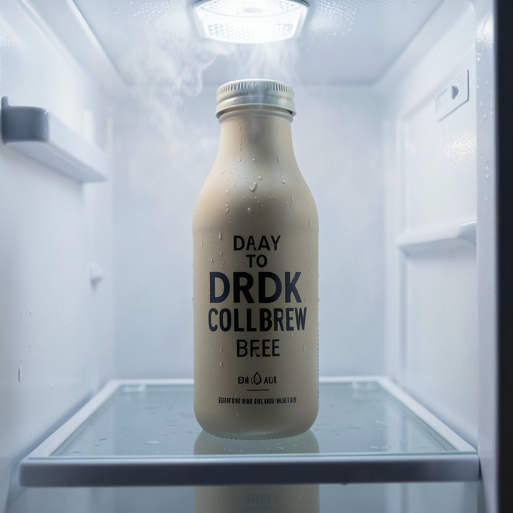
This closes the run well. Fridge lighting is a good way to test mixed shadows and glow. The product still stays readable, which is the main thing that matters.
What worked best in these FLUX.2 Klein 4B product ads
- Single hero products worked better than crowded layouts.
- Hard surfaces like slate, acrylic, and stone gave the model cleaner structure.
- Beauty, food, and tech prompts looked stronger than splash-heavy scenes.
- Strong side light or soft studio light was easier to control than complex mixed lighting.
- The best outputs avoided text entirely and let shape, material, and mood do the work.
If the goal is fast concept art for ads, the cleanest path is to prompt one product, one surface, and one lighting story. That is where FLUX.2 Klein 4B looks strongest. The weaker images in this set were not bad. They just asked for more moving parts.
Verdict
FLUX.2 Klein 4B product ads look good when the scene stays disciplined. The model is not trying to outdo larger systems on complex brand campaigns. It is trying to get to a clean commercial concept fast, and in that lane it works well. The best prompts in this run were the headphones, espresso machine, watch, and serum shots.
For prompt packs, landing page concepts, and quick ad mockups, that is enough. Try FLUX.2 Klein 4B on Wiro and build the prompt around one product hero, one clear surface, and one lighting cue.