OpenAI image models look close on paper, but a real layout test splits them fast. This comparison used one prompt across three Wiro builds: GPT Image 2, GPT Image 2 Custom, and GPT Image 1.5. The prompt asked for readable headline text, a small footer line, and a clean studio scene. That mix catches weak typography, bad spacing, and sloppy object placement.
The underlying image workflow is documented in the OpenAI image generation guide. For a narrower text-to-image review, see the SenseNova U1-8B Text-to-Image review.
Contents
Prompt and setup
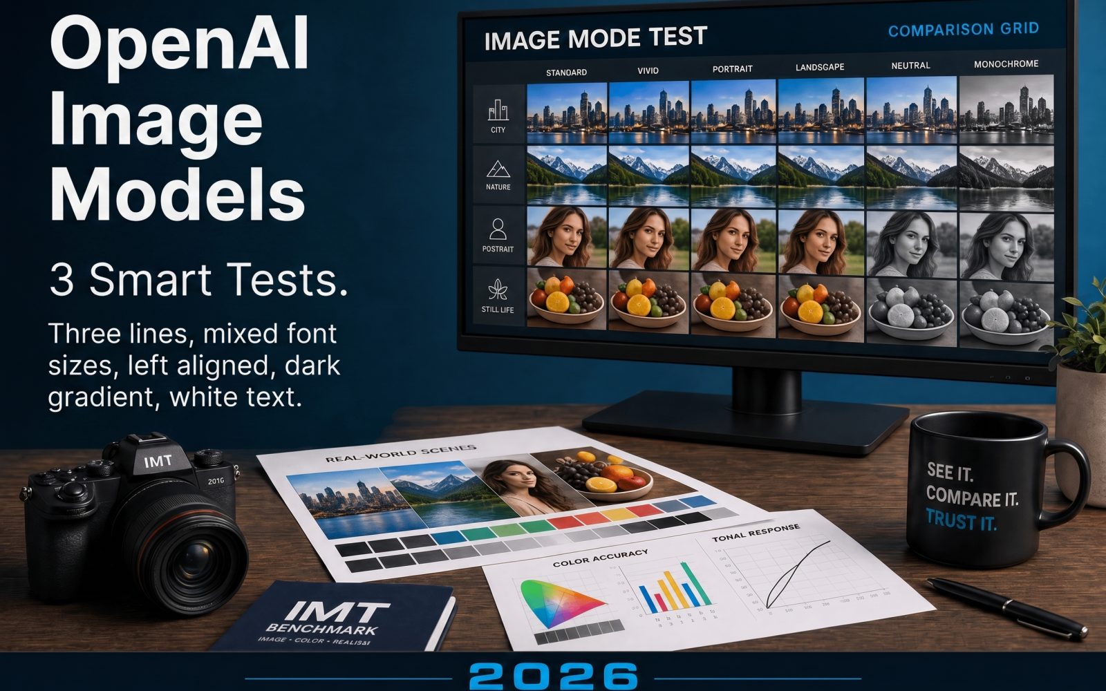
The prompt was intentionally plain and hard at the same time. It asked for a fictional poster called IMAGE MODE TEST, a camera, printed sheets, a monitor, and a small footer line. That forces the model to juggle text, depth, and composition at once. All three runs used high quality, a 3:2 frame, and the same wording. The only thing that changed was the model.
| Model | Run time | Control style | Main strength |
|---|---|---|---|
| GPT Image 2 | About 10s | Standard preset | Balanced layout and scene control |
| GPT Image 2 Custom | About 10s | Exact width and height | Tight framing and pixel control |
| GPT Image 1.5 | About 10s | Simple size preset | Fast setup and stable baseline output |
The three outputs
GPT Image 2
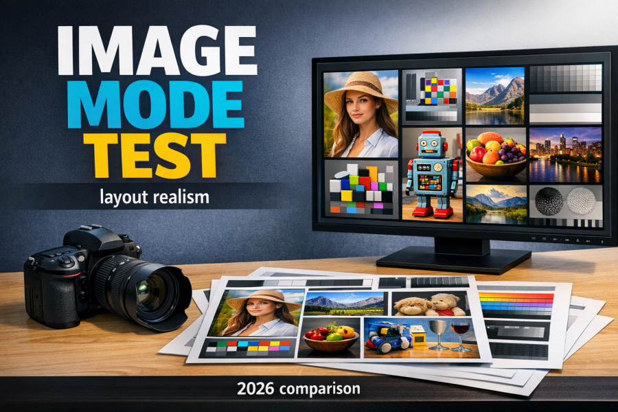
This version handled the whole brief with the least friction. The text still feels generated, but it stays readable enough to work in a blog graphic. The tabletop props support the poster instead of fighting it.
GPT Image 2 Custom
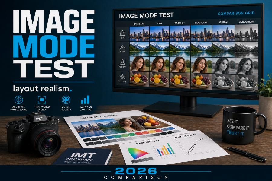
This one looks the most production-ready. The extra size control helped the composition breathe. It gave the cleanest poster-like read and the best chance of surviving a tighter crop for social or cover use.
GPT Image 1.5
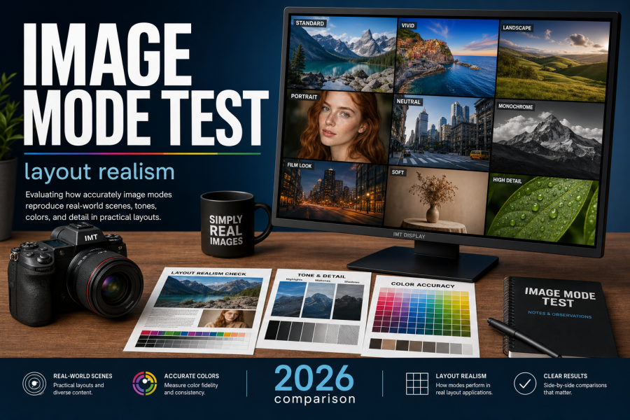
This run is the safest of the three. It keeps the scene tidy and avoids weird clutter, but the poster has less snap than the other two. For quick drafts, that is fine. For a final cover, it is a step behind.
What changed
The biggest gap is not raw image quality. It is control. GPT Image 2 gives the most balanced result when the prompt mixes text and objects. GPT Image 2 Custom gives the tightest control over the final frame, which matters when a post needs a specific crop or a cover image later. GPT Image 1.5 is the easiest baseline if the goal is fast iteration before a final pass.
Text rendering was the real stress test. All three models kept the headline readable enough, but none treated small type as a design system. That is normal for image models. The useful question is whether the model keeps the layout coherent while the text is present. On that point, GPT Image 2 Custom had the cleanest result, with GPT Image 2 close behind.
Composition also mattered more than surface detail. The poster works because the camera, sheets, screen, and title all support the same idea. When image models get busy, they often over-decorate the frame. These three stayed inside the lane, which is why the comparison is useful for blog work, ad mockups, and cover tests.
Best pick by use case
| Use case | Best pick | Why |
|---|---|---|
| Blog cover or social crop | GPT Image 2 Custom | Exact sizing keeps the frame under control |
| General purpose poster test | GPT Image 2 | Best blend of text, scene, and spacing |
| Fast baseline draft | GPT Image 1.5 | Simple setup and predictable output |
If the next test should go deeper, the best follow-up is a second round with denser text and a harder crop. That will separate the image models faster than any spec sheet.