3D text animations were tested here as ready-made motion scenes, not as a general text-to-video generator. The question was simple: with the same vertical frame and a one-word caption, how much does the selected EffectType determine the result? Each clip below keeps the test deliberately narrow so the differences come from the preset: a single promotional word, 9:16 ratio, and the listed EffectType. The model recommends short captions, especially one or two words, and these eight outputs support that advice.
What the 3D text animations test checks
3D Text Animations on Wiro takes a caption, an aspect ratio, and an EffectType. The model page lists more than 22 presets. This post focuses on eight that cover distinct moods: luxury balloons, neon retail, rainy street, food celebration, travel, drink, childrens visuals, and gold script. That gives a more useful selection than running eight nearly identical balloon styles.
All eight existing clips use the same working setup: ratio: 9:16 and a one-word caption. The original test labels also record videoMode: std; it is retained as the test setting, although the current model documentation exposes caption, ratio, and EffectType as the documented inputs. No claim is made that any look was prompted from scratch. The scene, material, lighting, and animation are preset-driven.
What each output actually shows
1. NEW: Silver Balloons Paris
The word NEW appears as reflective silver balloon lettering against a Paris-style scene. The letters read as objects rather than flat type, so the clip suits an upscale release, event reveal, or beauty launch. Pick it when the word itself should feel like a product. Avoid it for urgent discount copy: the polished material makes the message feel celebratory, not immediate.
2. SALE: Shop Window Neon
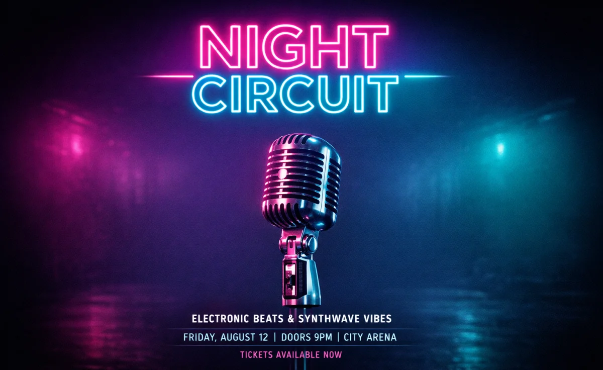
This output places SALE in a shop-window neon treatment. The bright stroke and darker storefront context create faster contrast than the balloon version. It is the clearest fit for a promotion, nightlife announcement, or a limited-time retail card. The narrow use case is a strength: pair it with a compact word such as SALE, OPEN, or LIVE rather than a sentence.
3. DROP: Rainy City Street
DROP is set into a wet, nocturnal city scene with reflected light. The result has more atmosphere than literal product information. That makes it a good choice for streetwear, music, a trailer card, or an after-dark event. It would be a poor match for a cheerful family promotion because the rain and dark palette carry most of the tone.
4. BIRTHDAY: Birthday Cake
The BIRTHDAY output makes the word part of a cake-led celebration scene. It is the most literal pairing in the set, which is useful for party invites, seasonal email headers, and reward messages. It also shows a practical limit: a longer word can work when the scene supports it, but the lettering occupies more of the frame. Keep extra copy outside the generated clip.
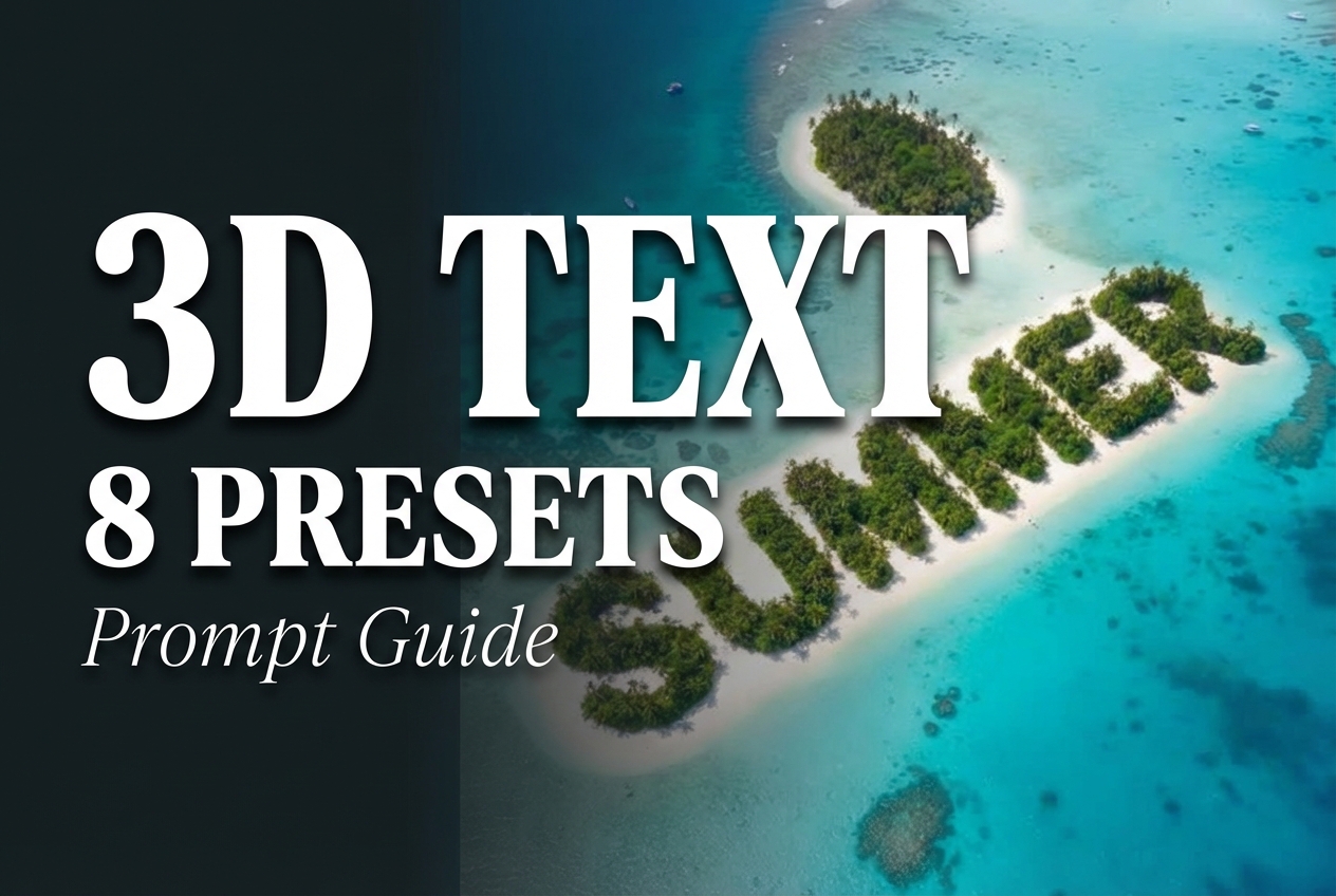
5. SUMMER: Island Shaped Text
SUMMER becomes part of an island and water motif. The letters carry the scene instead of sitting on top of it, which makes this preset useful for travel, resort offers, and outdoor campaigns. It communicates a destination quickly, but it is less flexible for a generic product launch. Choose it when the visual setting matters as much as the word.
6. FRESH: Watermelon Splash
FRESH is surrounded by watermelon and splash cues. The movement and food signals make this the right pick for beverages, produce, summer menus, or a quick-service special. It is energetic without needing more words. For a premium or restrained brand, use Silver Balloons Paris or Gold Script instead; the fruit treatment is intentionally playful.
7. KIDS: Colorful Toy Blocks
KIDS appears in a bright toy-block environment. This is the most direct option for childrens products, activity campaigns, classroom content, and family events. The preset carries a strong age signal, so it should not be used for a general-purpose software demo just because the colors are bold. Let the subject and preset agree.
8. LUXE: Gold Script
LUXE uses flowing gold script. It is the least forgiving preset for long captions because connected letterforms become visually dense fast. In return, short words look intentional and high-end. Use it for jewelry, weddings, fashion, or a premium membership reveal. Use the neon or toy-block presets when the priority is instant reading at small size.
Run time and cost on Wiro
The current documentation includes an example completed task with an elapsed time of 6 seconds. That is a documented example, not a promise for every 3D text animation run. Queue time, processing conditions, and output handling can change the wall-clock time. The documentation does not publish a per-output price for a completed 3D Text Animations task. A separate cancelled-task example includes a total cost, but it is not reliable evidence for the price of these eight completed clips, so no invented per-output cost appears here.
Which 3D text animation preset to pick
| Preset | Best use | Caption guidance |
|---|---|---|
| Silver Balloons Paris | Luxury launch | One short word |
| Shop Window Neon | Sale or nightlife | Fast, direct word |
| Rainy City Street | Streetwear or music | Moody announcement |
| Birthday Cake | Celebration | One longer word can work |
| Island Shaped Text | Travel and summer | Season or destination cue |
| Watermelon Splash | Food and drink | Freshness or offer cue |
| Colorful Toy Blocks | Kids and family | Simple age-specific word |
| Gold Script | Fashion or weddings | Keep it very short |
For adjacent video work, see the LTX-Video vs Kling vs Seedance comparison and the text-to-video API roundup. Those posts compare broader video generation. This tool solves a narrower job: turning a compact caption into a finished, themed motion title.
Try 3D Text Animations
Start with a one- or two-word caption, choose the mood before the copy, and run 3D Text Animations on Wiro. The preset is the creative brief here, so the fastest route to a useful result is selecting the scene that already matches the campaign.