Shopify Template Generator was tested with one product photograph and seven preset-and-ratio combinations to answer a practical question: can a static product shot become usable storefront creative without redrawing the product for every placement? The test kept the input image fixed. Only ratio and effectType changed.
The result is not an editable Shopify theme or a Liquid section. It is a finished image composition: useful as a homepage hero concept, campaign creative, a collection banner, or a design direction to rebuild in a real theme. That distinction matters. Shopify’s own theme documentation explains that production themes use Liquid, HTML, CSS, JavaScript, JSON, templates, sections, and assets. This tool generates the visual brief, not that underlying storefront system.
What the Shopify Template Generator test checked
Shopify Template Generator takes one required product image, one required aspect ratio, and one required visual preset. There is no text prompt field. That makes the test focused: product preservation, composition, whitespace, and the character of the chosen preset become the variables that matter.
The set was designed to test the same product across mobile-first, square, feed, standard-wide, and ultra-wide frames. A good result should keep the product recognizable, avoid crushing it at the edges, and leave a composition that a merchant could use as a static creative starting point. It does not need to produce readable marketing copy, buttons, prices, or a usable checkout layout, because none of those become functional from a rendered image.
Seven of the model’s documented effect choices were selected: Soft Studio Glow, Cool Minimal Spotlight, Golden Hour Shadow, Monochrome Softbox, Tropical Shadow Play, Cinematic Glow Cast, and Sunset Silhouette. The documentation also lists Warm Ivory Fade and Amber Luxe Gradient. Those two were not part of this specific seven-output set, so this article makes no claim about their behavior.
Test setup and parameters
Every output started from the same base product photo below. The input was supplied through inputImage. Each run changed only ratio and effectType; the model offers 1:1, 3:2, 2:3, 4:3, 3:4, 4:5, 5:4, 16:9, 9:16, and 21:9 ratios. The seven selected ratios deliberately span the placements a store team commonly needs.
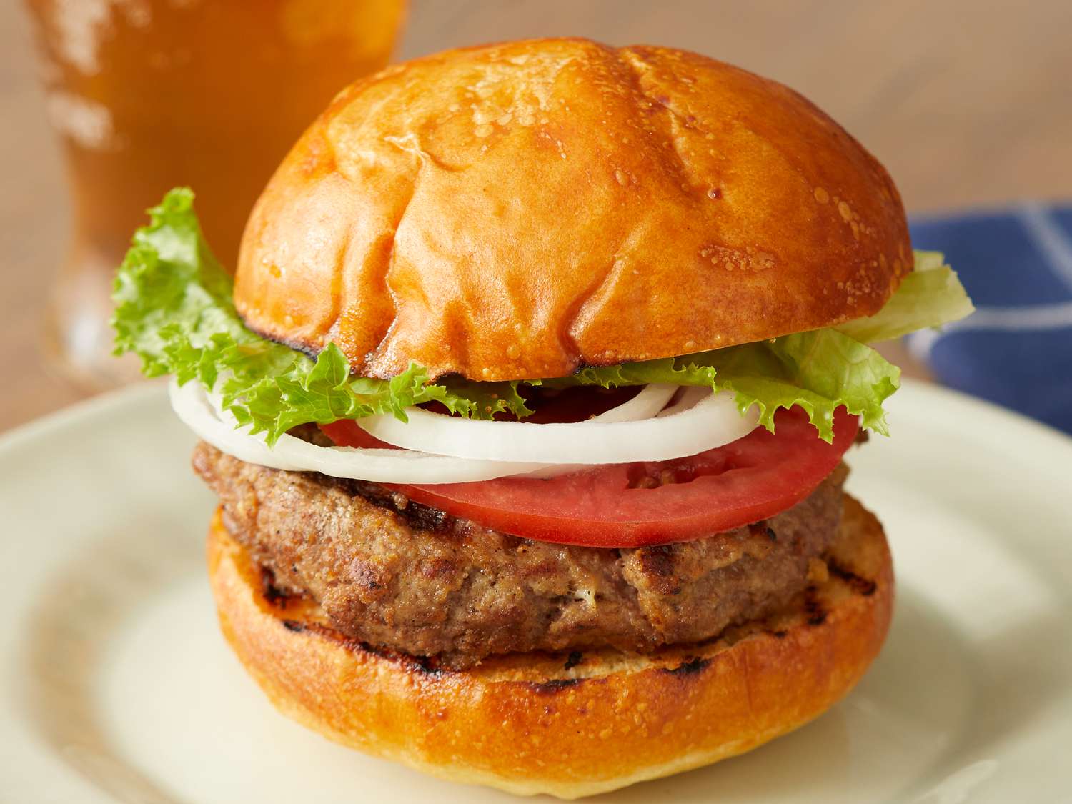
This setup is useful for testing consistency, but it is not a benchmark of product photography itself. If the input has a messy background, weak cutout, tiny label, or clipped product edge, the output begins with that constraint. The generator can frame a product attractively; it cannot guarantee factual product details that are not clear in the source image.
What each of the seven outputs actually shows
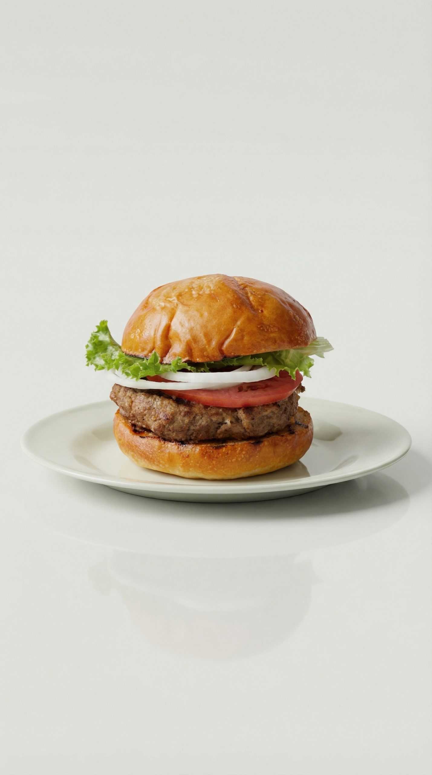
1. Soft Studio Glow in 9:16
Soft Studio Glow creates the cleanest mobile-first composition in the set. The vertical 9:16 frame gives the product room to breathe above and below, while the pale gradient keeps attention on the item instead of the set dressing. It reads like a story ad or a full-screen mobile landing concept. Choose it when the product needs a neutral, polished setting and the brand can add its own copy later.
2. Cool Minimal Spotlight in 9:16
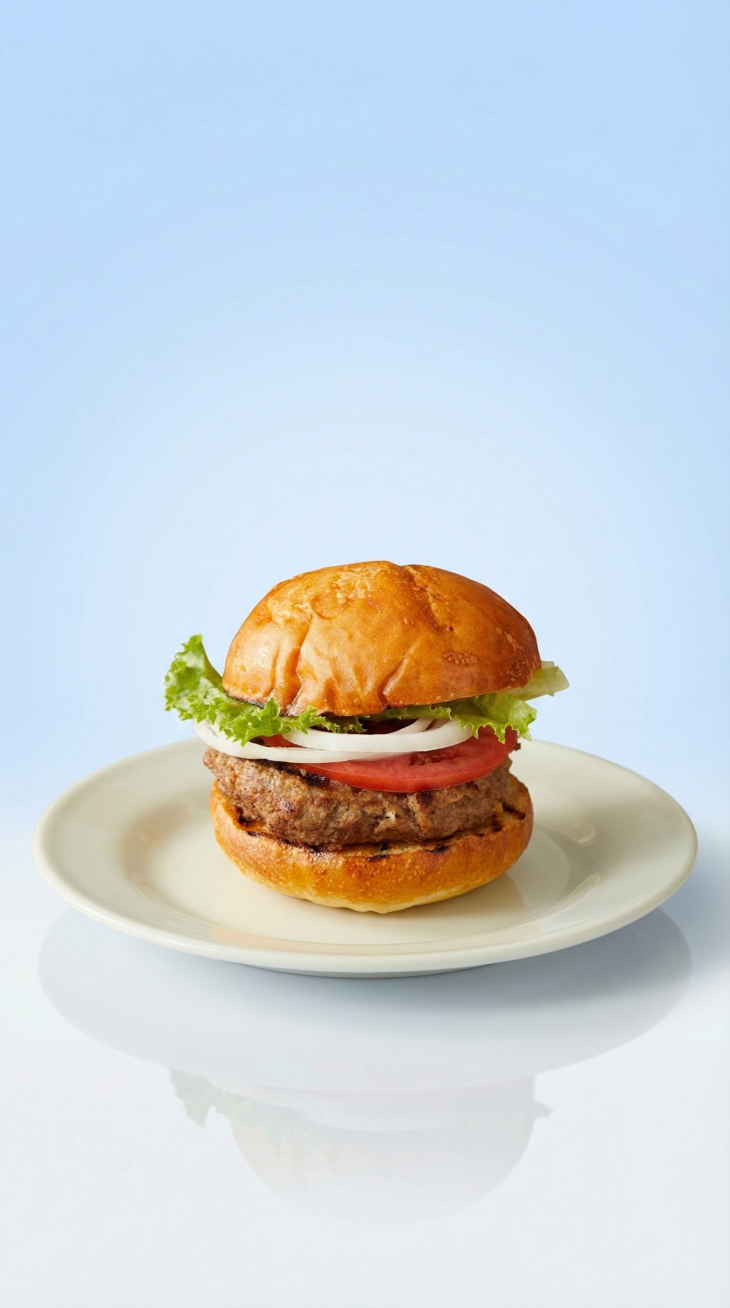
Cool Minimal Spotlight uses harder contrast and a quieter background. Compared with Soft Studio Glow, it feels less soft and more catalog-oriented. The product stays visually dominant, which makes this the safer pick for brands with restrained art direction or for creative that will carry a separate headline. It is less suitable when the brand wants warmth, lifestyle context, or a colorful seasonal campaign.
3. Golden Hour Shadow in 16:9
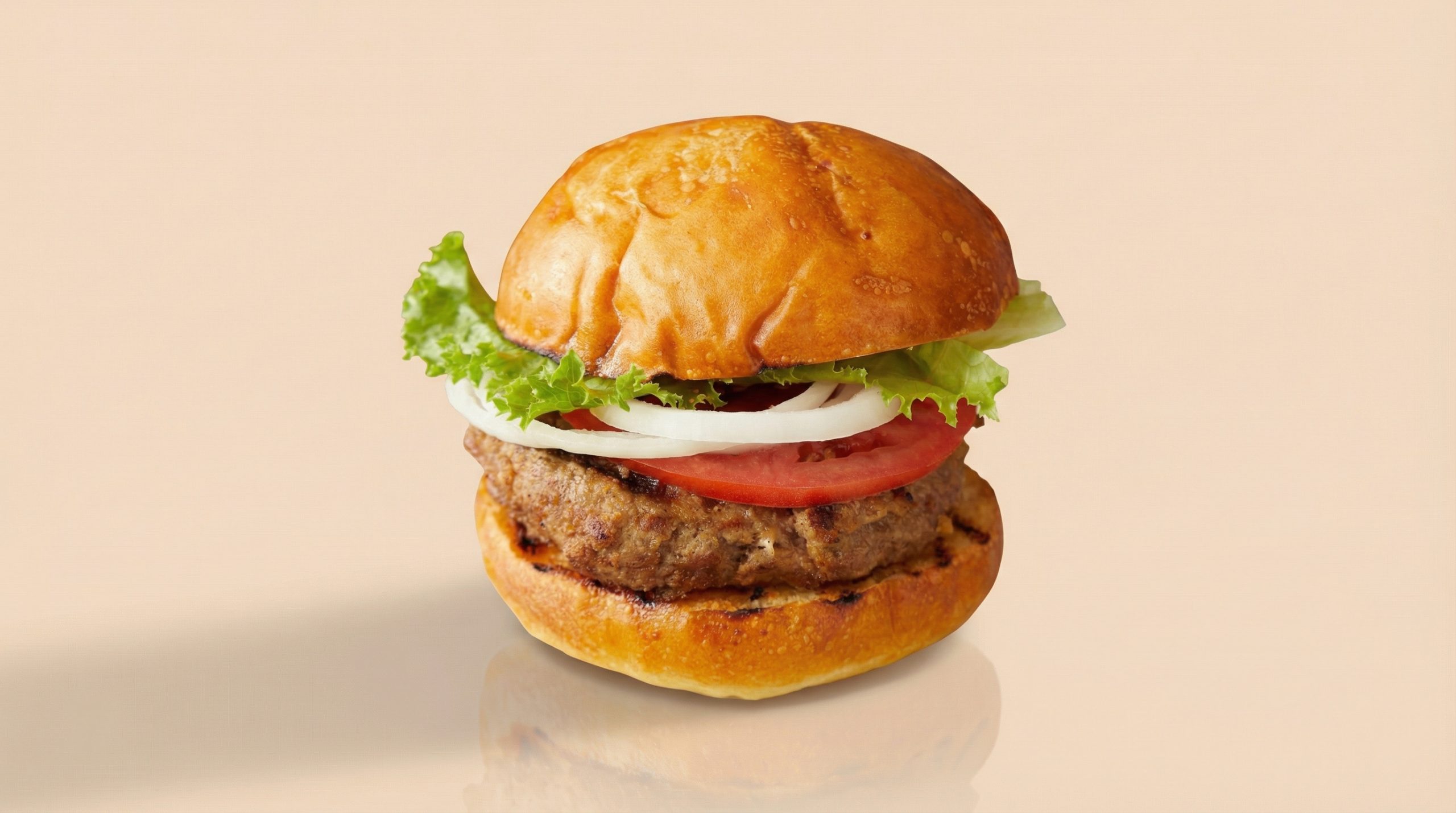
Golden Hour Shadow turns the same product into a broad hero-banner treatment. The warm shadow adds atmosphere without hiding the item, so it has more character than the two vertical studio options. The 16:9 frame is a sensible starting point for homepage hero art, email headers, and desktop campaign panels. Pick it when warmth supports the product story; skip it if strict color matching is more important than mood.
4. Monochrome Softbox in 1:1
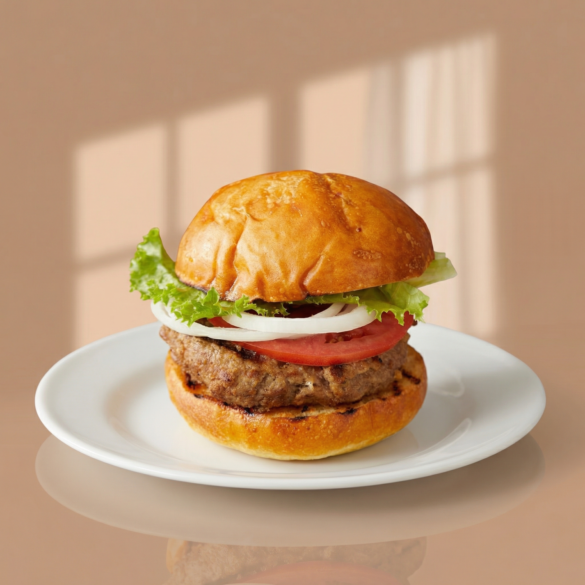
Monochrome Softbox is the most grid-friendly output. The square frame makes it practical for collection tiles, social posts, and simple product callouts. Its restrained treatment leaves little visual conflict with branded type, stickers, or price overlays. It can feel plain for a premium launch page, but that restraint is a strength when a team needs a dependable asset that can sit beside many different products.
5. Tropical Shadow Play in 4:5
Tropical Shadow Play has the strongest lifestyle-ad energy in the group. The 4:5 ratio fits a vertical feed slot, and the color and shadow treatment makes the output more expressive than the studio presets. The product remains clear, but the framing has more opinion. Choose it for a campaign that can carry playful light and color. Avoid it when the palette must match a tightly controlled brand system.
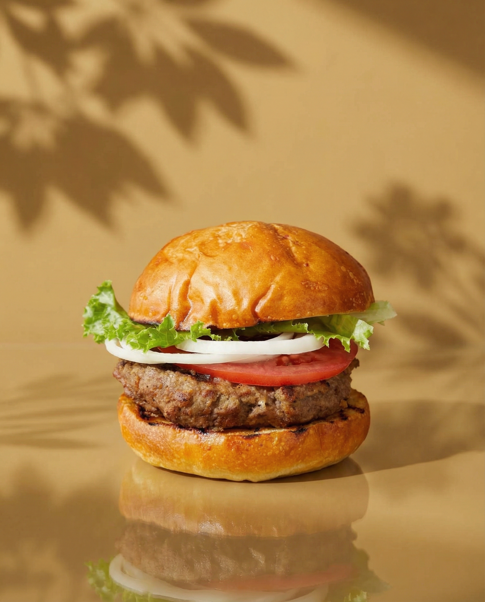
6. Cinematic Glow Cast in 16:9
Cinematic Glow Cast is the most dramatic wide result. It pushes shadow and glow further than Golden Hour Shadow, which gives it a more premium editorial feel. That can work for launches, luxury products, or a campaign landing page with dark typography. It can also overwhelm a light, clinical, or minimalist brand. The output is best treated as hero art, not a universal product catalog image.
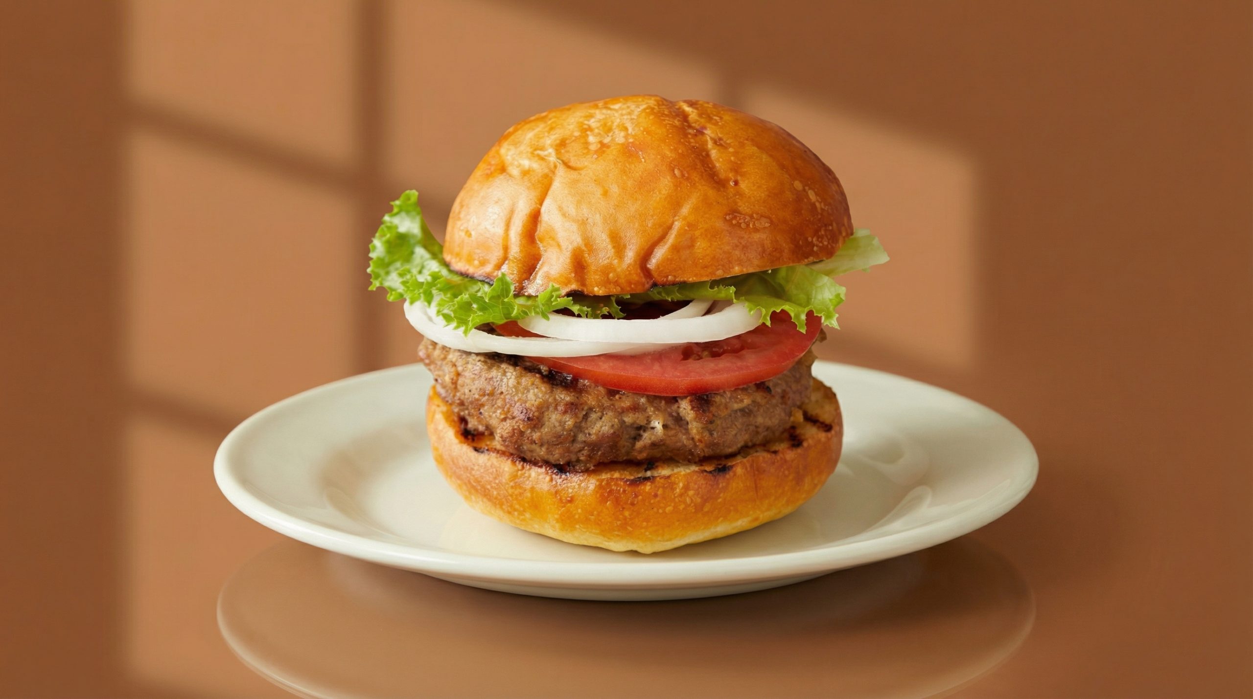
7. Sunset Silhouette in 21:9
Sunset Silhouette tests the widest available frame used in this set. It behaves like a homepage masthead: broad, editorial, and dependent on careful placement of the product. The tradeoff is clear in an ultra-wide frame. There is more room for a headline, but the product can look small if the source image does not already have a strong central silhouette. Choose it for a wide header with planned copy space, not for a product-detail card.
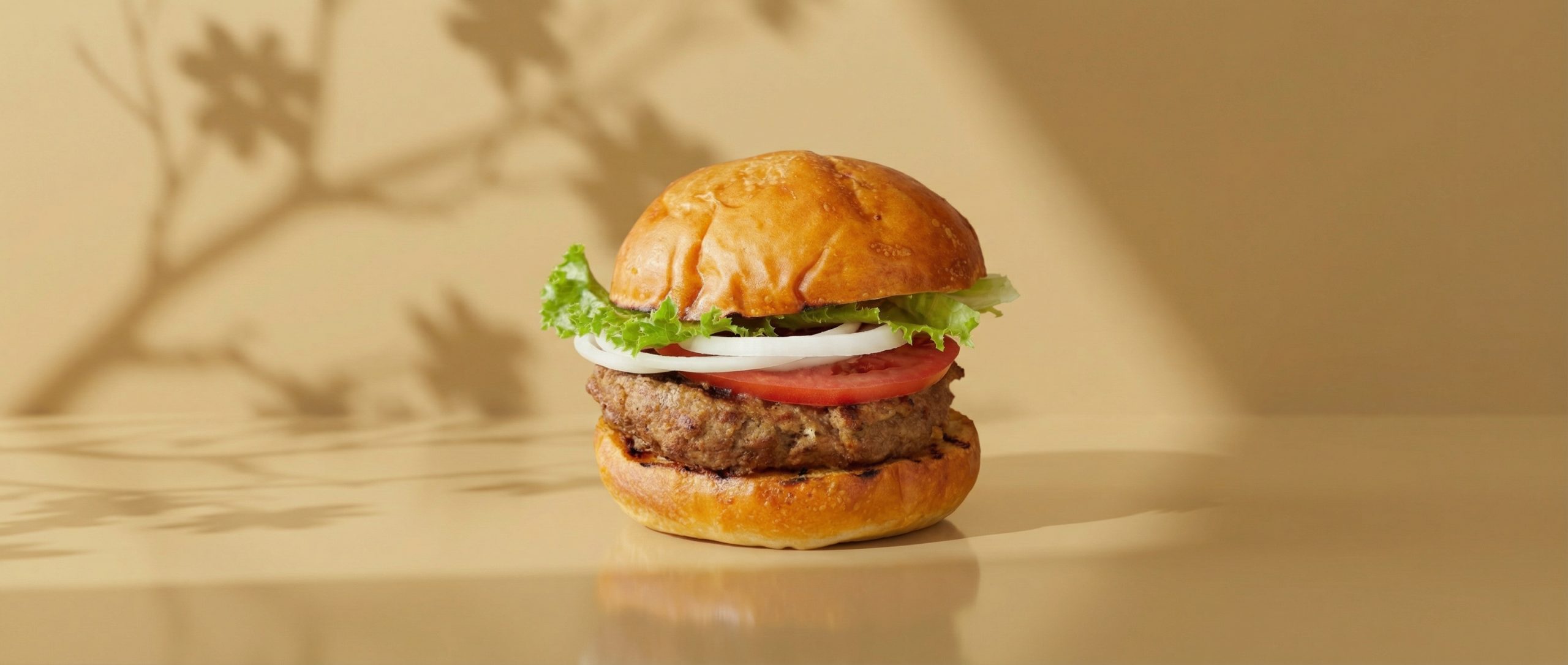
Runtime and cost record
The original test recorded end-to-end completion times of about 20 to 30 seconds per output. Those are observations from these seven runs, not a service guarantee. The model documentation includes an example task record with a 6-second elapsed time and a total cost of 0.003510 for that record. It does not publish a stable current price table, so that figure should be read as a documented example per generated output rather than a quote for future runs.
| Preset | Ratio | Observed test runtime | Best fit |
|---|---|---|---|
| Soft Studio Glow | 9:16 | About 27 seconds | Mobile hero or story creative |
| Cool Minimal Spotlight | 9:16 | About 20 seconds | Clean, product-first mobile layout |
| Golden Hour Shadow | 16:9 | About 25 seconds | Warm desktop hero |
| Monochrome Softbox | 1:1 | About 28 seconds | Grid post or collection tile |
| Tropical Shadow Play | 4:5 | About 25 seconds | Vertical feed creative |
| Cinematic Glow Cast | 16:9 | About 27 seconds | Premium campaign hero |
| Sunset Silhouette | 21:9 | About 30 seconds | Ultra-wide homepage header |
How to pick the right Shopify Template Generator output
Start with placement, not style. For full-screen vertical creative, choose Soft Studio Glow for a lighter feel or Cool Minimal Spotlight for a sharper product-first treatment. For a social feed, Tropical Shadow Play uses 4:5 efficiently and brings more campaign character. For square placement, Monochrome Softbox is the least risky option.
For wide desktop spaces, choose Golden Hour Shadow when warmth adds value and Cinematic Glow Cast when the campaign needs more contrast. Sunset Silhouette only makes sense when a wide header genuinely needs negative space for a headline. It is not automatically better because it is wider. The product must still carry enough visual weight at that scale.
Teams that need source imagery before generating layouts may also find the product-shot methods in this product photography prompt test useful. For adapting a finished asset to other placements, see the AI image resizing comparison. A separate product photo editing test shows why preserving the original item should be checked before a campaign asset goes live.
Limits before production
These outputs should be reviewed as creative assets, not shipped as storefront code. Check the product shape, material, label, color, and crop against the original photo. Do not treat generated text as approved copy. If an asset becomes a live Shopify section, rebuild the layout in the theme so it remains responsive, accessible, and editable.
For fast visual exploration from a single packshot, the model does what the test set out to check: it gives seven clearly different directions without changing the source image or writing a prompt. The best preset depends on the placement and brand mood. Start with the least stylized output that fits the slot, then move toward stronger lighting only when the campaign calls for it.
Try Shopify Template Generator on Wiro with one clean product photo and compare two ratios before committing a design direction.