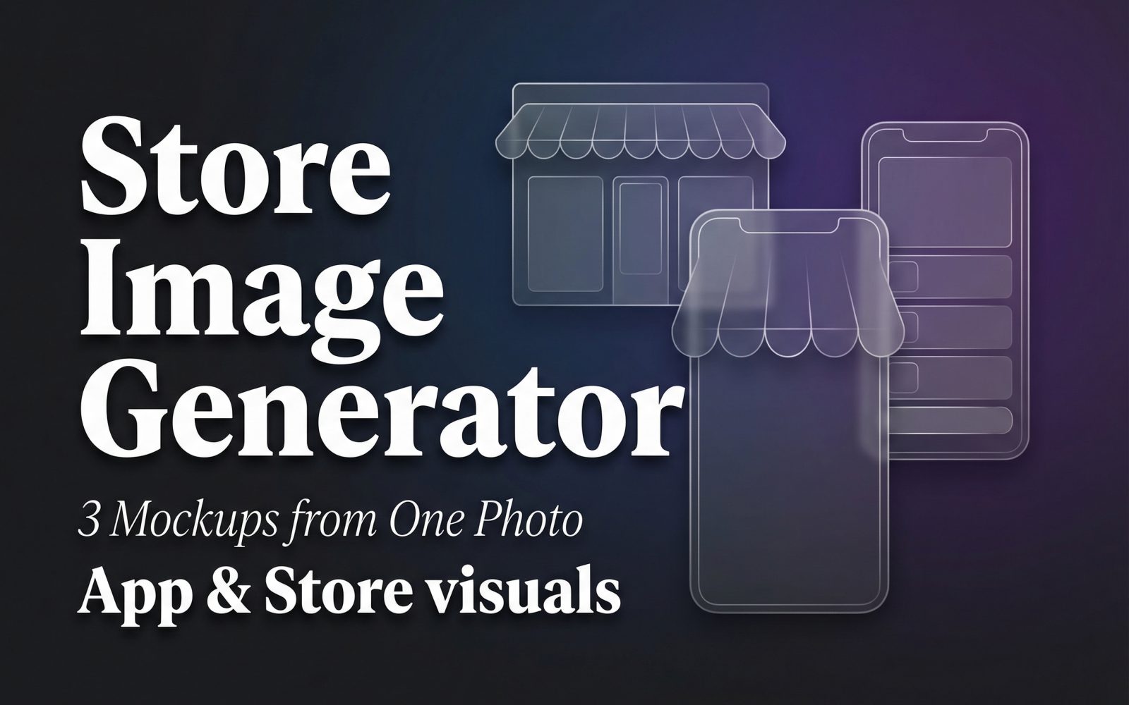
Store Image Generator turns a small set of app or product images into store-listing artwork. This test asked a narrow question: can the same three source assets produce usable visual directions without changing the product itself? The answer is yes for early creative exploration, with an important caveat: the output still needs a human check for store-specific copy, safe areas, and final screenshot rules.
What the Store Image Generator test checked
The goal was not to invent a new brand. It was to see whether one coherent input set could become three storefront treatments that still point back to the same product. The input set contains a coffee-bag product image, a Northpeak logo, and a lifestyle image. Those assets give the generator a product anchor, a brand mark, and a supporting scene. The output set changes the presentation around them rather than replacing the underlying product.
That makes this a useful test for a launch team that has the core screenshots or product photography but needs several directions for a review. It does not test conversion rate, policy compliance, localization, or whether generated text matches an approved claim. Those checks sit outside the model output.
Inputs and parameters used
The published run used three input images and three background treatments: white gradient, gold gradient, and dark gradient. Store Image Generator requires at least three images and ignores images after the fourth, so this test sits at the documented minimum. The source body does not record an exact store selector, font name, font-color hex value, or written description. Those values are deliberately not reconstructed here.
The current model controls are a store choice for Apple App Store or Google Play, a description field, background color, font, and font color. The documentation lists Apple as the default store and Roboto as the default font, but defaults are not evidence of the settings used in these three historical outputs. For a repeatable run, record the store target, all three or four source files, chosen gradient, font, font color, and the final description alongside the exported artwork.
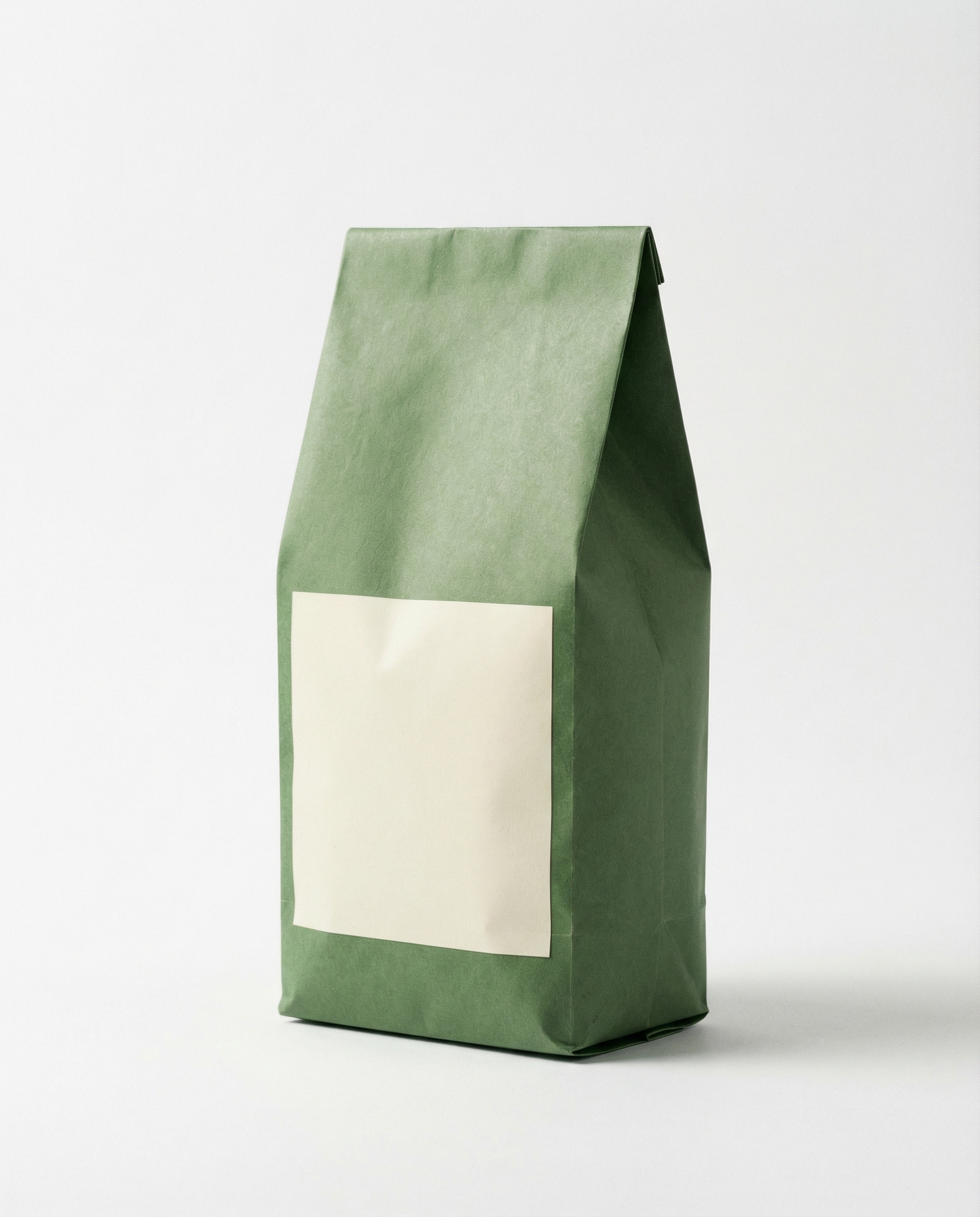

What each mockup actually shows
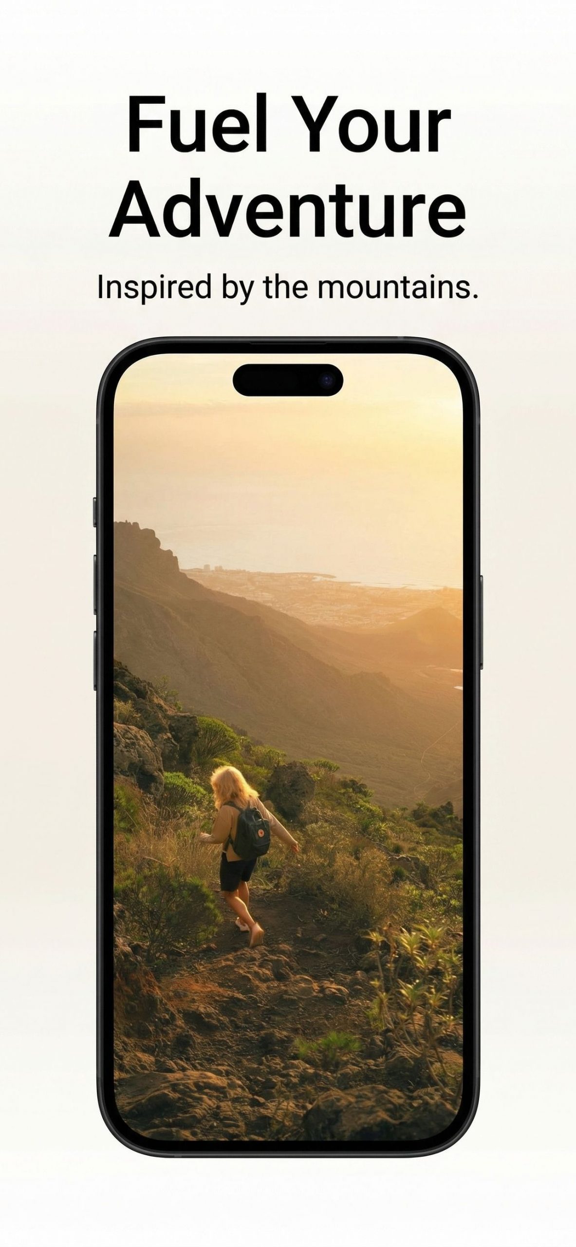
The white-gradient result is the safest starting point for product-led pages. It keeps the composition legible and makes it easier to spot whether a screenshot, logo, or headline needs manual adjustment. It can feel restrained beside a busy store listing, so it is best when the app or product imagery already carries enough color.
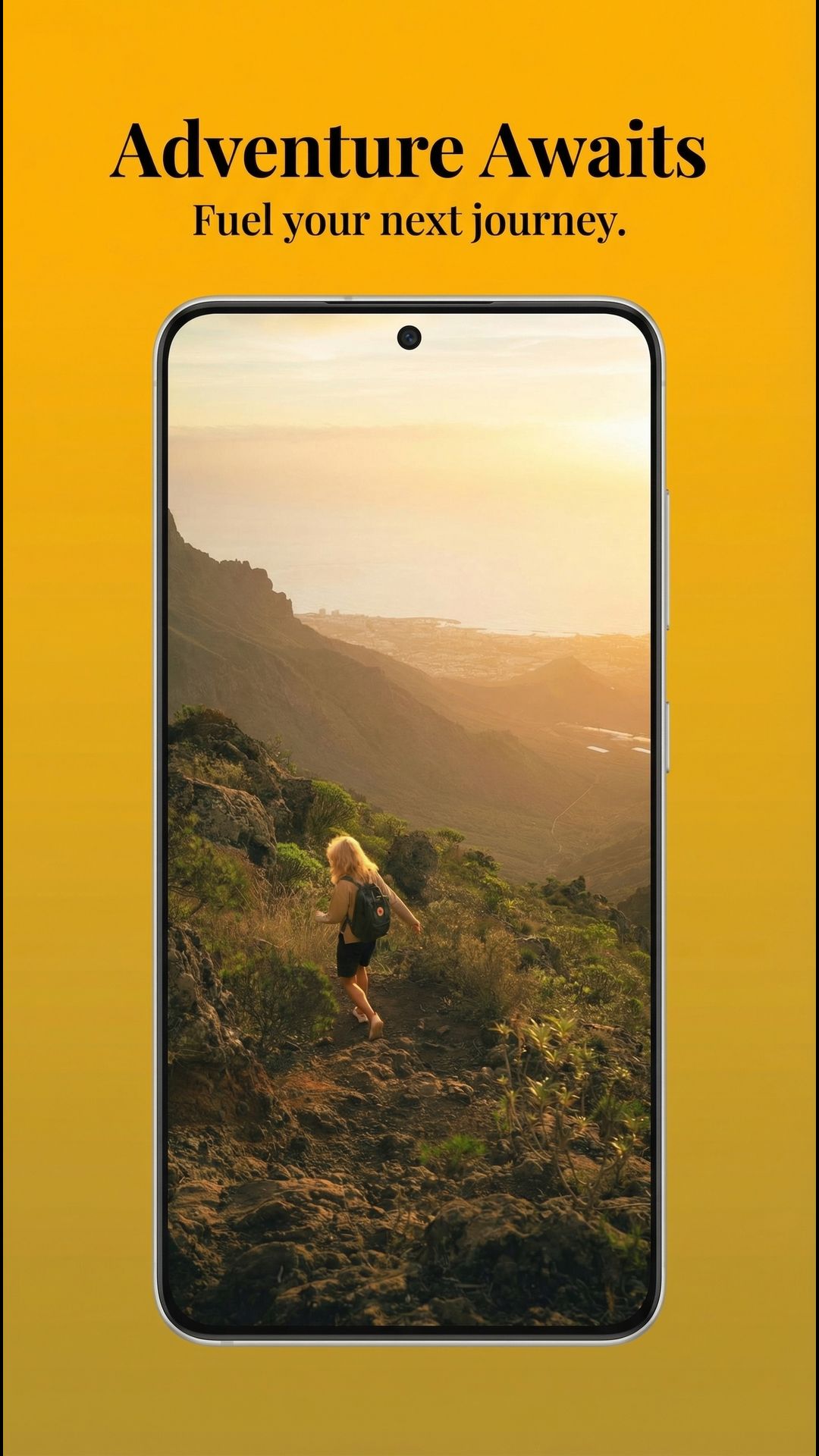
The gold-gradient result provides the strongest retail cue of the three. It is a sensible direction for a seasonal launch, a premium product angle, or a campaign that needs more visual separation in a scrolling gallery. Check contrast at the final store size; a warm background can compete with light logos and small text.

The dark-gradient result is the best fit when the product image contains light packaging, a bright interface, or a logo that needs separation. It creates a stronger frame than the white version. It is less forgiving of dark screenshots, though, and should be checked against both light and dark source elements before export.
Runtime and cost on Wiro
Wiro’s model documentation includes a completed example with an elapsed time of 6 seconds. Treat that as a documented example, not a service-level promise: queue time, upload size, and processing conditions can change the end-to-end wait. The documentation does not publish a cost for a successful output. It also shows a separate cancelled-task example with a total cost of $0.003510, but that is not a successful-output price and should not be presented as one. This post therefore reports no cost per output rather than inventing a rate.
For store requirements, review Apple’s official product-page guidance before shipping artwork. The model helps generate directions; the store owner remains responsible for final assets, claims, and compliance.
When to pick Store Image Generator
Choose Store Image Generator when the job starts with real screenshots or product imagery and the bottleneck is layout exploration. It is particularly useful when three or four related assets need to become a consistent store-gallery direction quickly. Pick the white gradient for a product-first presentation, gold for a warmer campaign treatment, and dark for higher contrast around light source art.
Use a broader image-generation workflow instead when the task is to create a new product scene, replace the product photography, or develop a concept with no source assets. For adjacent workflows, see product photography prompt recipes, clean-layout prompt tests, and brand-asset prompt expansions.
Try Store Image Generator on Wiro with three distinct assets, then judge the output at the exact size and store surface where it will appear.