Professional headshot edits are often sold as a single click, but the useful question is narrower: which background and crop produce an image that still looks credible for the job at hand? This six-output test used one source portrait with Wiro Professional Headshot. It checks subject separation, crop, lighting treatment, and the small edge failures that matter once an image leaves a preview window.
Professional headshot edits: test setup
The same source photo went into all six runs. The model takes a JPEG or PNG image URL, then applies a selected background, an aspect ratio, a safety-tolerance setting, a seed, and an output format. Background was the main variable. The test used the documented choices: neutral, gray, white, office, and black. The first two outputs also test how a square crop and a 4:5 crop change the presentation of the same neutral treatment.
| Parameter | Value used |
|---|---|
| Model | wiro/professional-headshot |
| Input | One JPEG or PNG portrait reference |
| Safety tolerance | 2 |
| Seed | 42 |
| Output format | jpeg |
| Backgrounds | neutral, gray, white, office, black |
| Aspect ratios | 1:1, 4:5, 3:4 |
Holding seed 42, safety tolerance 2, and JPEG output constant does not prove that another seed would look identical. It does make the comparison easier to read. The purpose is not to measure face verification or claim that a result is a literal photograph. It is to see how the tool treats the supplied portrait when the background and frame change. A production workflow should still inspect hair, glasses, earrings, collar edges, and any area where the foreground meets a flat background.
What the six outputs actually show
1. Neutral background, 1:1
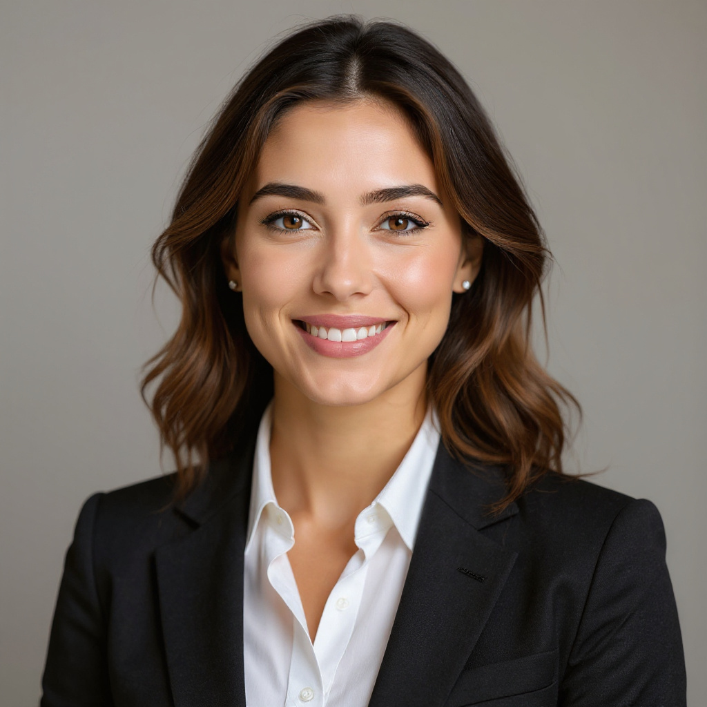
The neutral square version is the least opinionated result. It gives the portrait a warm studio-style backdrop without adding an environment that competes with the face. The subject remains recognizable, although the skin has mild smoothing and the hair boundary is softer than it is in the input. This is a sensible first choice for an account avatar, team directory, or speaker bio where the image will appear small and needs to fit a square slot.
2. Neutral background, 4:5
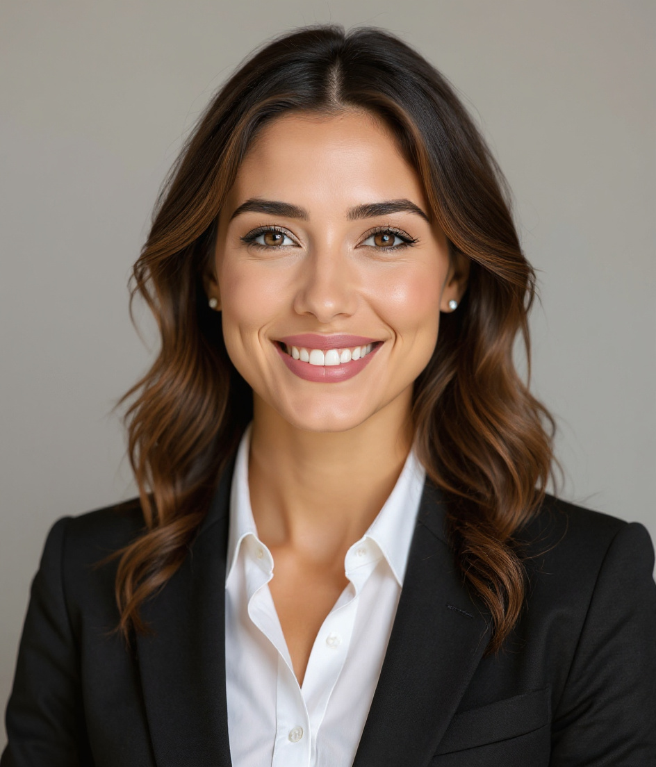
The 4:5 version keeps the neutral backdrop but gives the shoulders and upper torso more room. That makes the image read more like a conventional portrait than a profile icon. The face appears a little sharper because the framing supplies more context, not because the test changed an enhancement setting. At close size, the jacket seam shows a little blur. Pick this crop for LinkedIn, conference programs, press pages, or any vertical placement where the shoulders should remain visible.
3. Gray background, 1:1
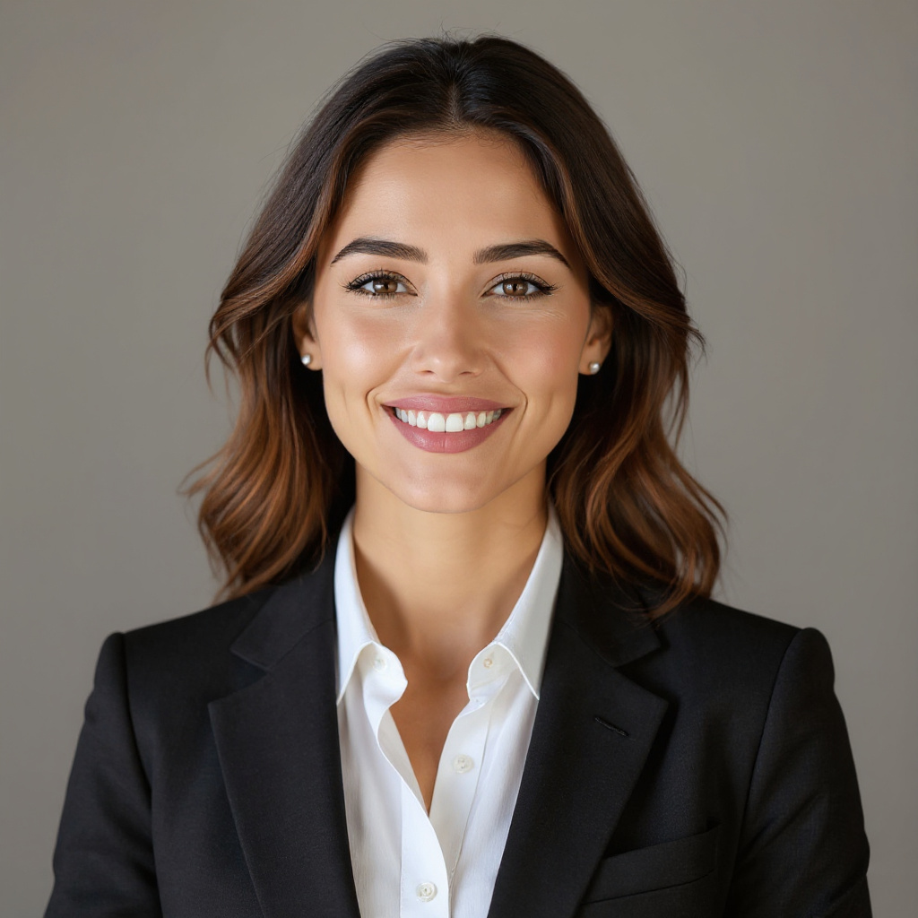
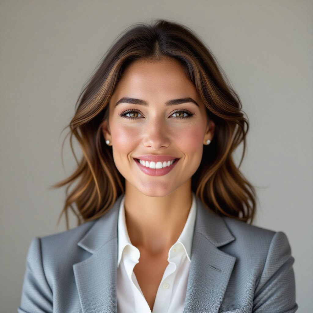
Gray produces the most restrained editorial option in the set. It separates the face from the background without the high contrast of black or the hard edge demands of white. Facial detail holds up well, though skin texture remains slightly smoothed. This is the safer choice for a corporate site, CV, or staff page with mixed portrait lighting. It also works when the surrounding design already uses white space and a pure-white cutout would disappear into it.
4. White background, 1:1
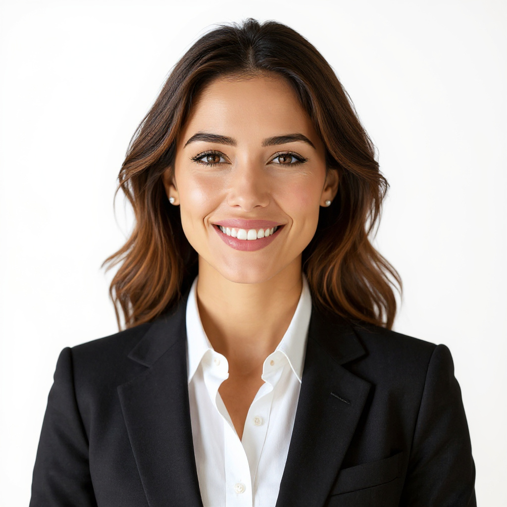
The white version creates a bright, high-key headshot that can sit neatly on a light landing page or in an employee grid. It also reveals the most obvious compositing weakness in the test: a faint halo where the hair meets the white field. That is common in a hard contrast transition and matters more when the image is printed or enlarged. Choose white when a clean page needs visual continuity, but zoom in before publishing. If the halo is distracting, gray is the safer background rather than a cosmetic fix.
5. Office background, 3:4
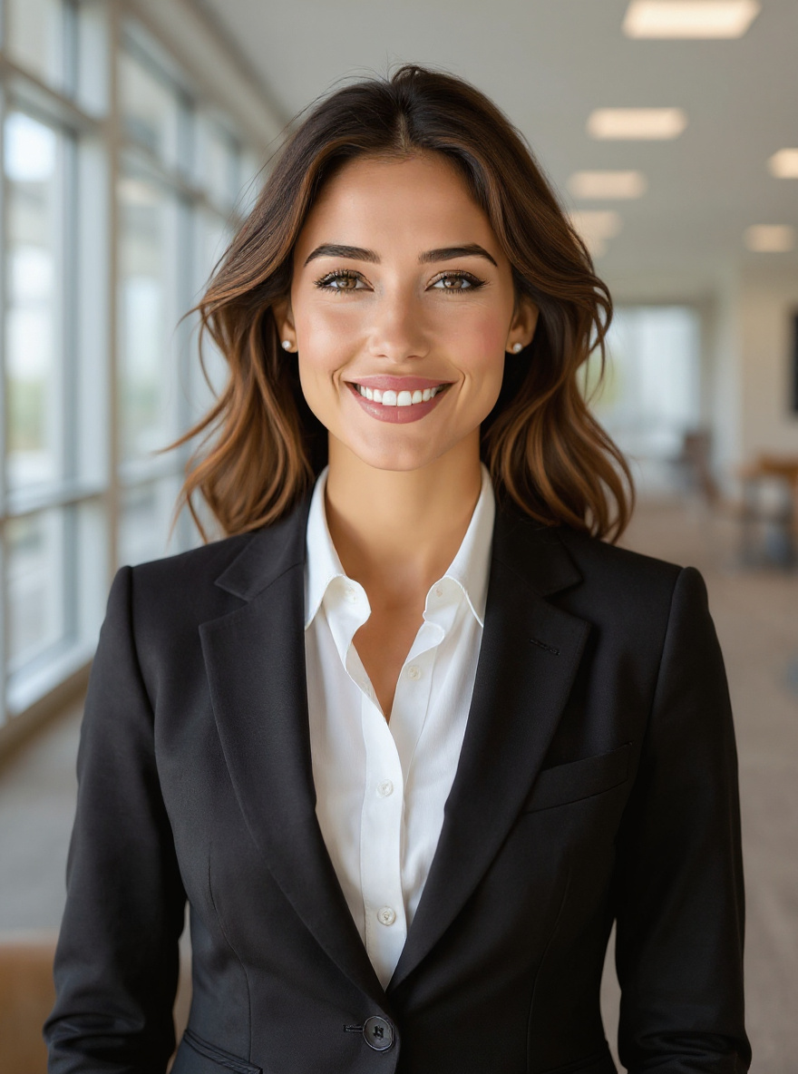
The office test answers a different brief. Instead of reducing context, it adds it. The 3:4 crop gives the subject a more environmental portrait shape, but the extra furniture and tones compete for attention. The output can work for a team page, recruiting story, or an about page that benefits from a workplace cue. It is not the best option for a formal profile image. A restrained blur behind the subject would improve this direction, but that was not a parameter in this run.
6. Black background, 1:1
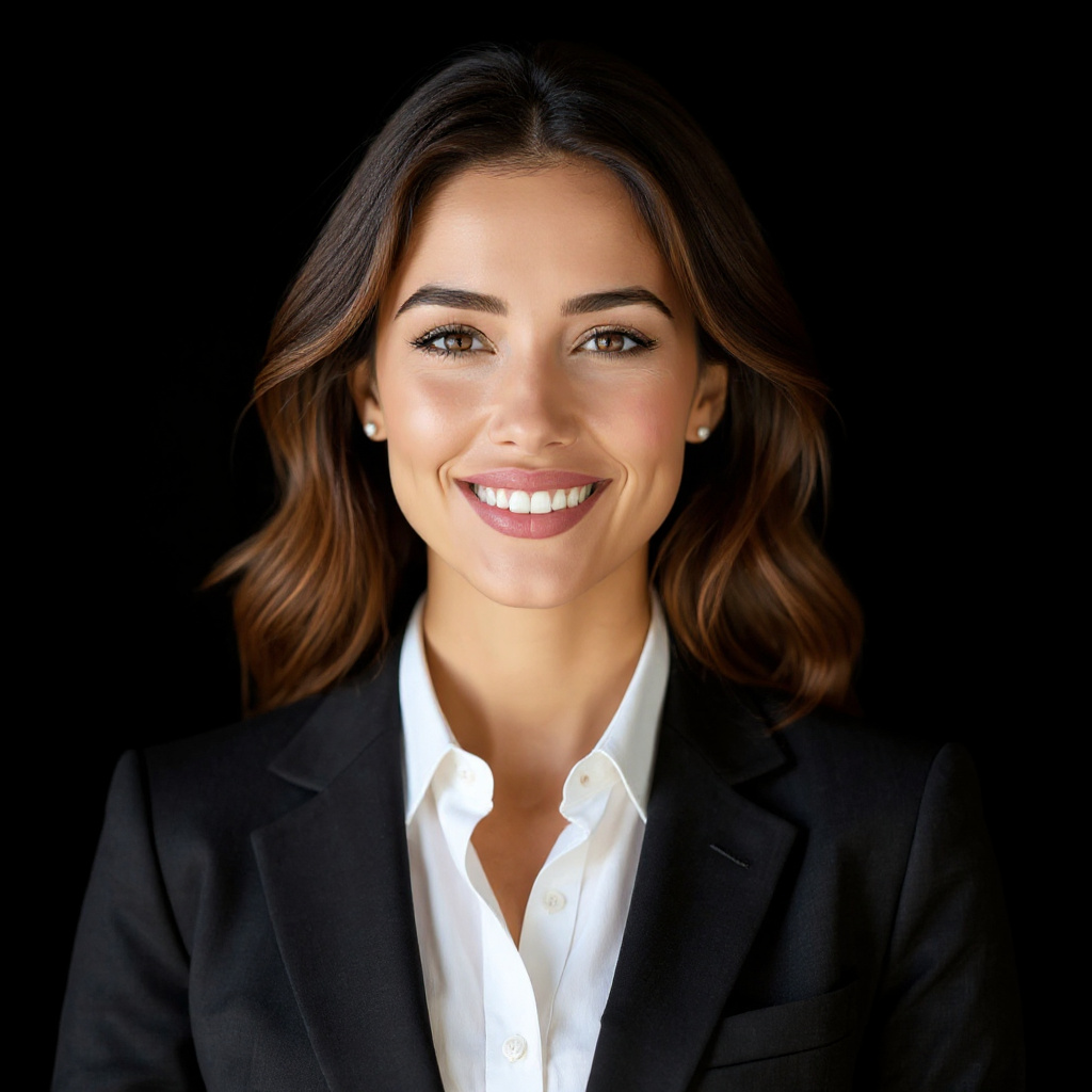
Black delivers the strongest separation in the set. The face and shoulders stand forward, and the dark field creates a dramatic result without the visible white-edge halo. That makes this output a good candidate for a hero card, an event cover, or an executive bio where a more deliberate look fits the brand. It can feel severe in a cheerful team grid, so it is not a universal default. Watch dark hair and dark clothing closely in other inputs, because the same treatment could lose separation when the source has fewer highlights.
Run time and cost on Wiro
The preserved six-output test does not contain task records, so it cannot support an exact runtime or cost for each historical image. Those figures are not guessed. The current model documentation includes an illustrative completed-task record showing 6.0000 elapsed seconds and a separate cancelled-task example with a total cost of $0.003510000000. Those examples establish that Wiro returns run details, but they are not evidence that every background or account configuration will have the same time or charge. For a production estimate, run the chosen input and save the task details from that run.
Which professional headshot background to choose
| Need | Best output from this test | Reason to choose it | Check before use |
|---|---|---|---|
| Profile avatar | Neutral, 1:1 | Balanced and compact | Hair edge softness |
| LinkedIn or speaker page | Neutral, 4:5 | More shoulder context | Jacket seams at full size |
| Corporate staff page | Gray, 1:1 | Restrained, adaptable tone | Skin smoothing |
| Light website grid | White, 1:1 | Clean high-key appearance | Halo around hair |
| Team story or recruiting page | Office, 3:4 | Adds workplace context | Background distraction |
| Hero or executive card | Black, 1:1 | Strong separation and contrast | Dark hair or clothing |
Pick Wiro Professional Headshot when the input is already a clear, front-facing portrait and the job is a polished background treatment with a predictable crop. Start with neutral or gray for a safe professional result. Use white only after checking fine edges, office only when context helps the story, and black when the design can carry a more dramatic portrait. For a one-photo avatar workflow with larger stylistic changes, see Kolors IP-Adapter: 6 Avatar Styles From One Photo. For pose variation from one reference, see Instagram Pose: 4 Preset Poses From One Photo. For a different image-editing test, see Qwen Image Edit Fast: 6 Quick Before/After Edits.
Run Wiro Professional Headshot with a high-resolution JPEG or PNG, then inspect the result at the final display size before using it publicly.